Solutions
Collaborators
Photography
Overview
To contextualise the organic focus of minimal skincare line LESSE, we developed a brand identity that subtly adapts visual codes of minimalism across a streamlined website, print collateral and wraparound packaging system designed for heightened name recognition.
Contents
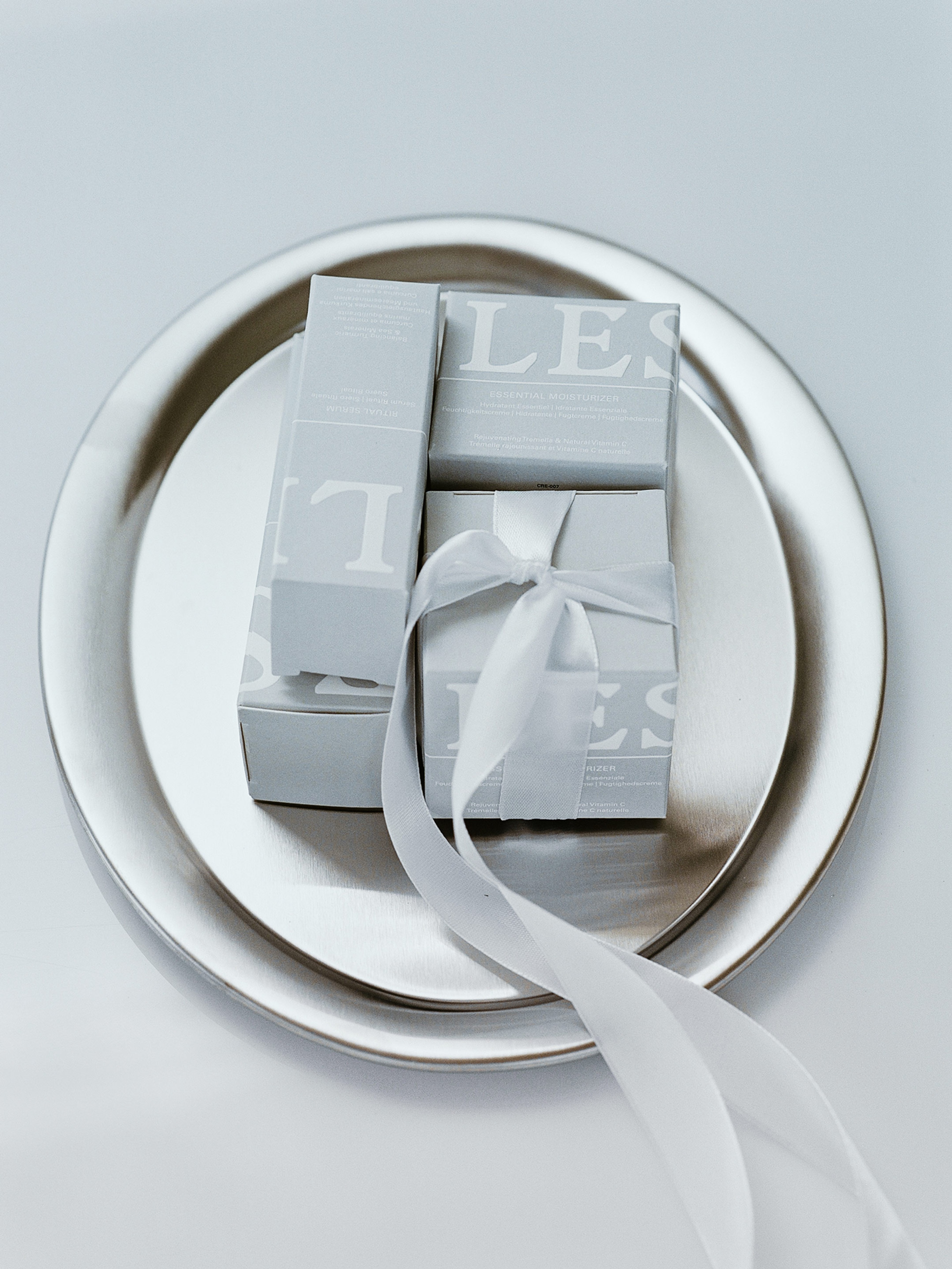
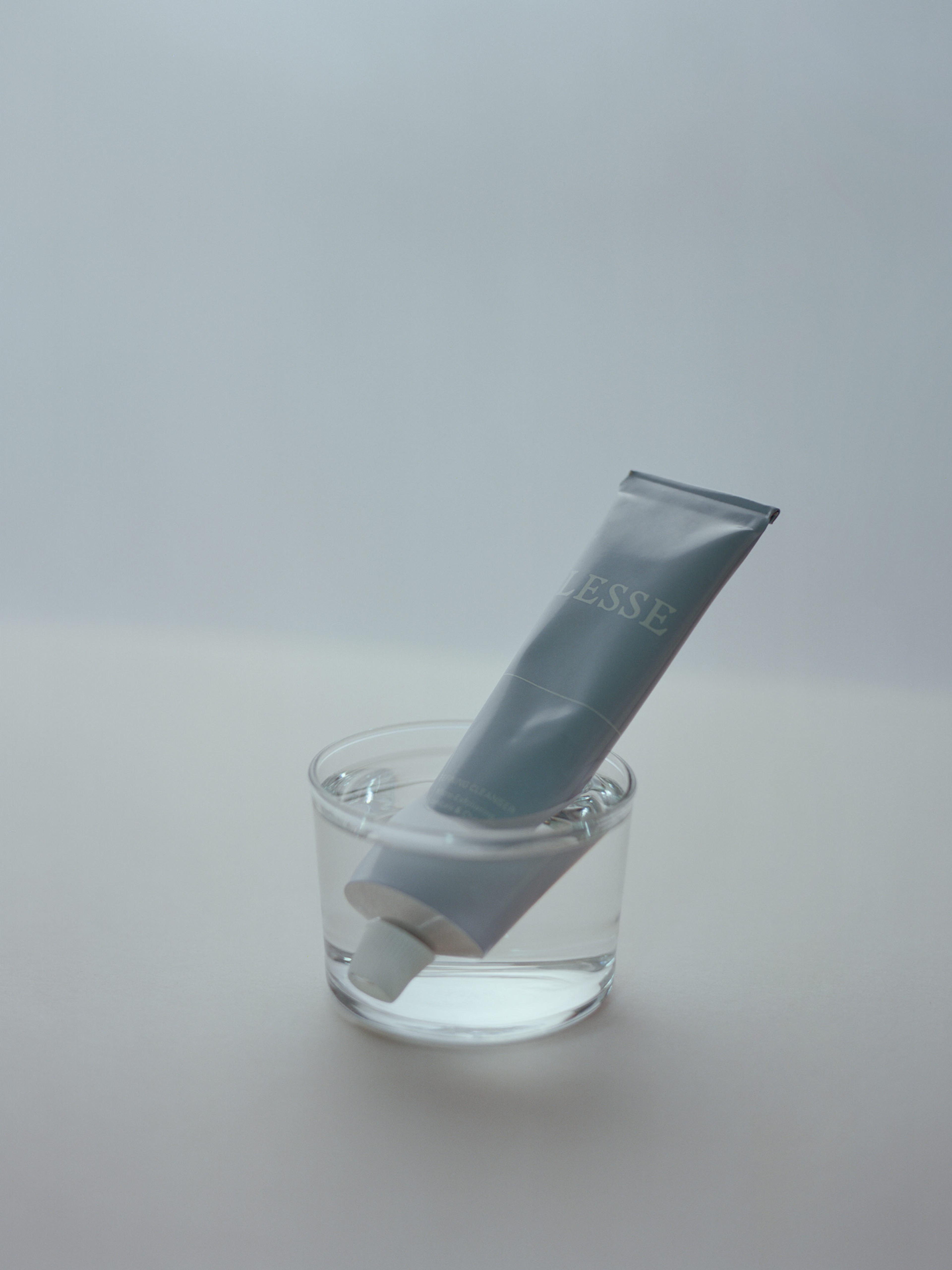
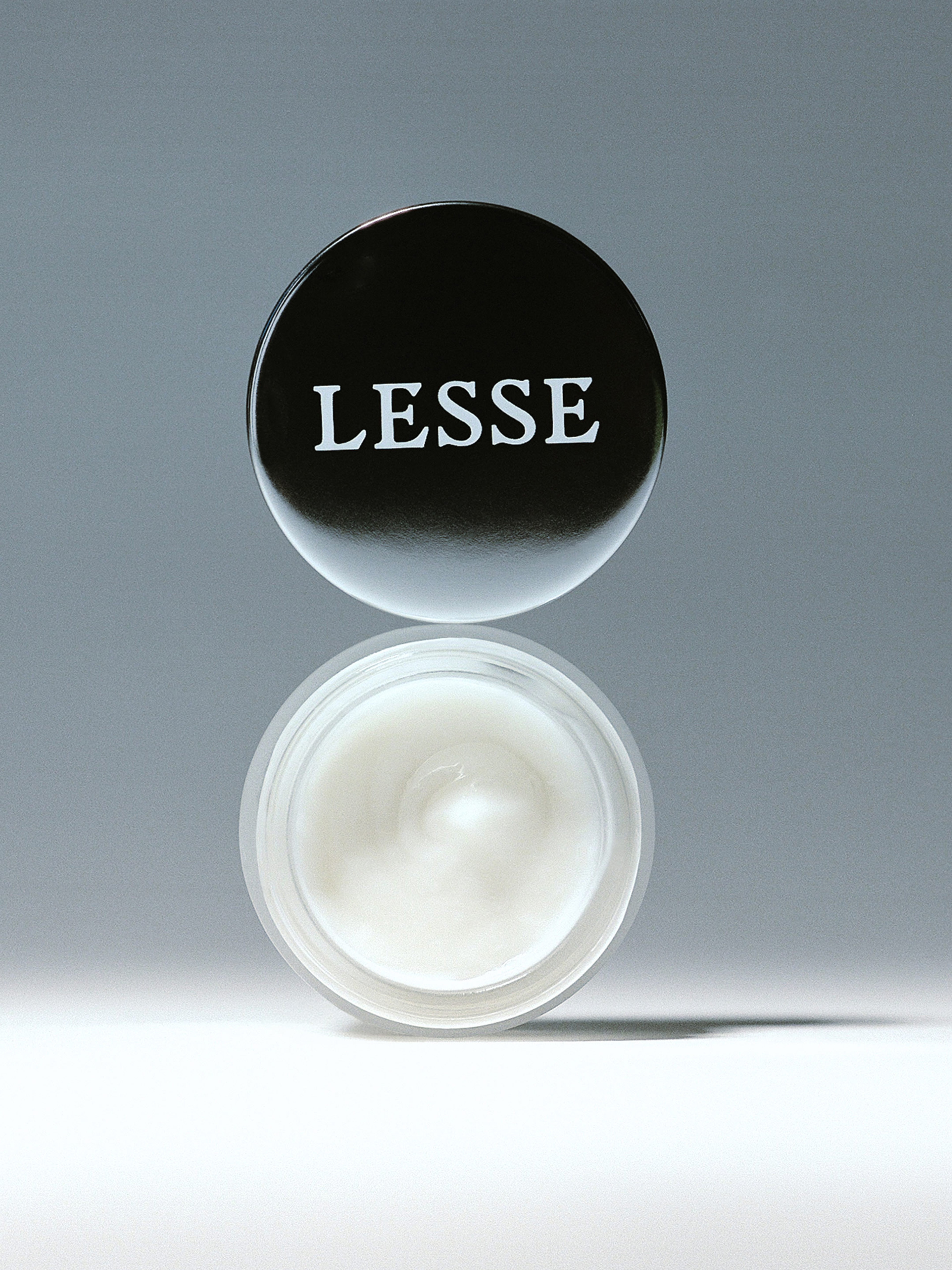
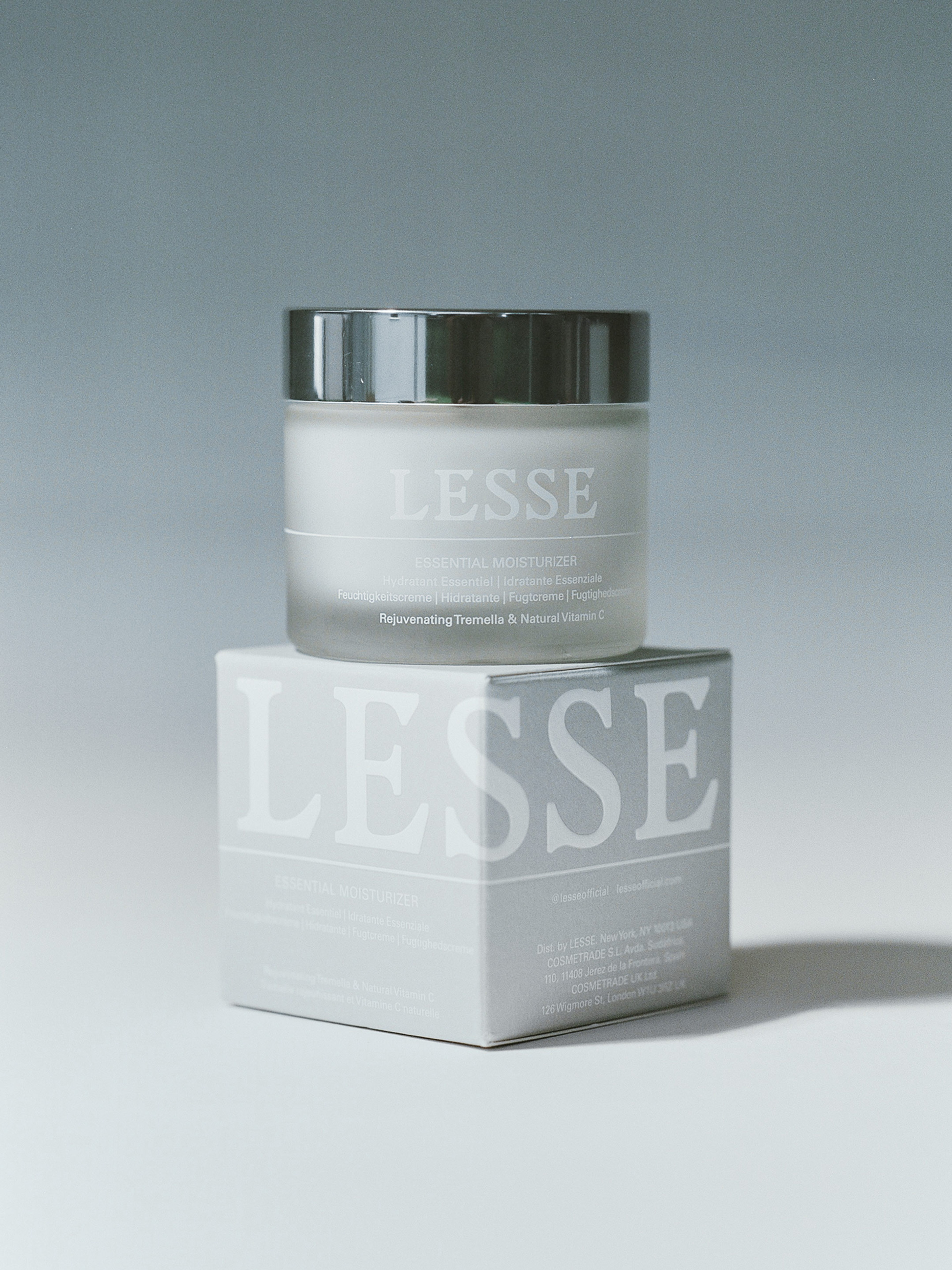
Packaging
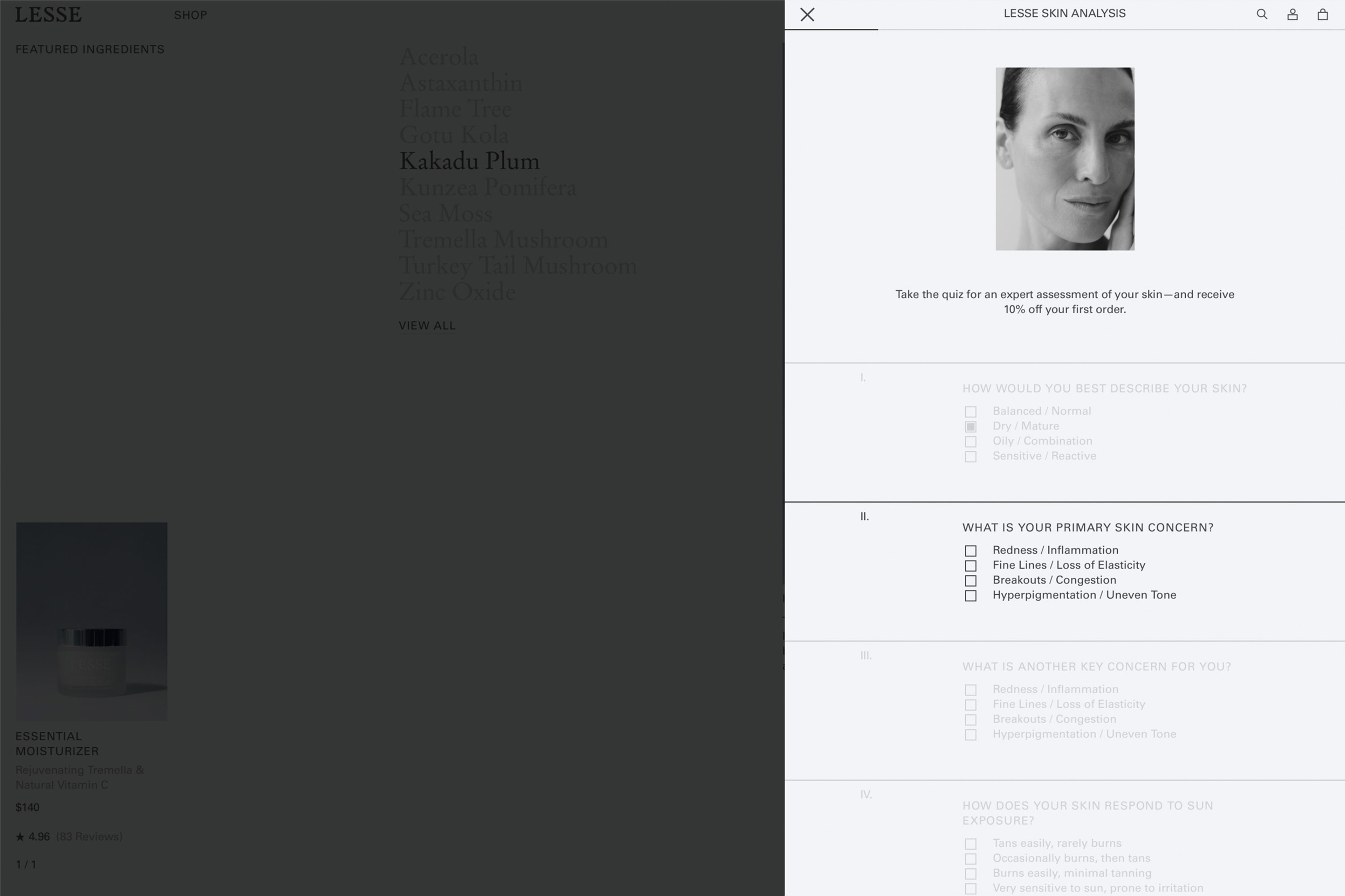
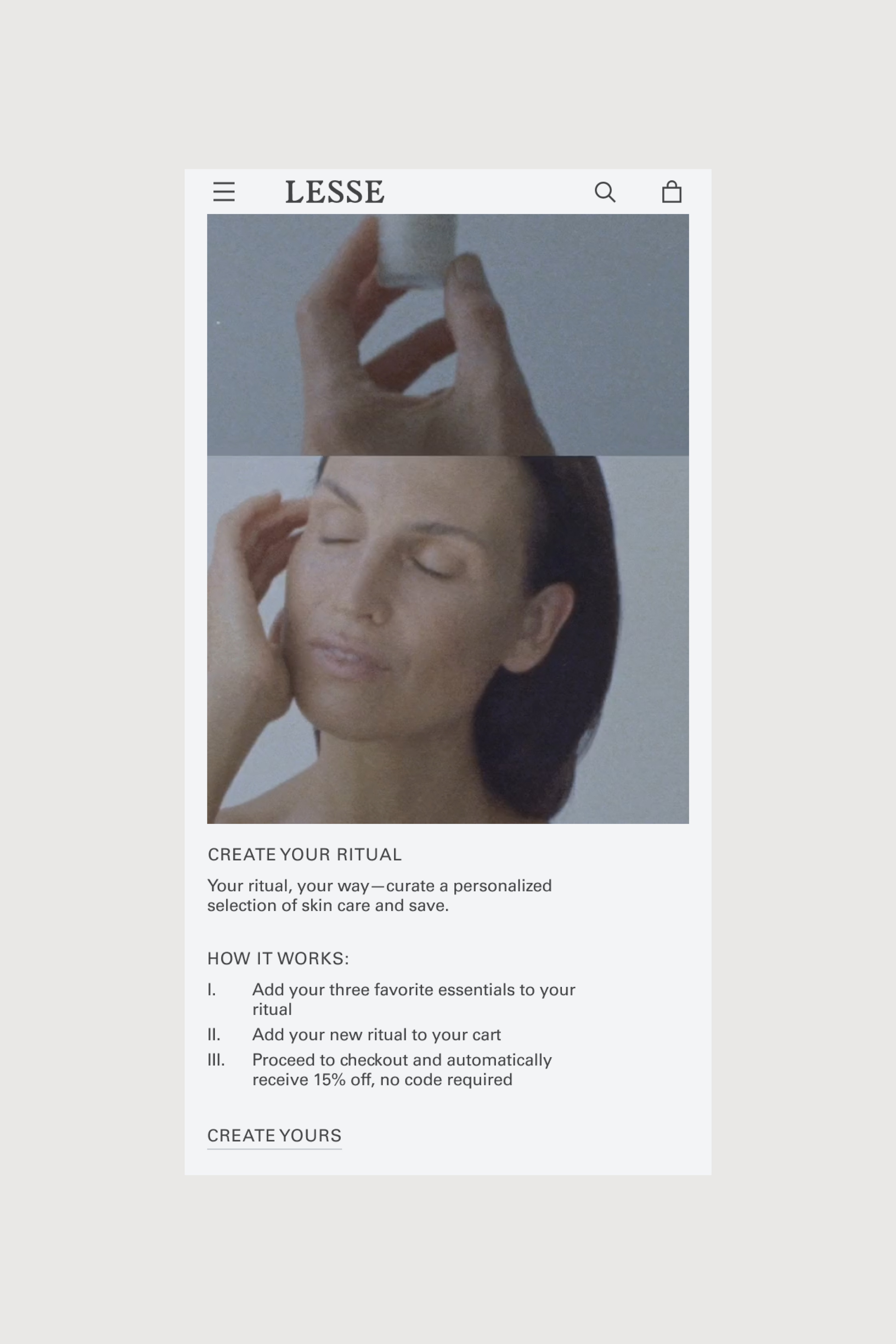
Website
Art Direction
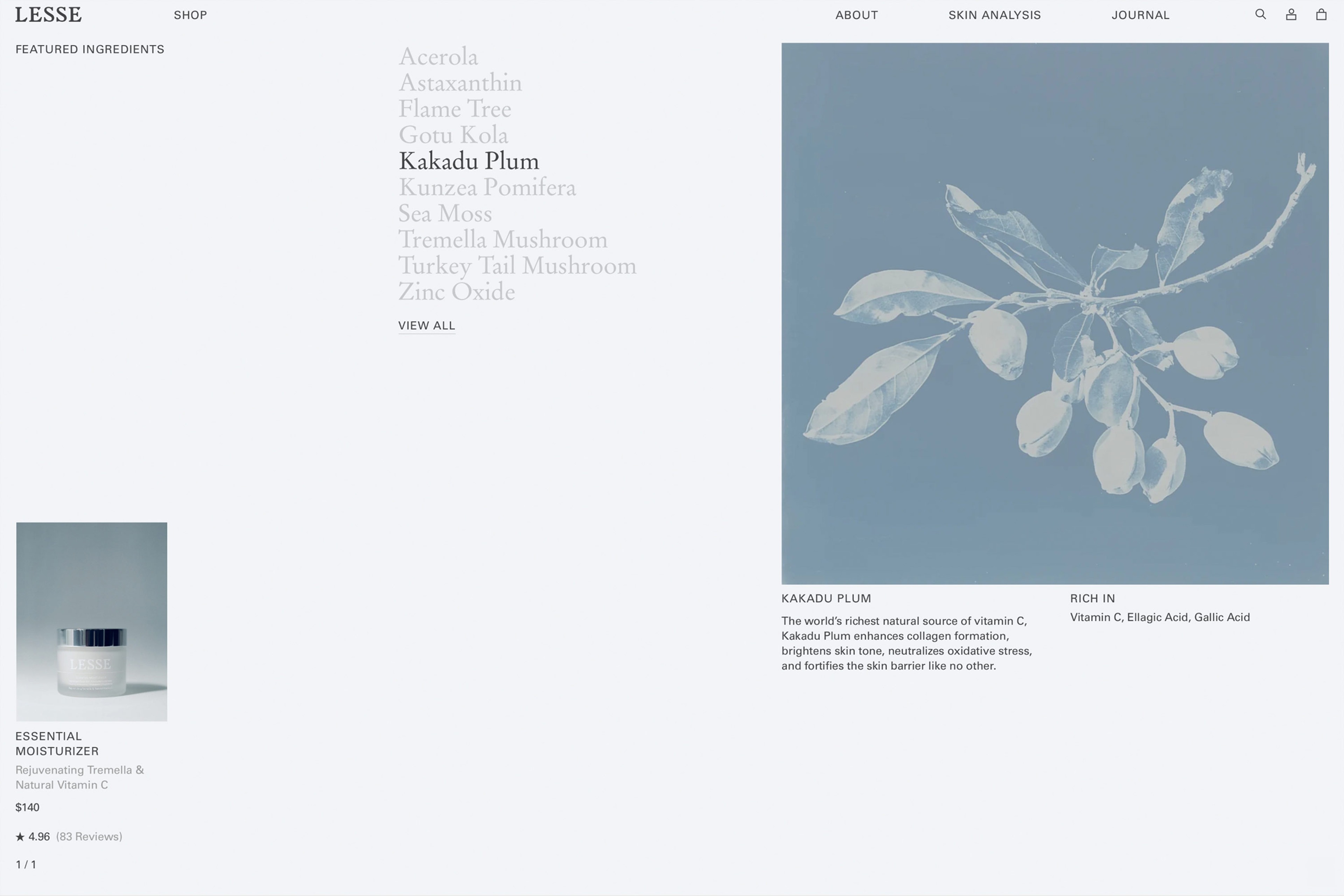
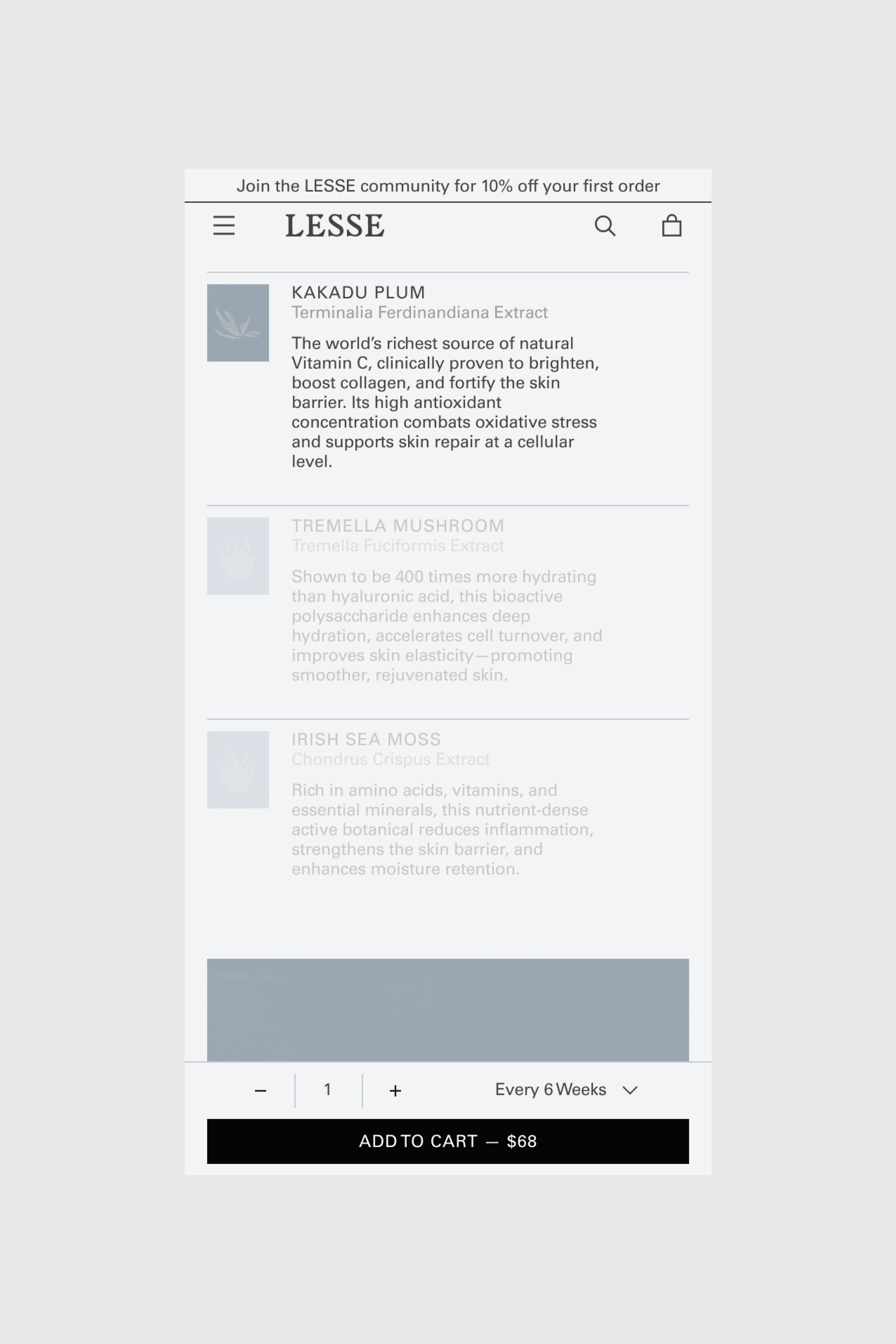
Hero Ingredients Summary

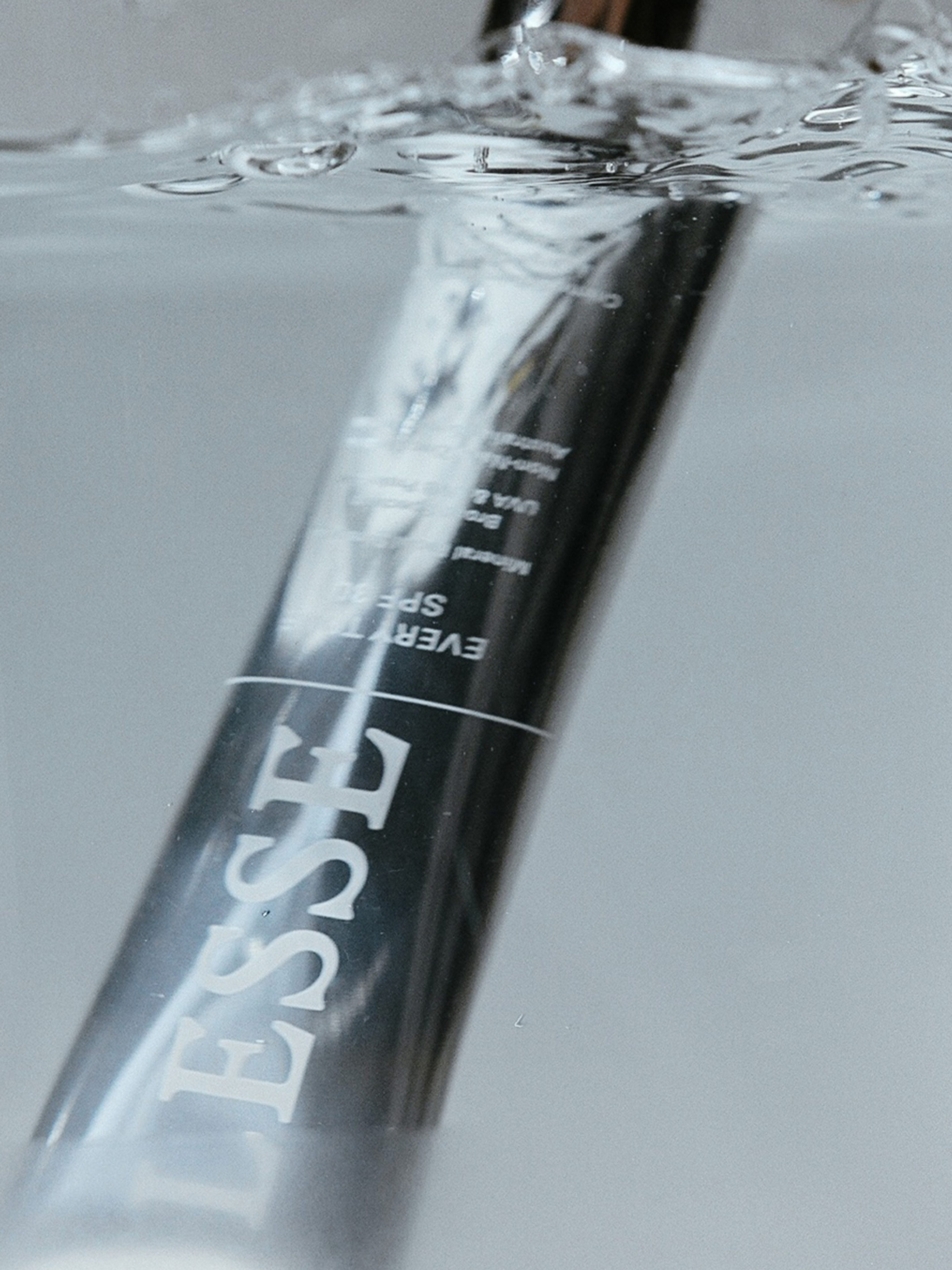
Every Tone SPF 30


Context
True to the philosophy of minimalism embedded in its name, LESSE approaches organic skincare as a simplified ritual built on uncompromising, meticulously formulated essentials. In 2018, as founder Neada Deters built her brand around the effective yet gentle natural ingredients that she couldn’t find represented in the products she was seeking, she came to us to translate her vision by portraying its organic foundations from a new perspective.
Solutions
Brand Identity
Packaging
Print Assets
E-Commerce Design
E-Commerce Development
Digital Assets

Refining Cleanser

Identity
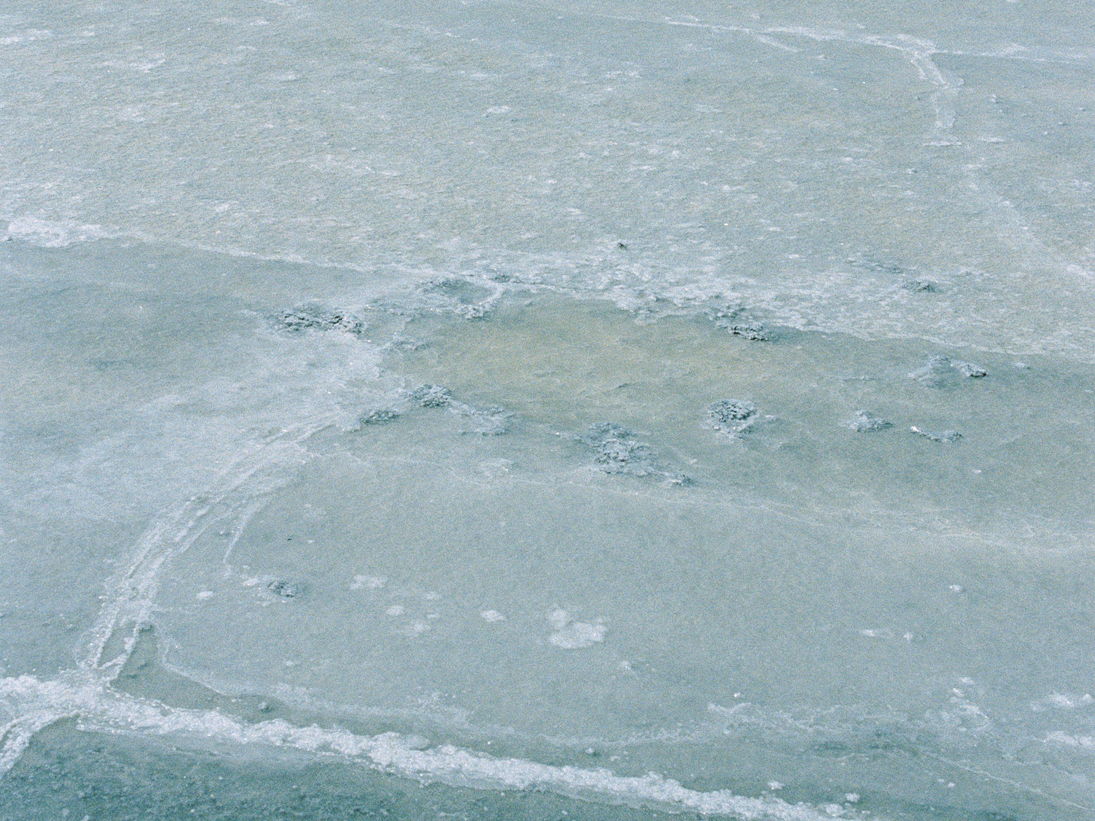
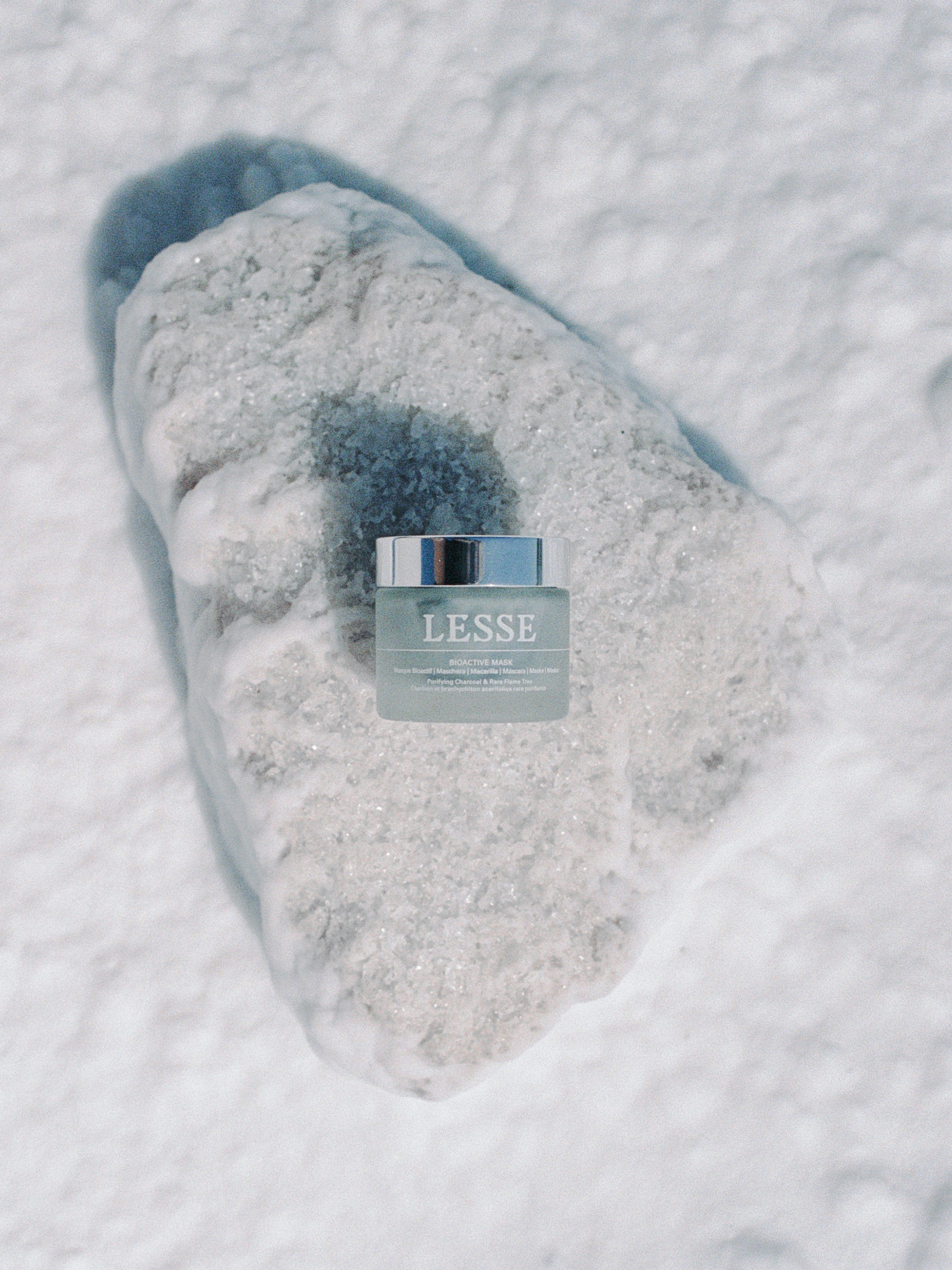
Grounded in an appreciation for tactility, the brand identity we developed is informed by the visual language of ‘90s minimalism, from its restrained approach to the fine grained texture of its imagery to a distinctive colour palette led by the LESSE blue, a crisp shade recalling both water and sky to emphasise the collection’s natural origins. A custom wordmark, solid and organically formed, was balanced by Univers, selected as the brand typeface for its robust and functional feel.
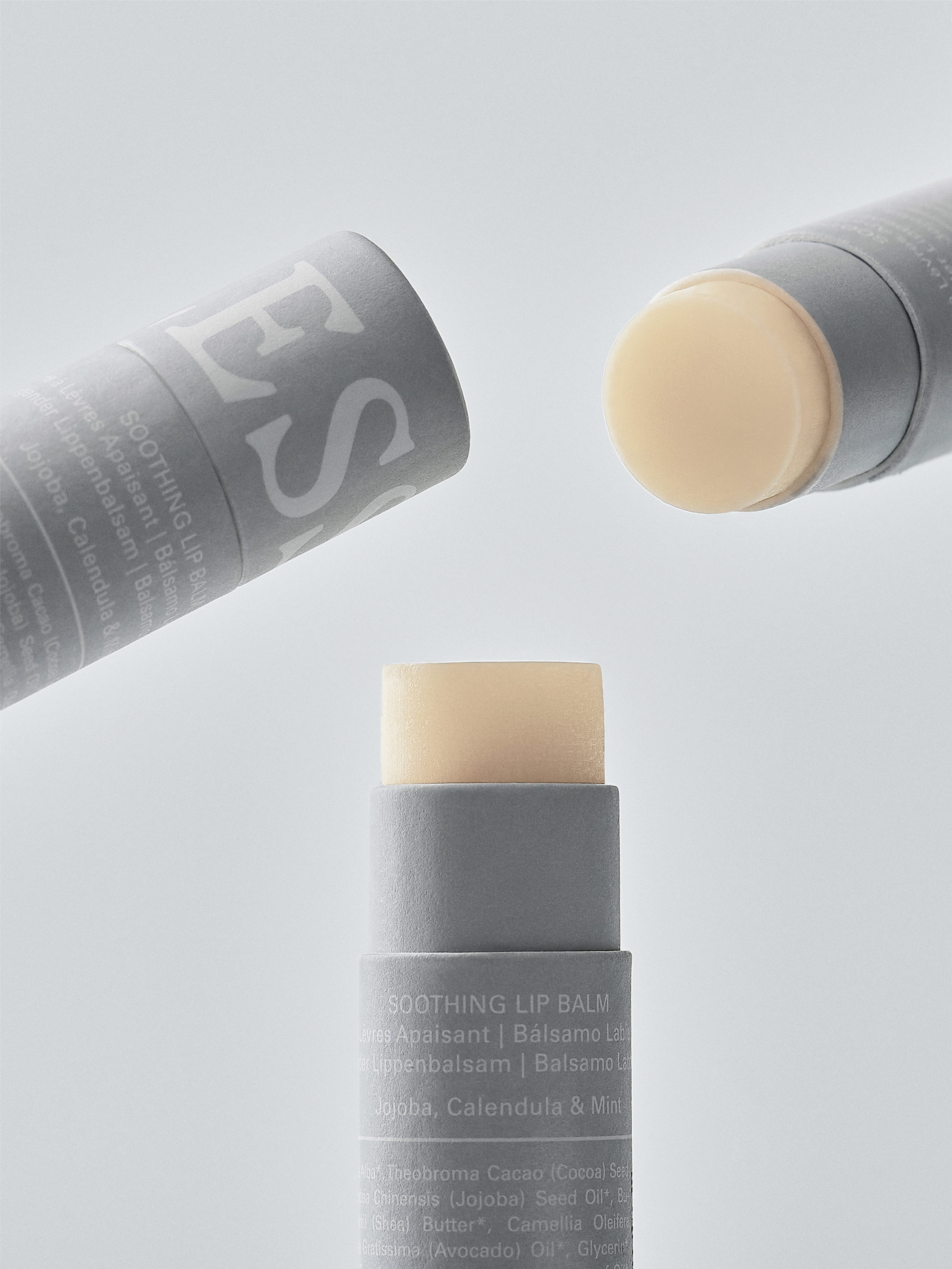
Soothing Lip Balm
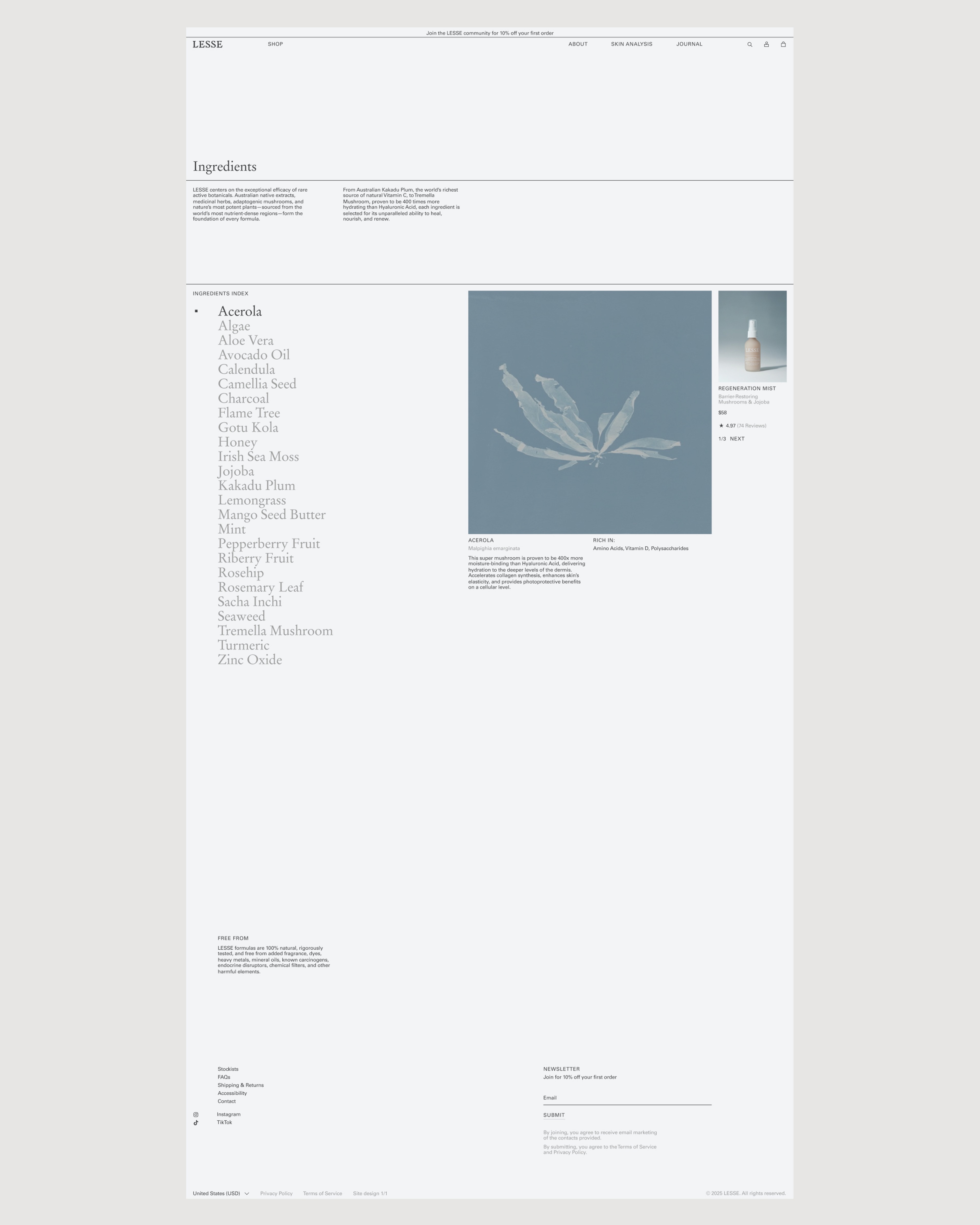
LESSE centres on rare active botanicals—Australian natives, medicinal herbs, adaptogenic mushrooms, and potent plants from the world’s most nutrient-rich regions.
Ne Geurra


Handcrafted Modern


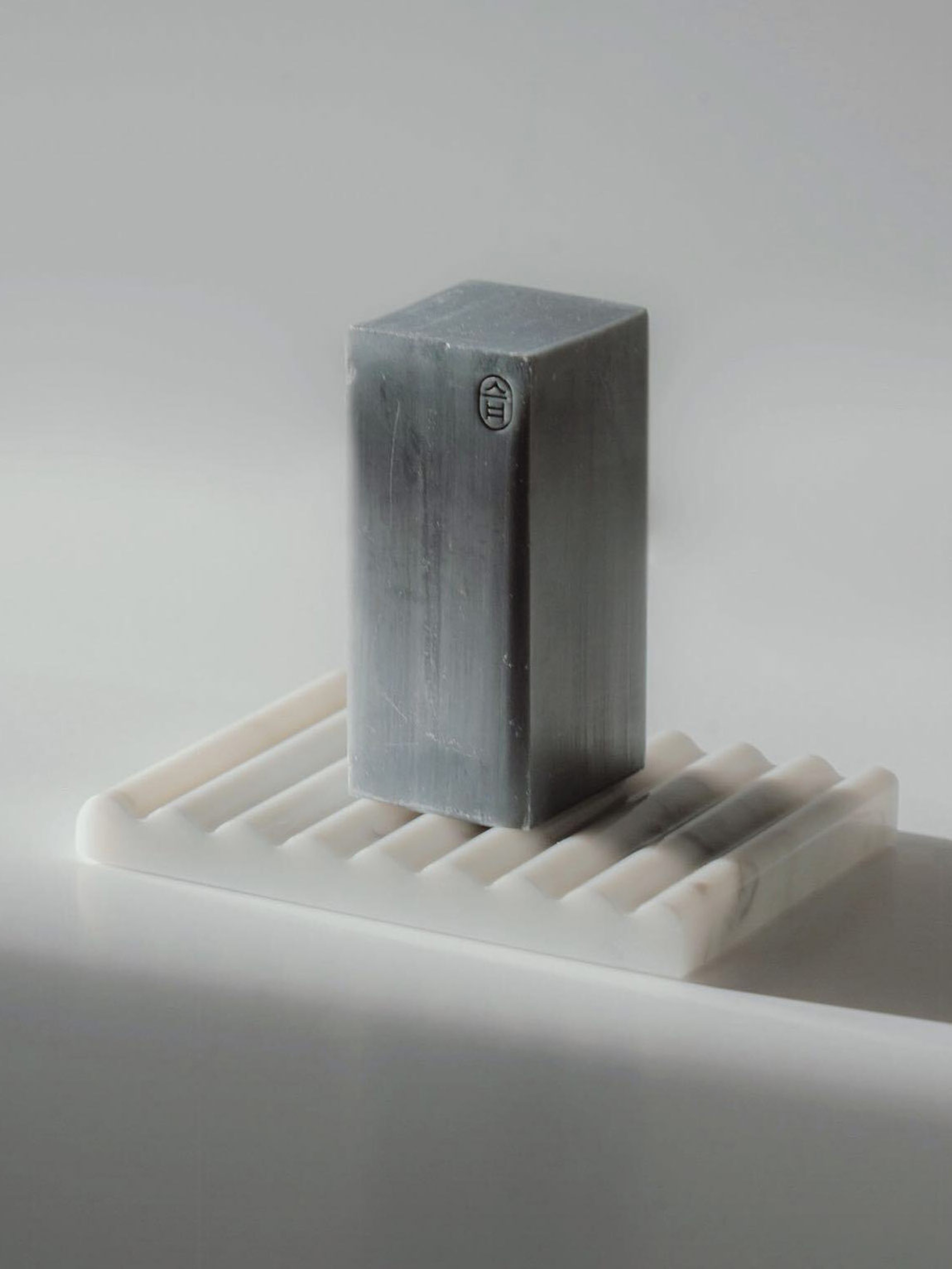
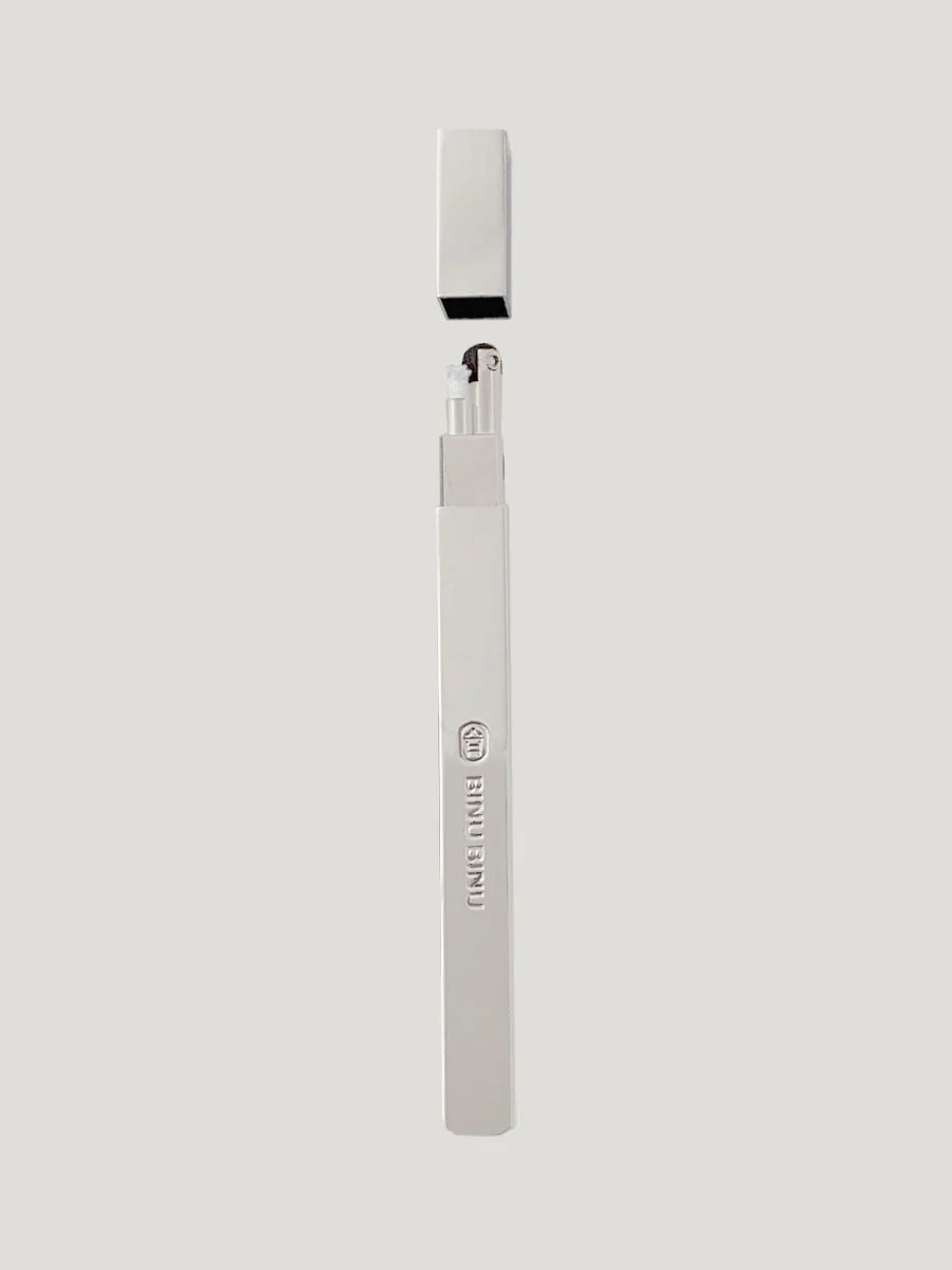
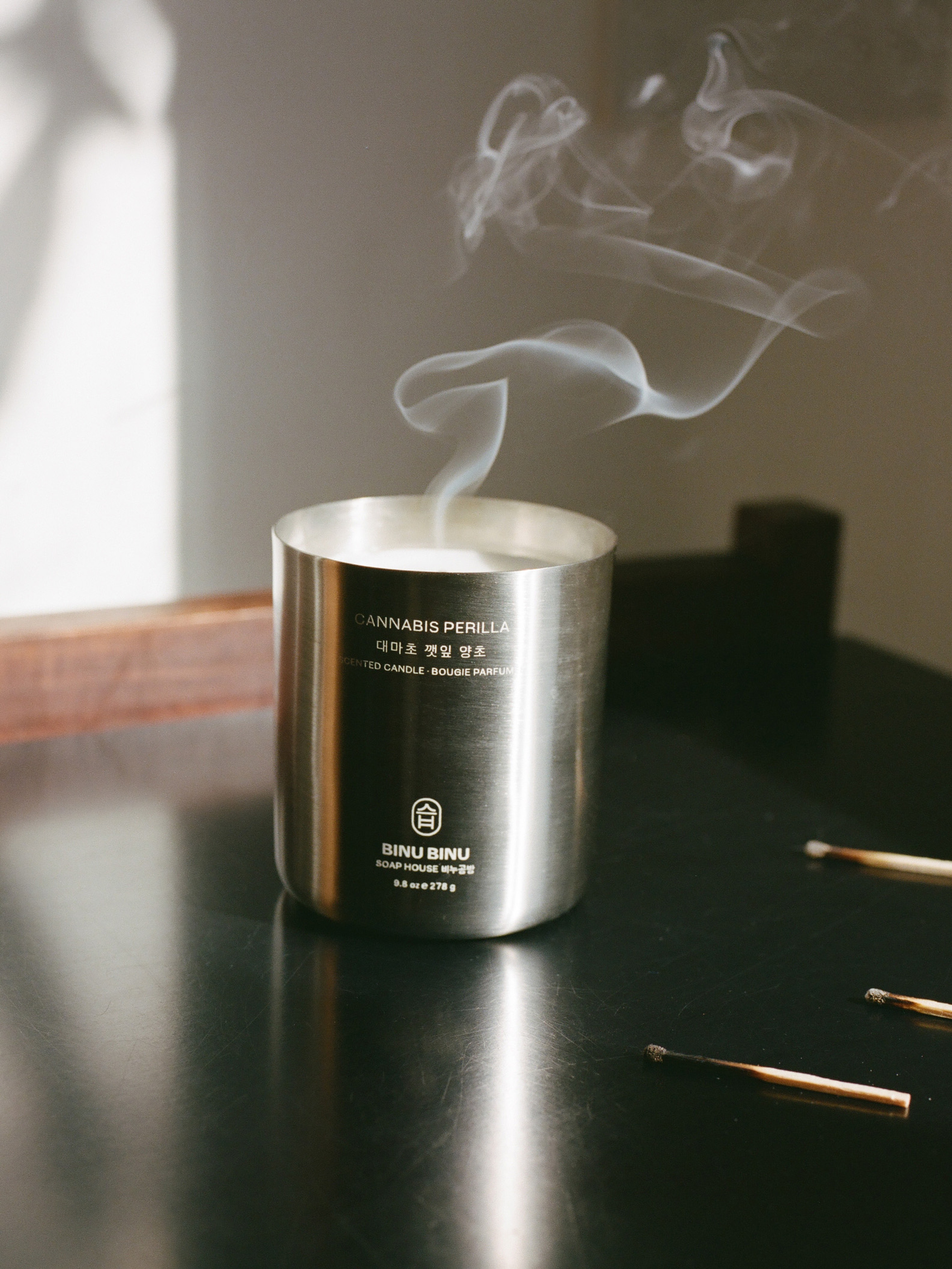
BINU BINU