Solutions
Collaborators
Photographers
Videography
Overview
A comprehensive rebrand for botanical skincare line F. Miller saw us translate an emphasis on essentialism and versatility into a distinctive visual identity applied through custom website design and development and a sustainable packaging system.
Contents
Packaging
Website
F.Miller Packaging Screenprinting
Context
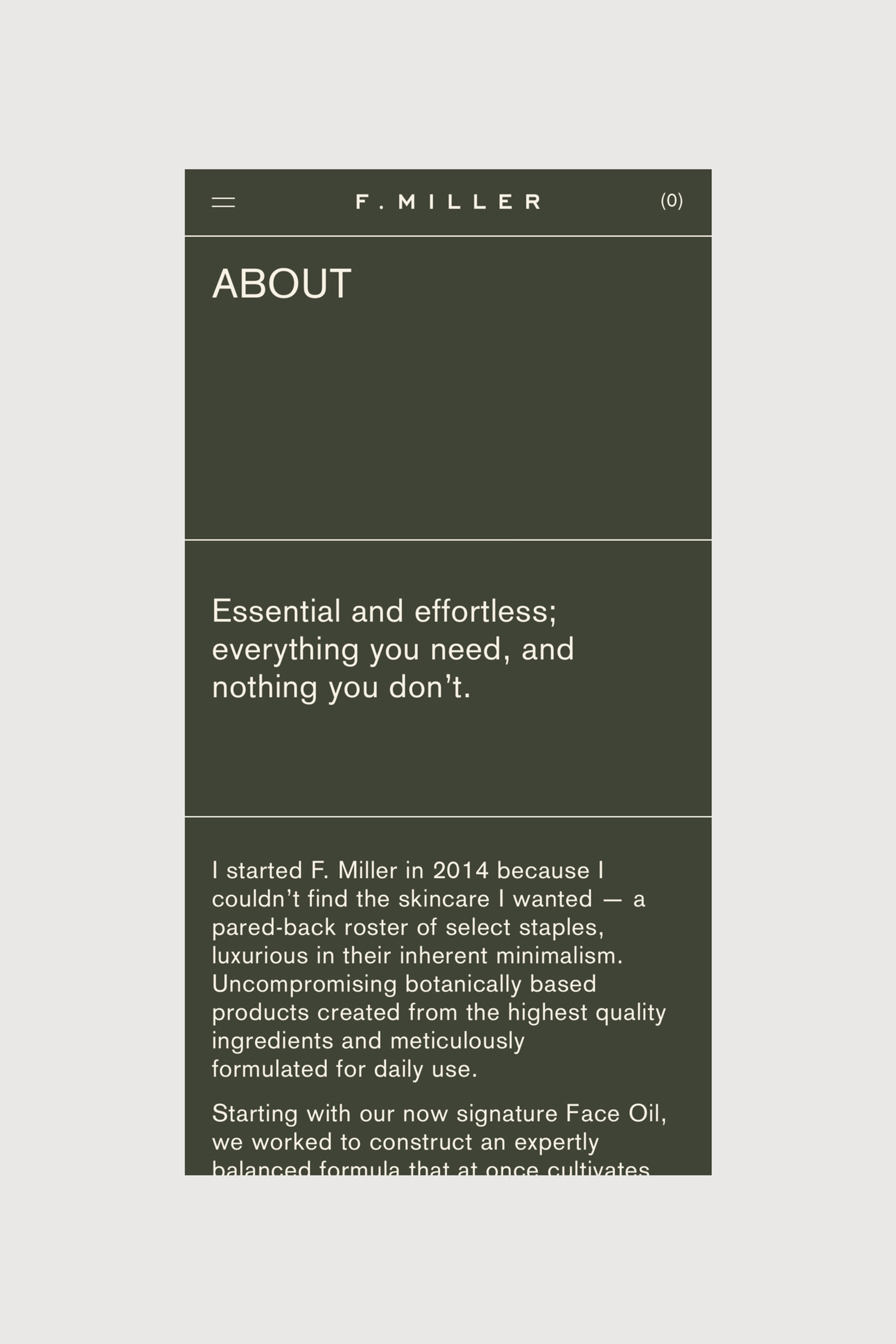
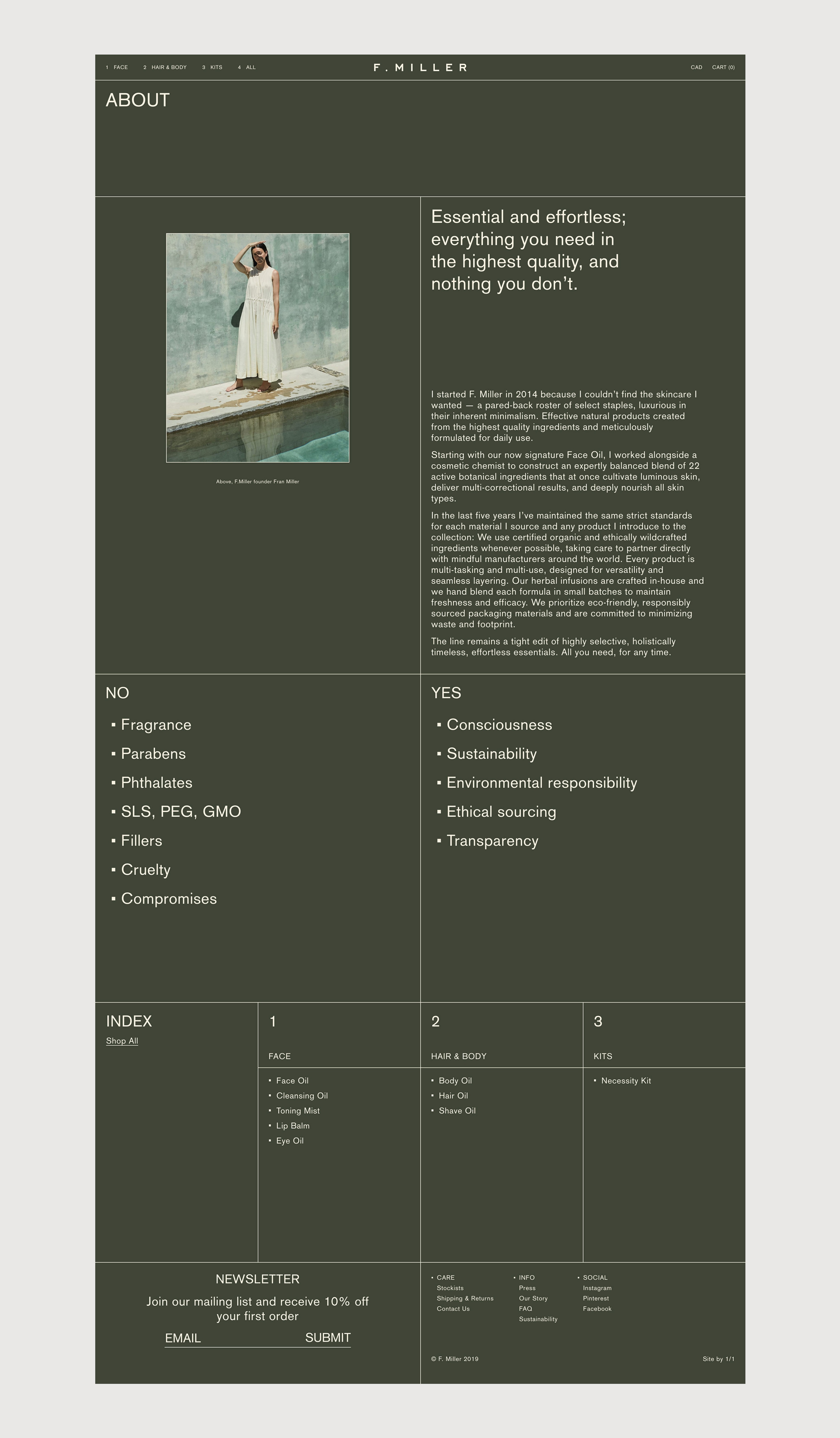
Botanical skincare line F. Miller was developed to embody the essentialism that its creator, Fran Miller, found to be lacking in the market when she debuted her signature Face Oil in 2014. Four years in, she approached us to embark on a long-term partnership to develop and evolve a new brand identity that conveyed the values behind her formulations. We translated Fran’s emphasis on simplicity and versatility through a pared-back design language to recentre the F. Miller brand around typographic clarity, consistency and modularity.
Solutions
Brand Identity
Packaging
Print Assets
E-Commerce Design
E-Commerce Development
Digital Assets
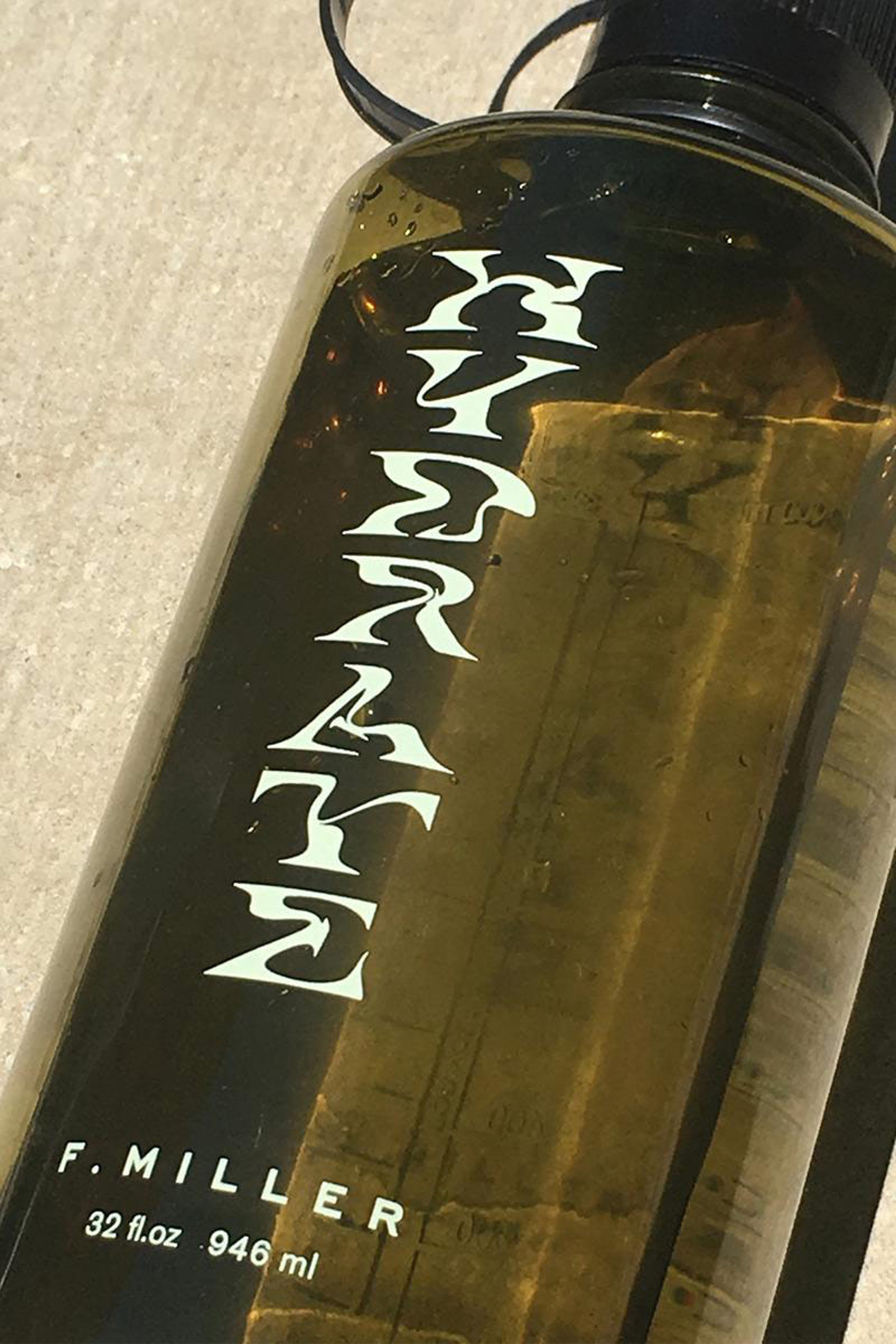
HYDRATE Nalgene Water Bottle
Context
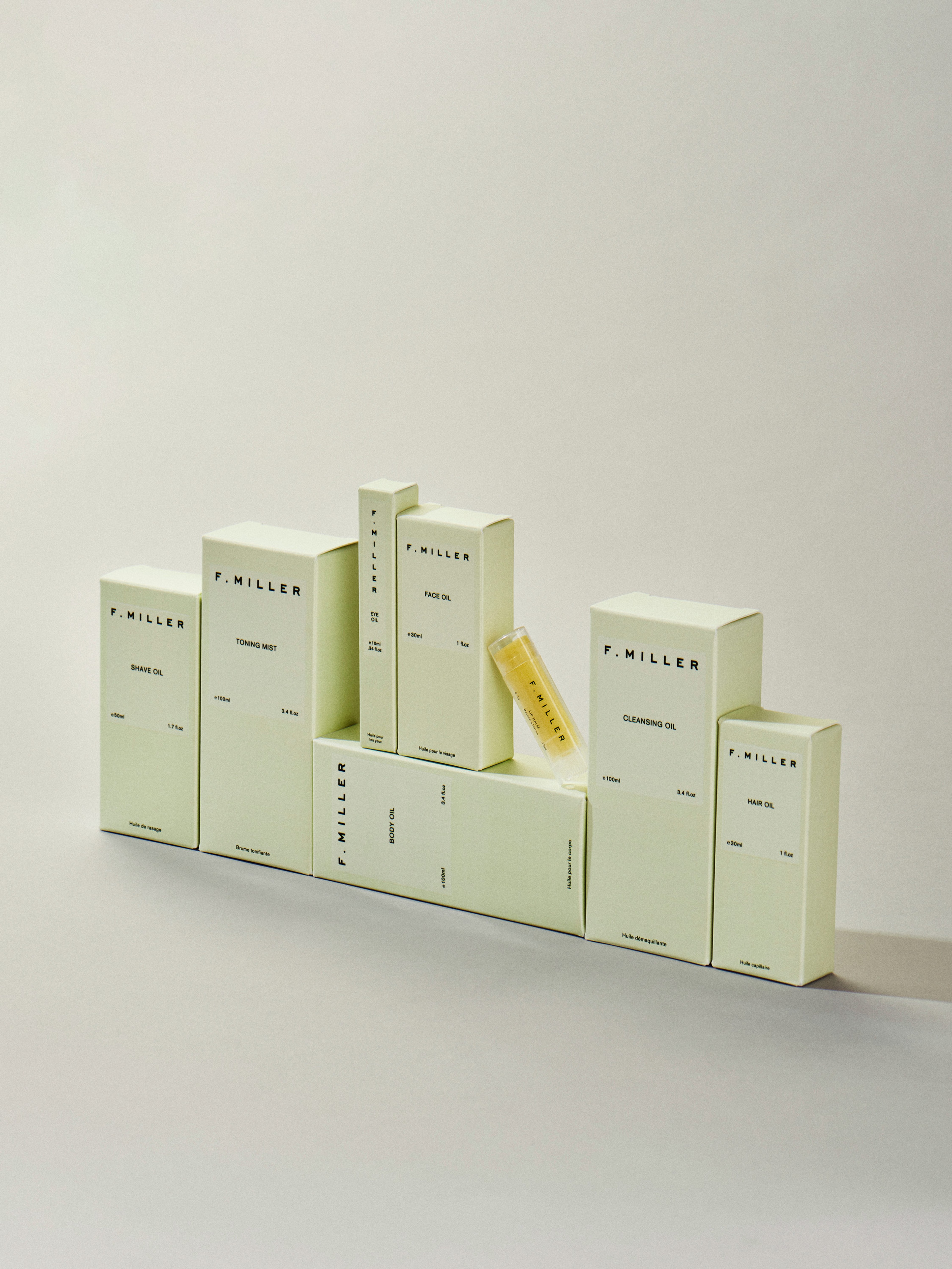
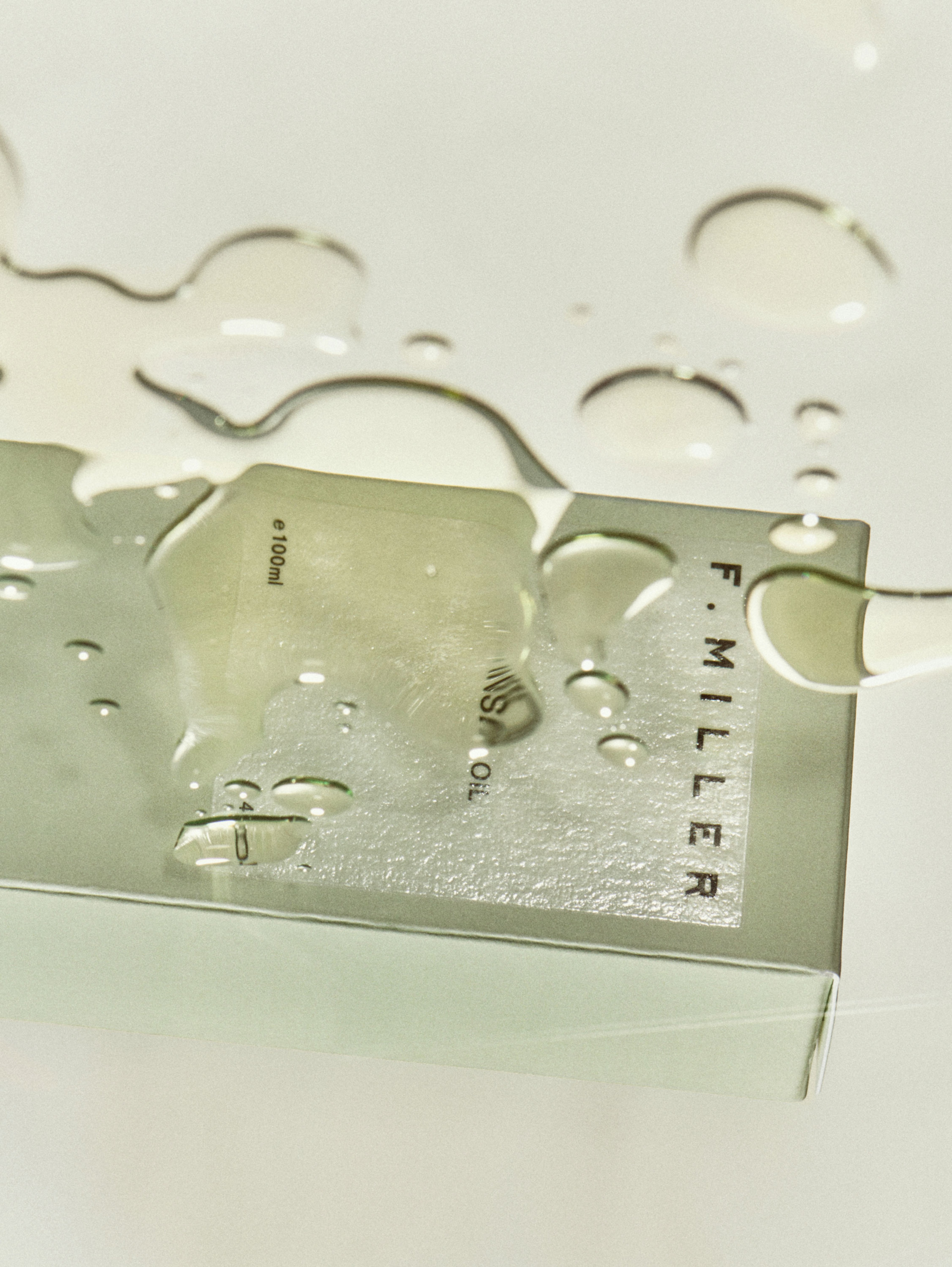
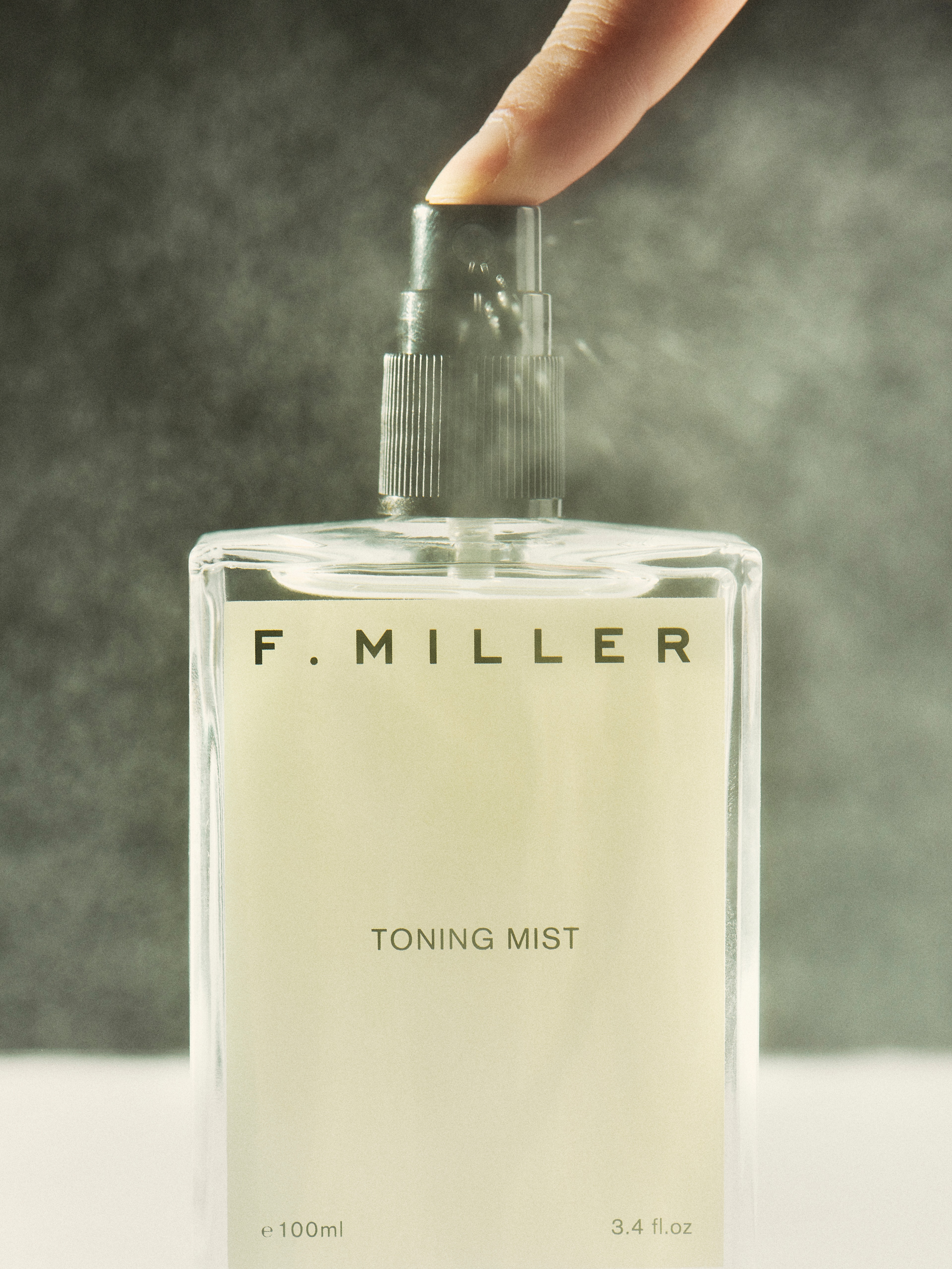
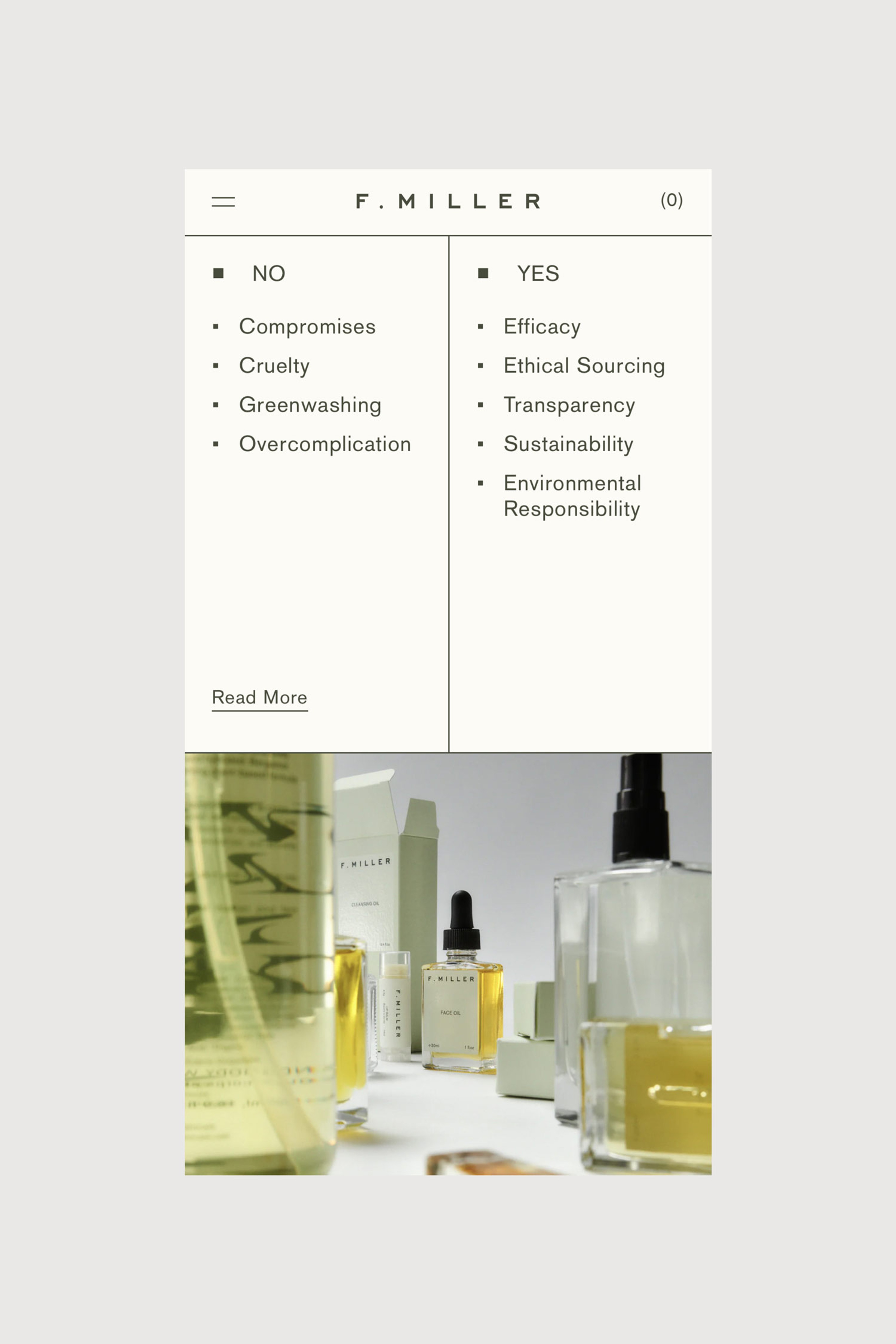
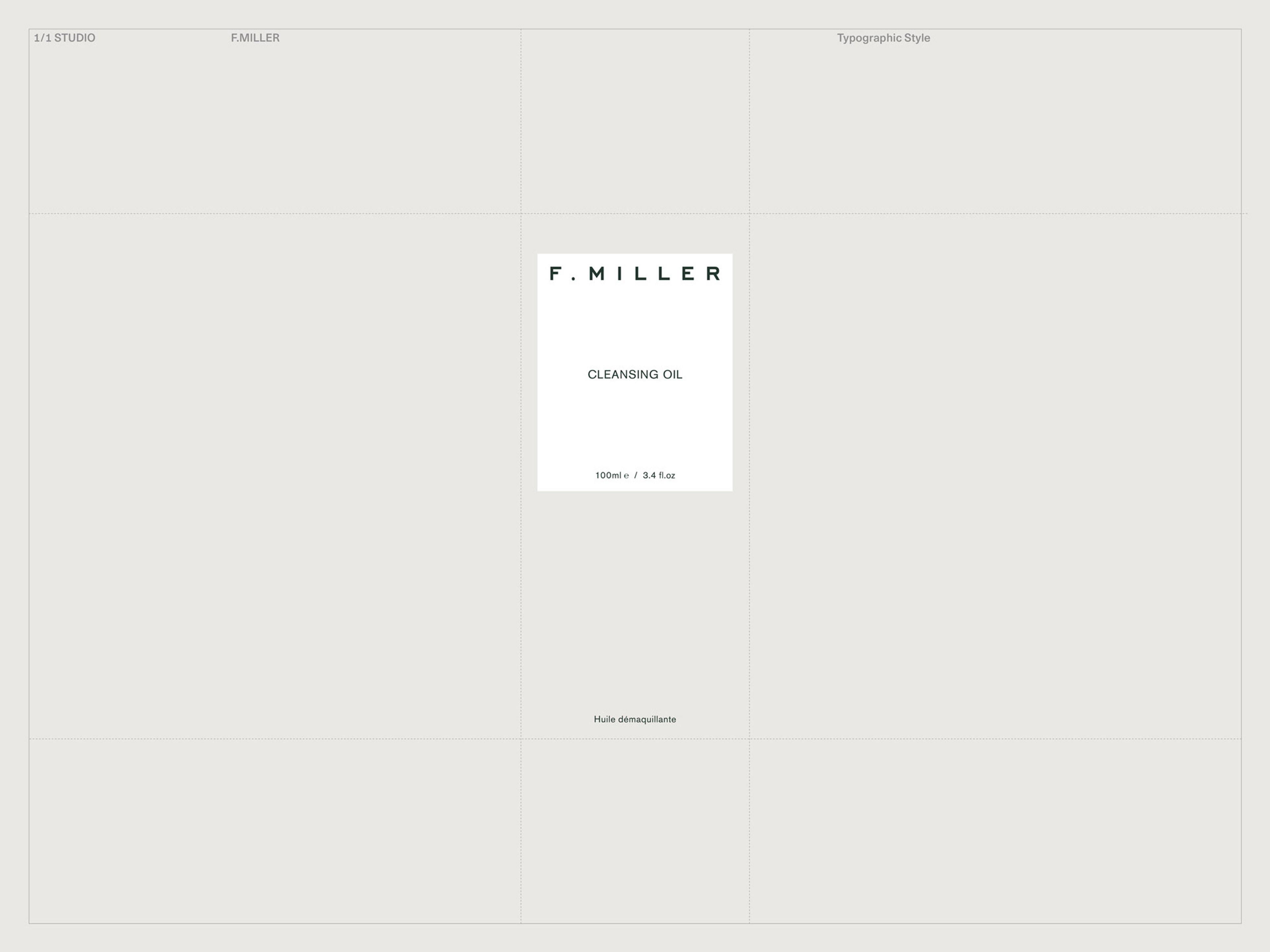
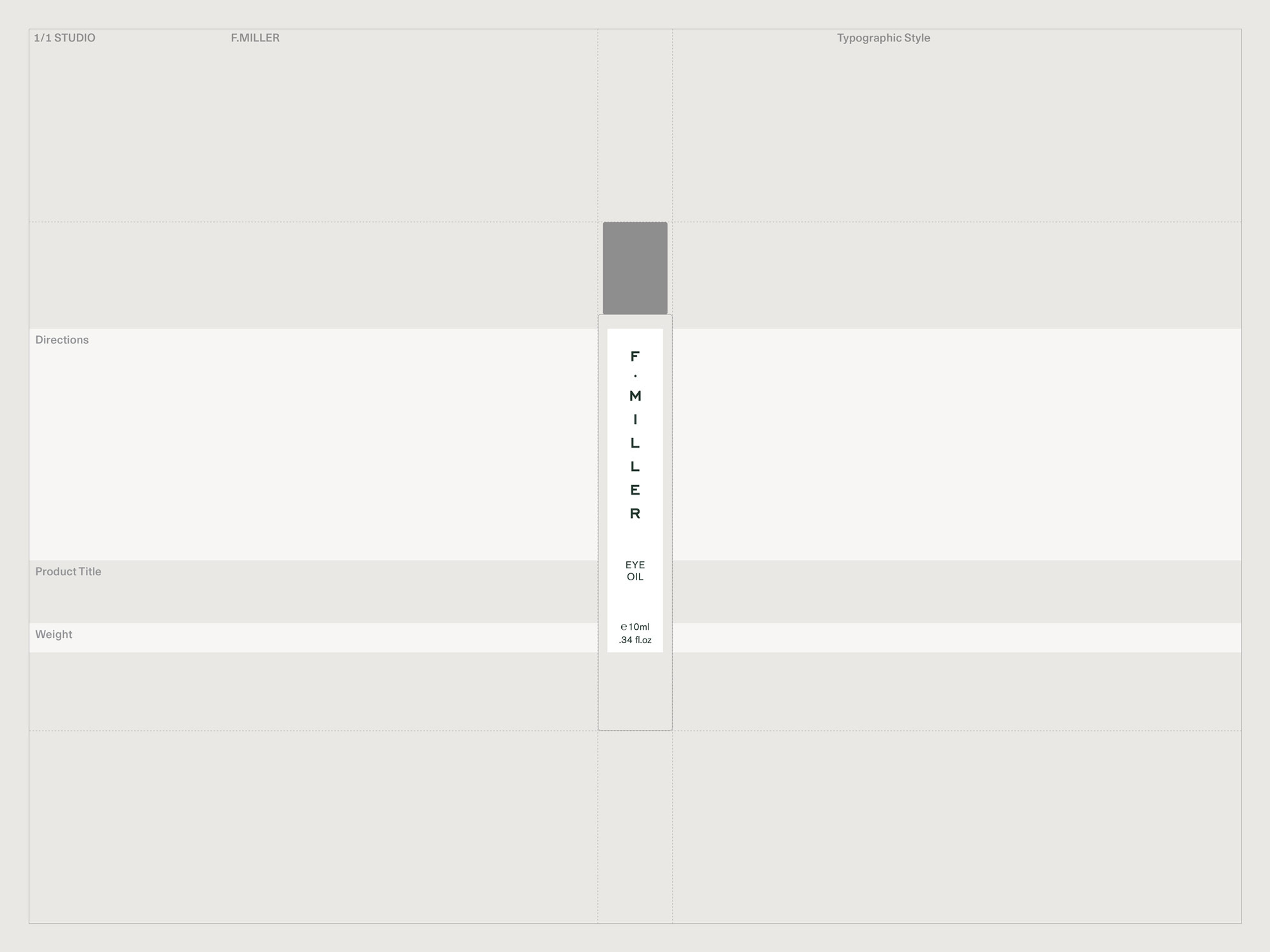
Alongside a new e-commerce platform based on a linear grid system, we applied this refreshed focus to product packaging based on rectangular glass bottles. Consistency of form visually unites each product and nods to the suitability of each for pairing and layering. Repetition of the rectangle on the packaging, highlighted in a subtle UV over gloss treatment, plays on contrasts between the oil product, glossy bottles and 500gsm matte paper box.


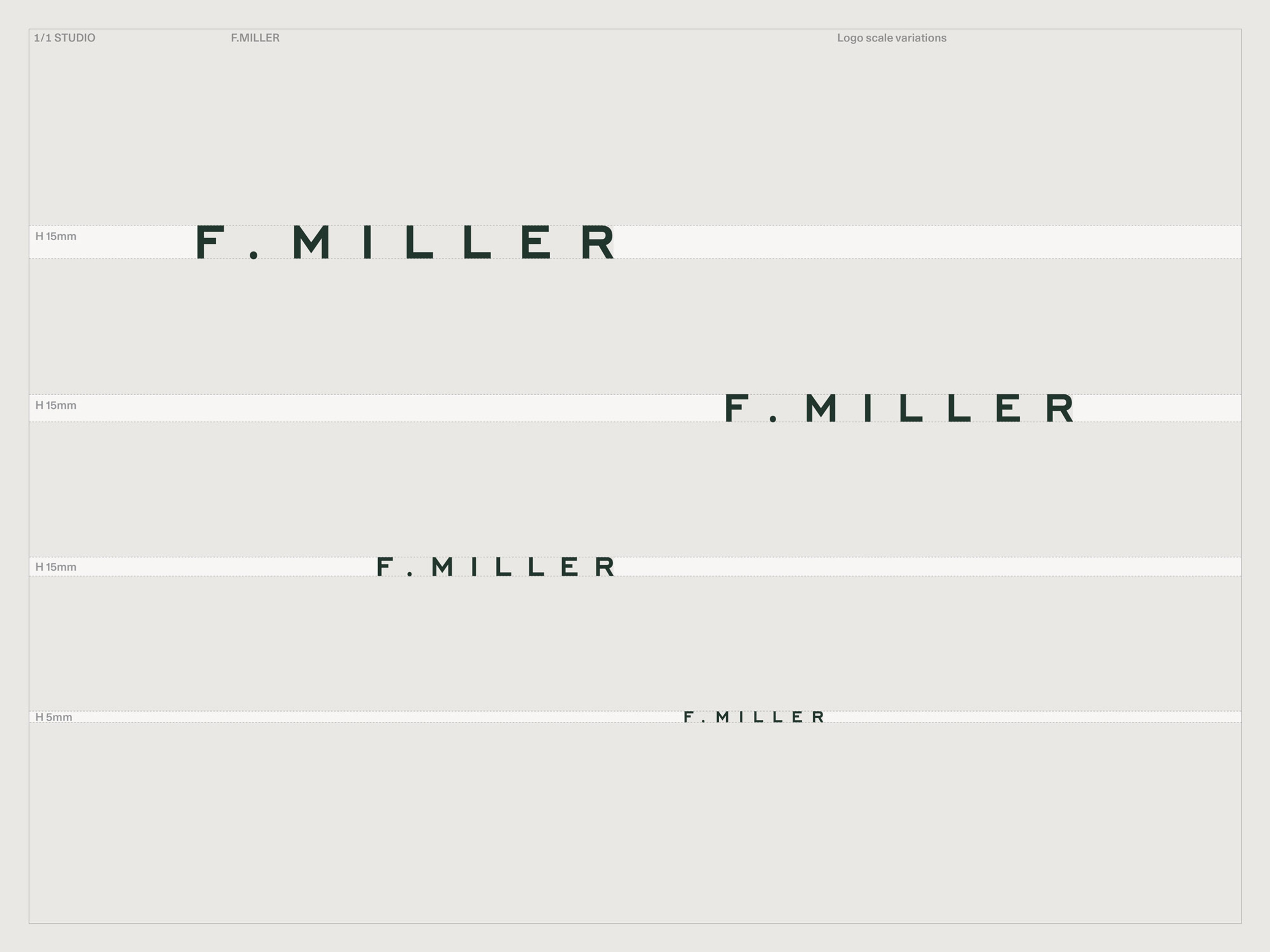
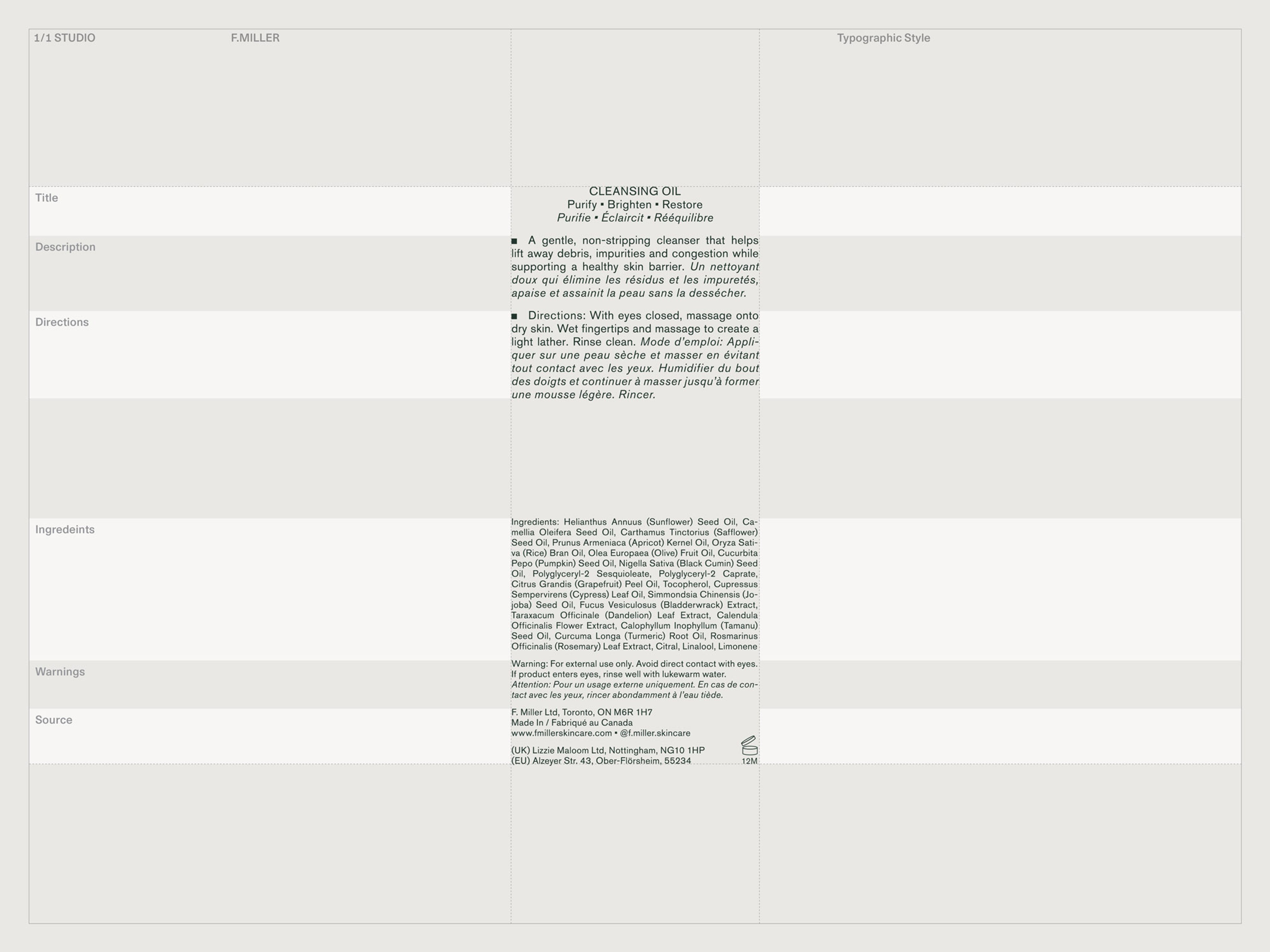
We selected Berthold's Akzidenz Grotesk as the primary brand font for its neutral appeal and elegant low x-height. It's a digitised historic typeface, often associated with the International (or Swiss) style, with some unique quirks not found in more modern typefaces. These add a humanist touch that balances the overall tone, which is edited but not cold.
Context
Respect for nature informs all aspects of the system, whose inbuilt flexibility has manifested in diverse iterations over the years. Environmental responsibility underpinned the choice of product and packaging materials, while a tonal pairing of deep khaki and milky green foregrounds the collection’s organic origins. The distinctive yet flexible identity imbued the F. Miller brand with a resonance that allows it to remain a leader in its niche over five years on, as attested to by the ever-increasing global reach of the brand’s stockists.

Photography of Lexie Smith by Brent Goldsmith
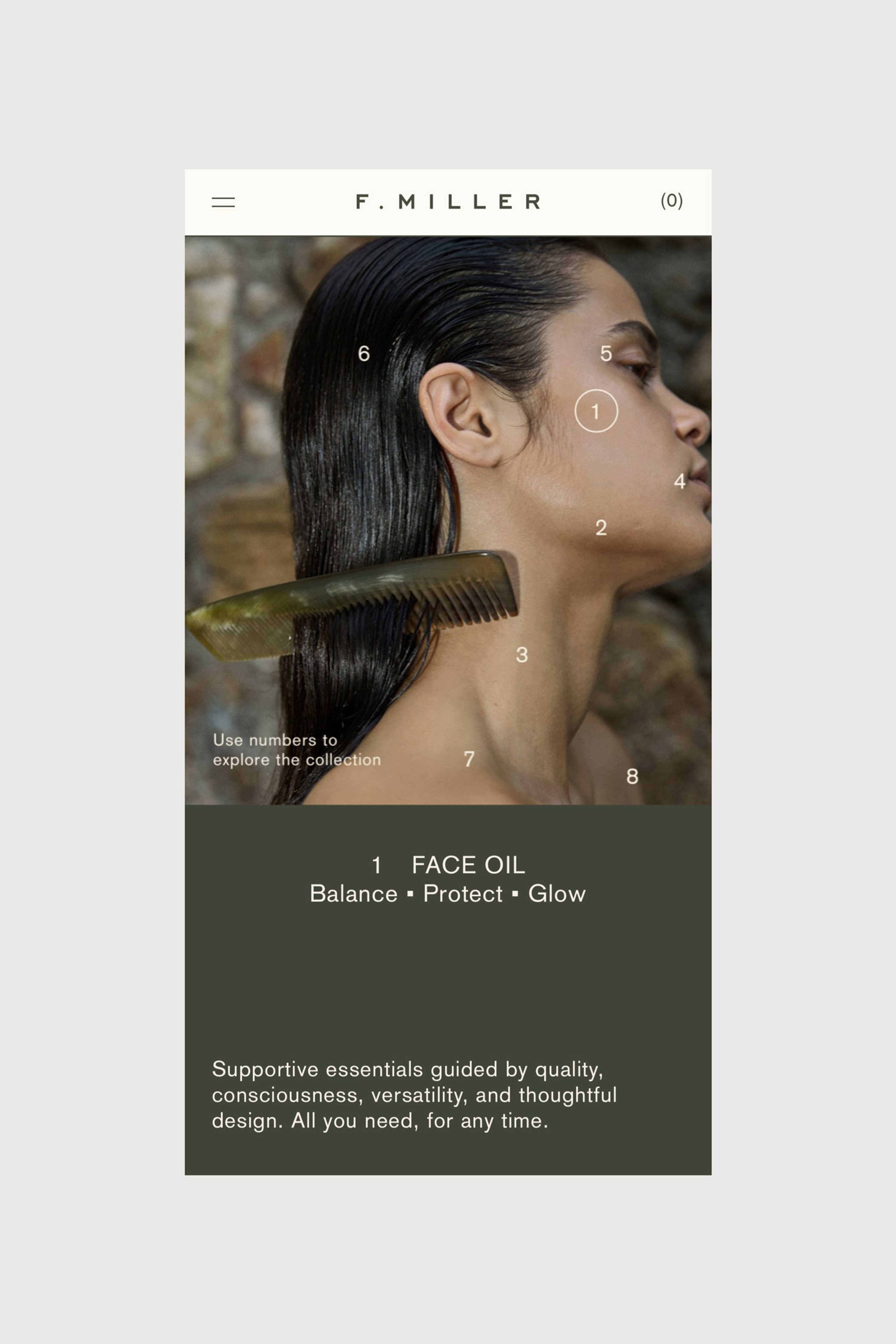
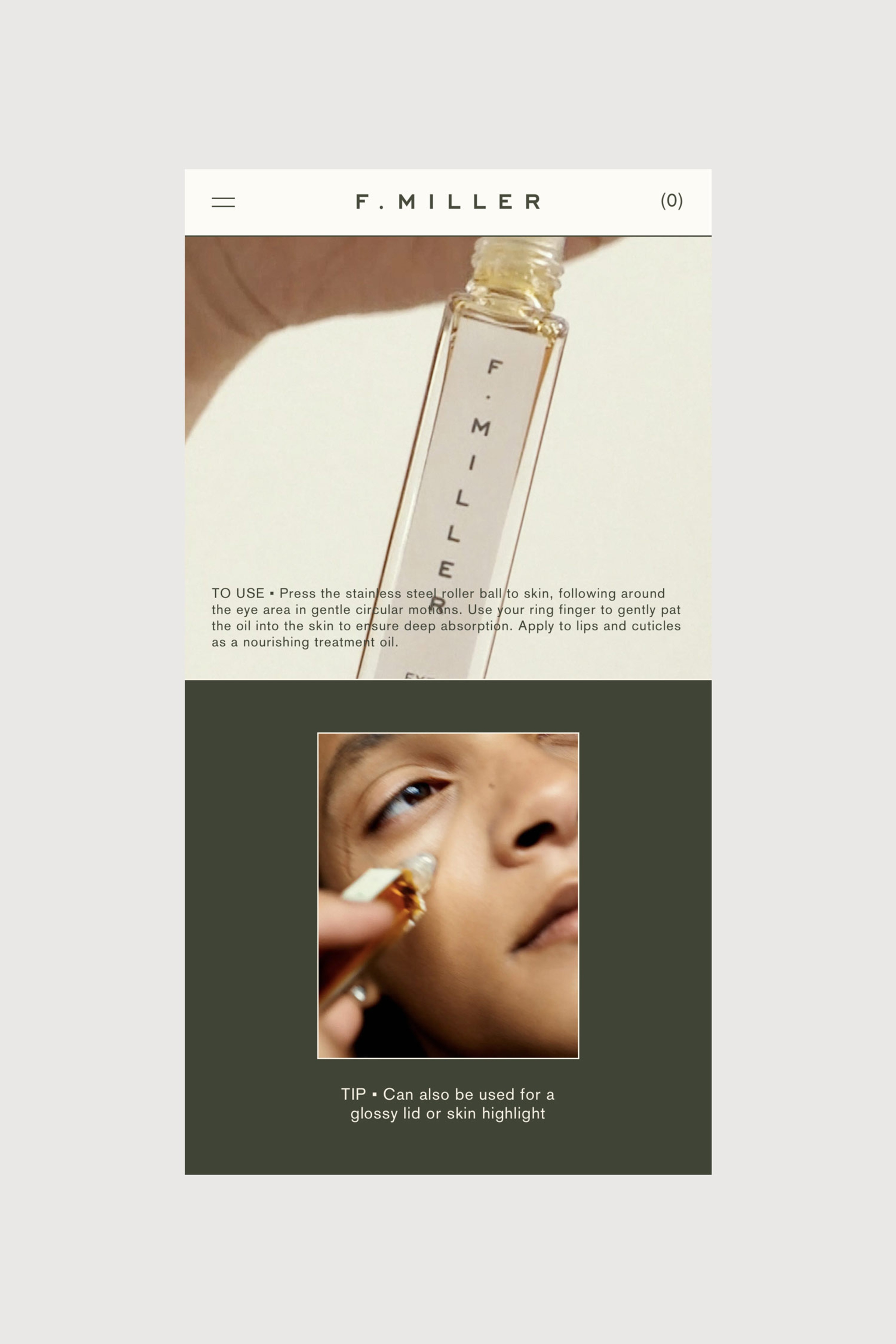
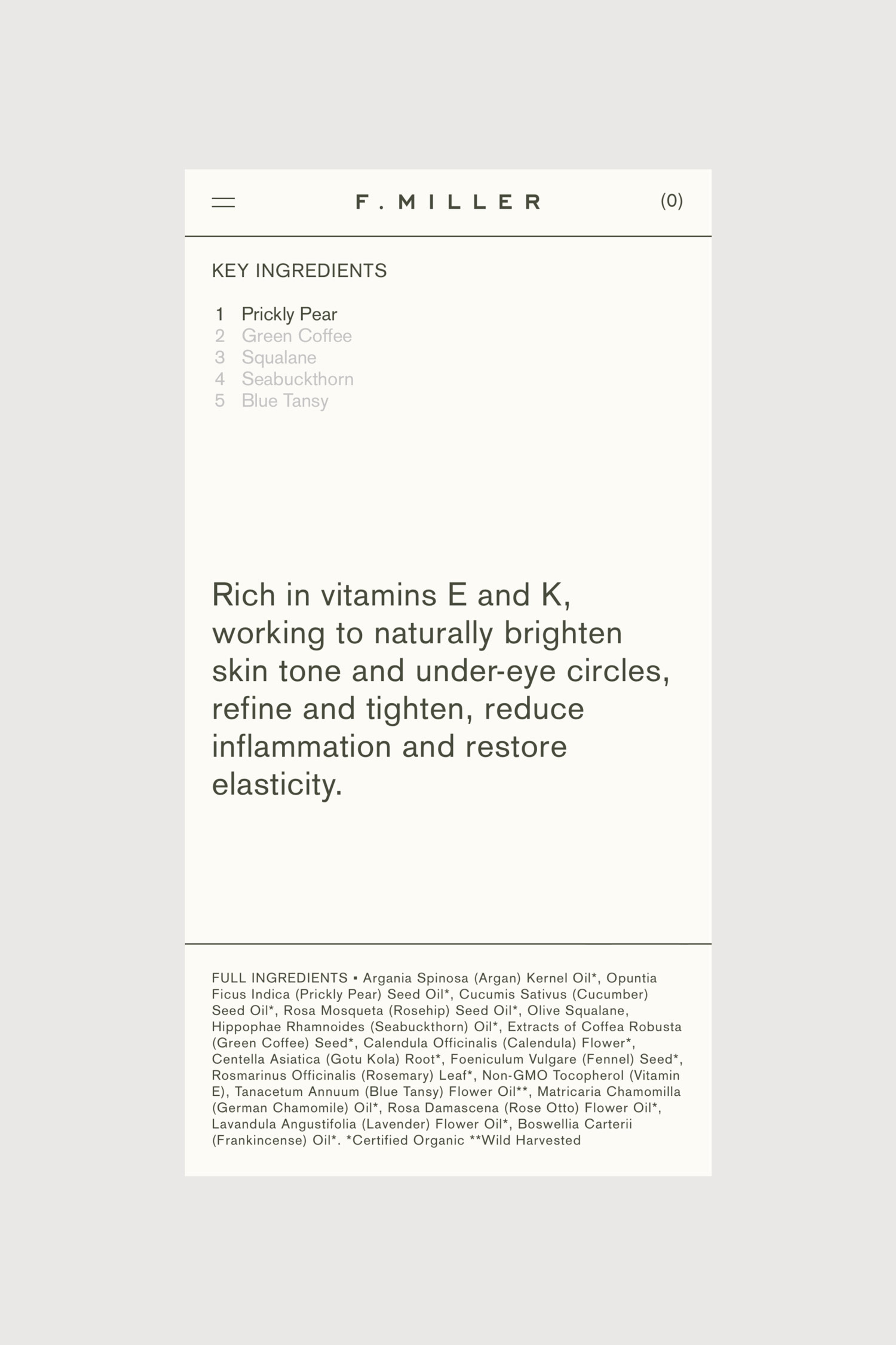
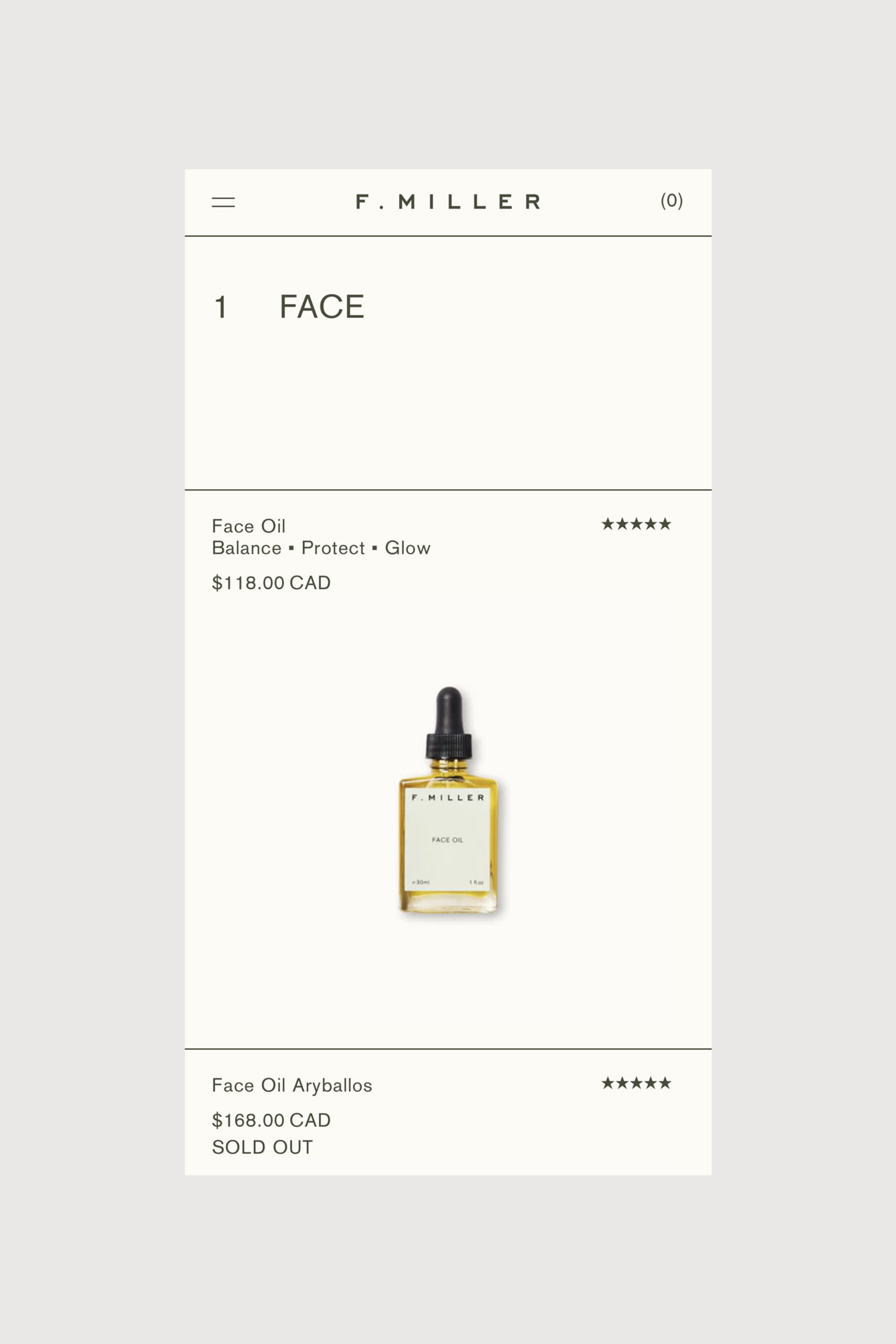
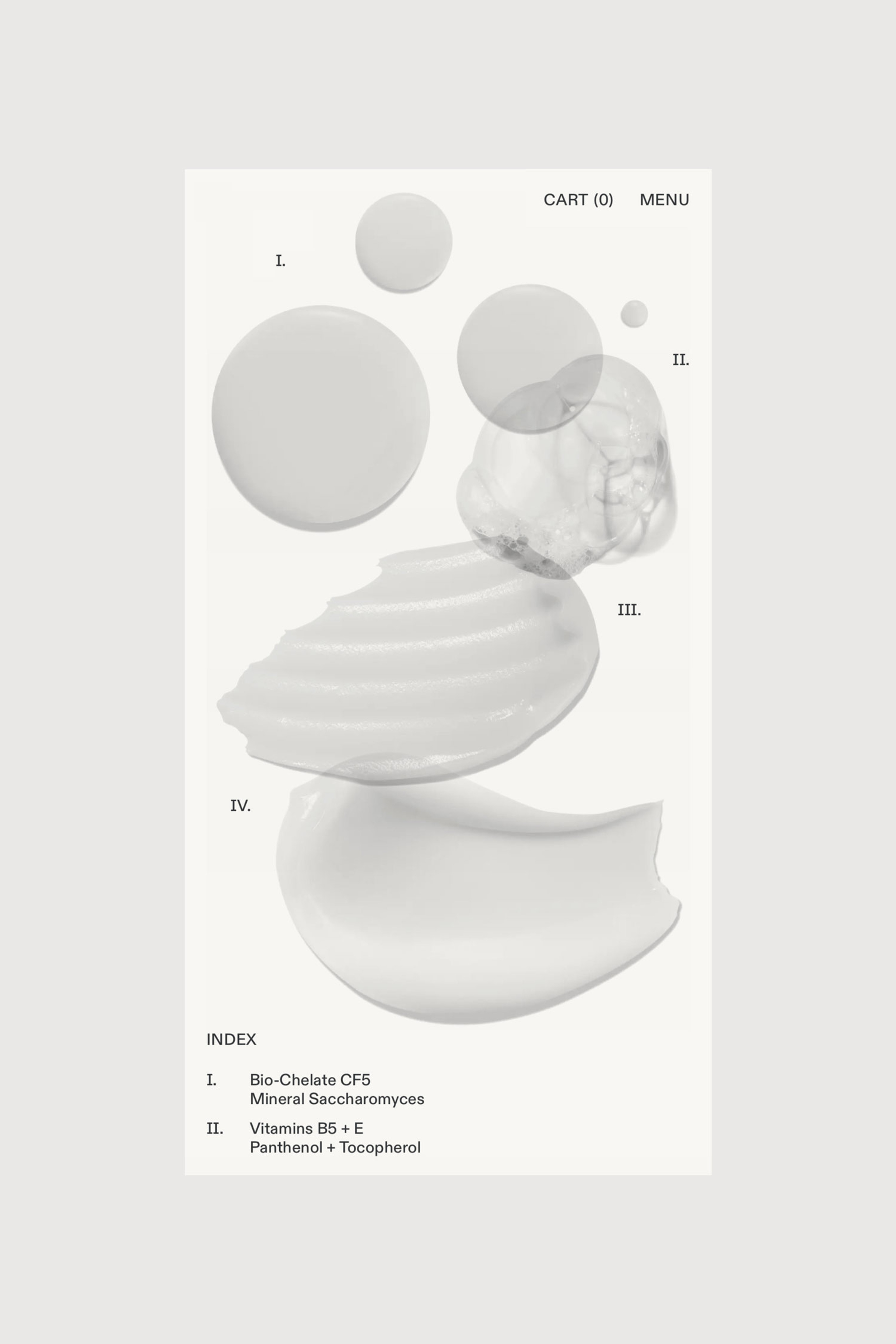
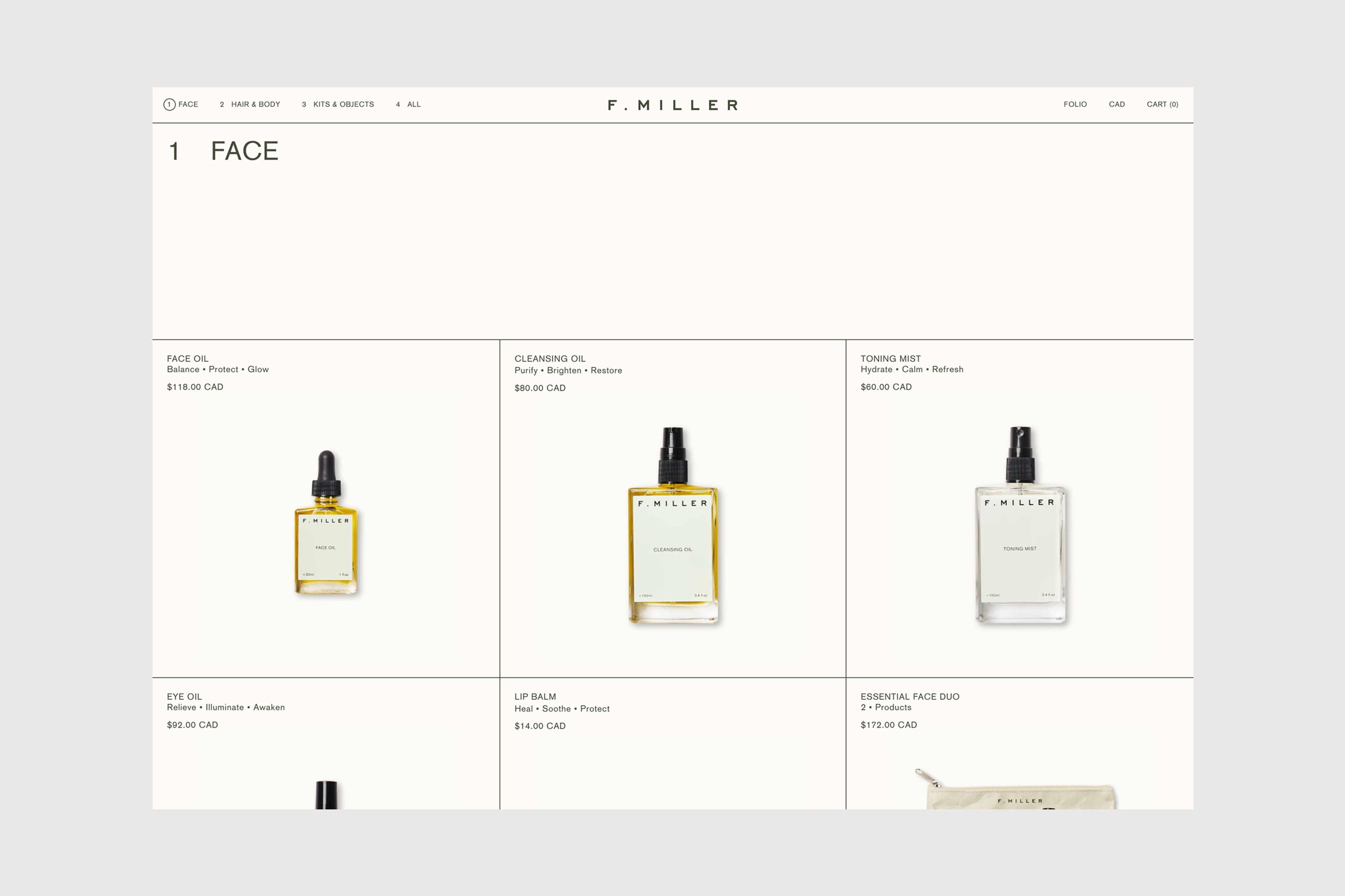
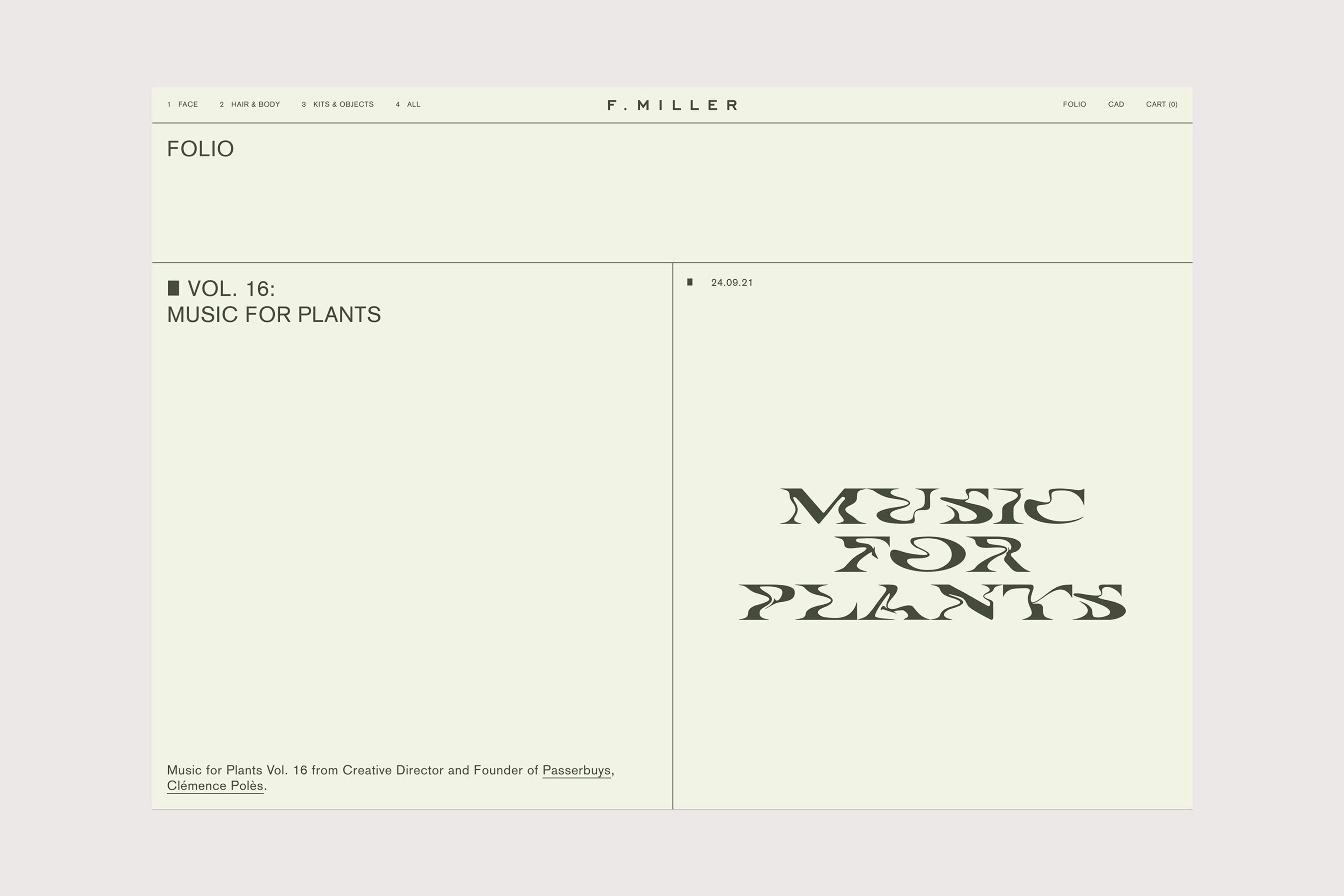
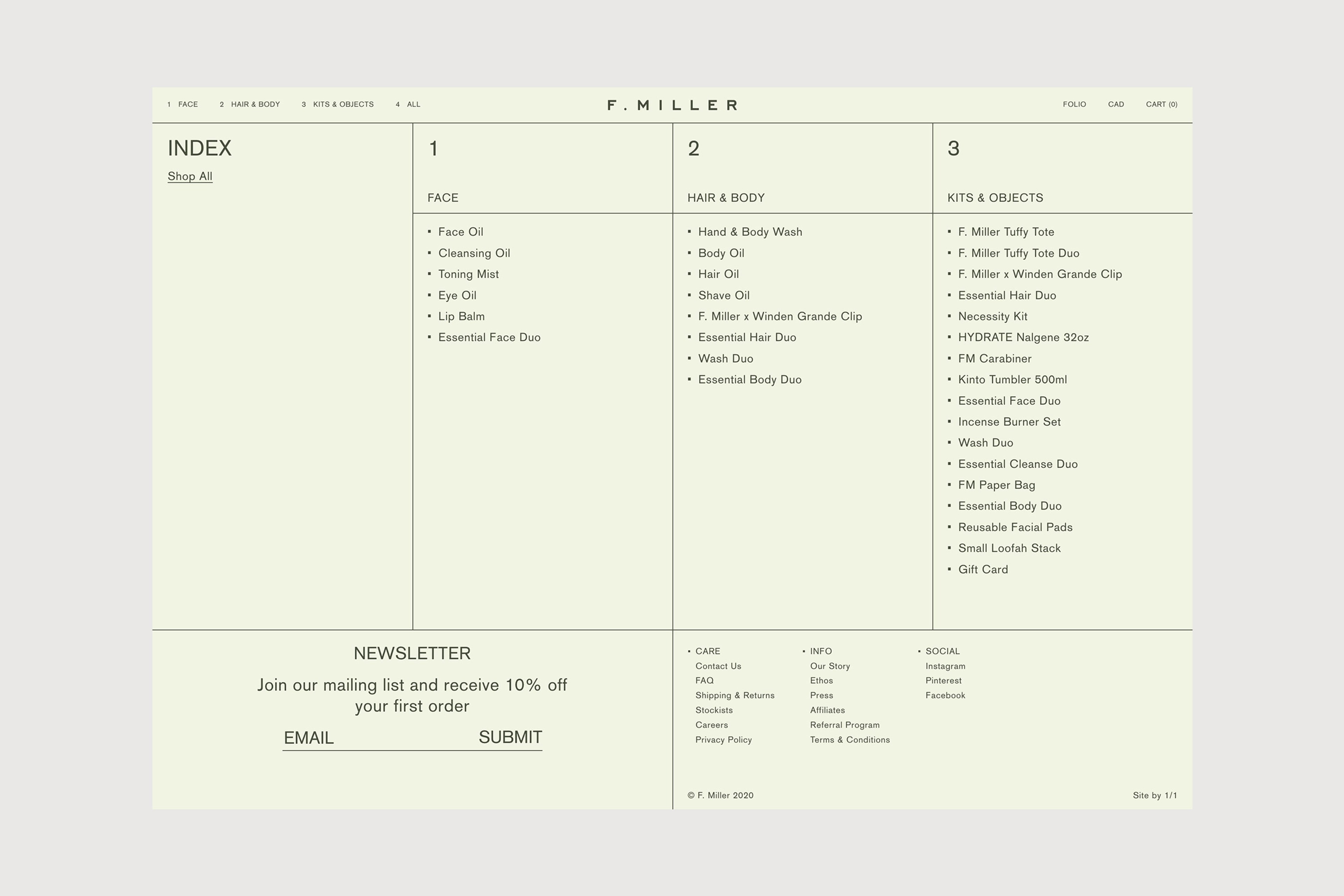
The brand’s new visual language has its foundations in a line based grid system, overlaid with colour and photography to set a distinct tone. An extension on the modular approach taken with the packaging, the line work is used to organise the collection in an accessible way, adding structure to the range and simplifying the offering into a clear index of 1. Face, 2. Body 3. Kits and 4. Objects.
Graphic Systems
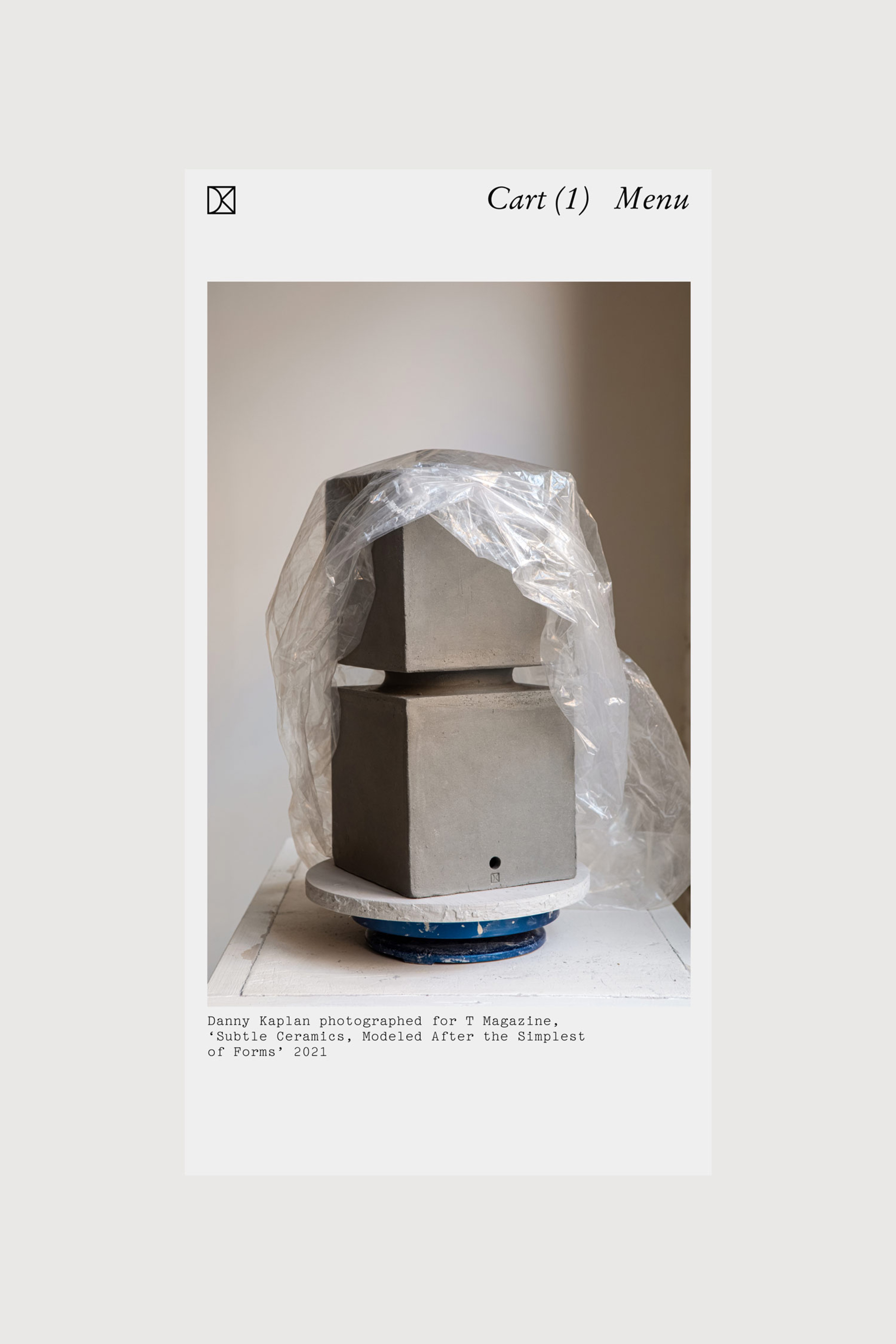
Danny Kaplan Studio


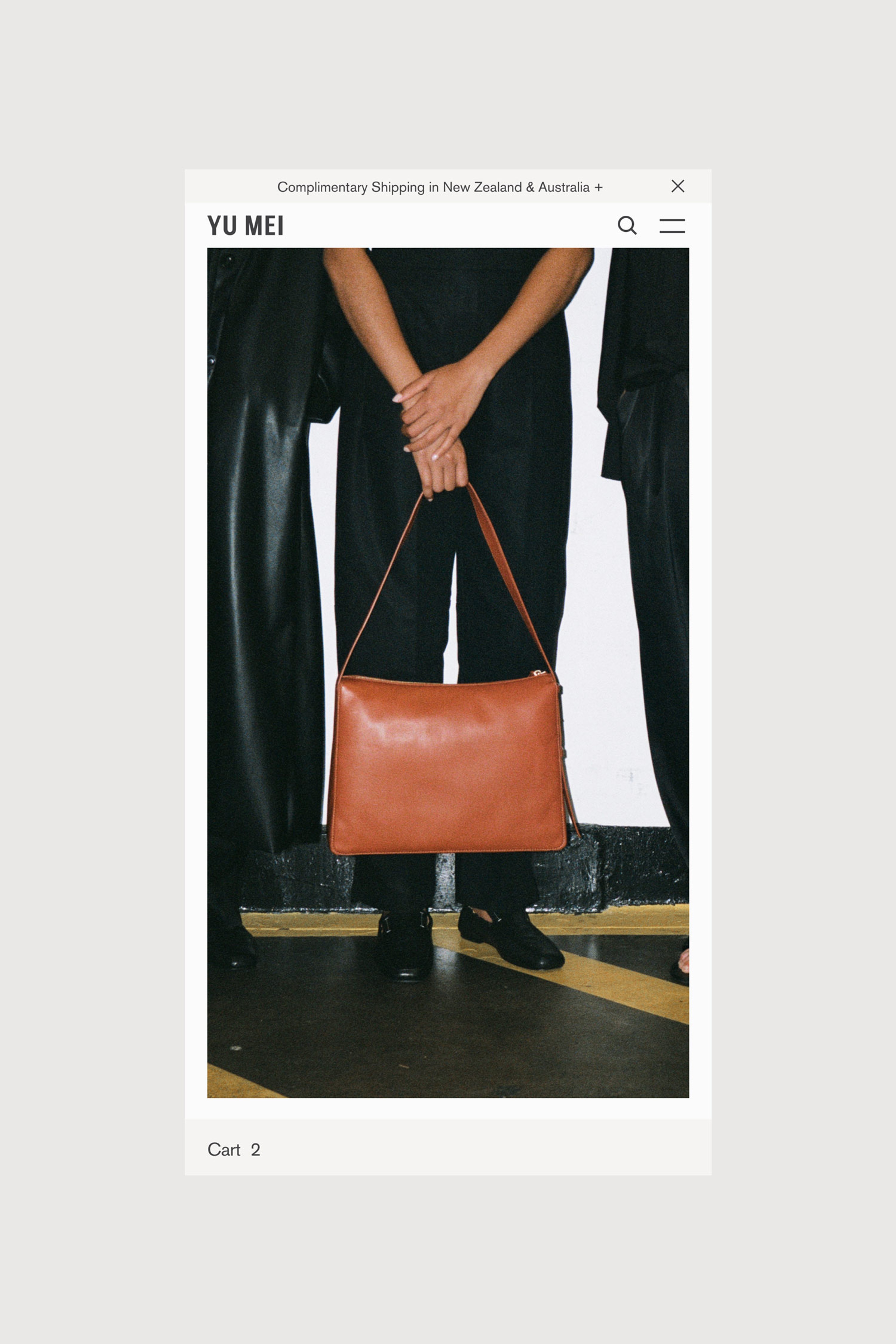
Yu Mei