Solutions
Collaborators
Photographers
Videography
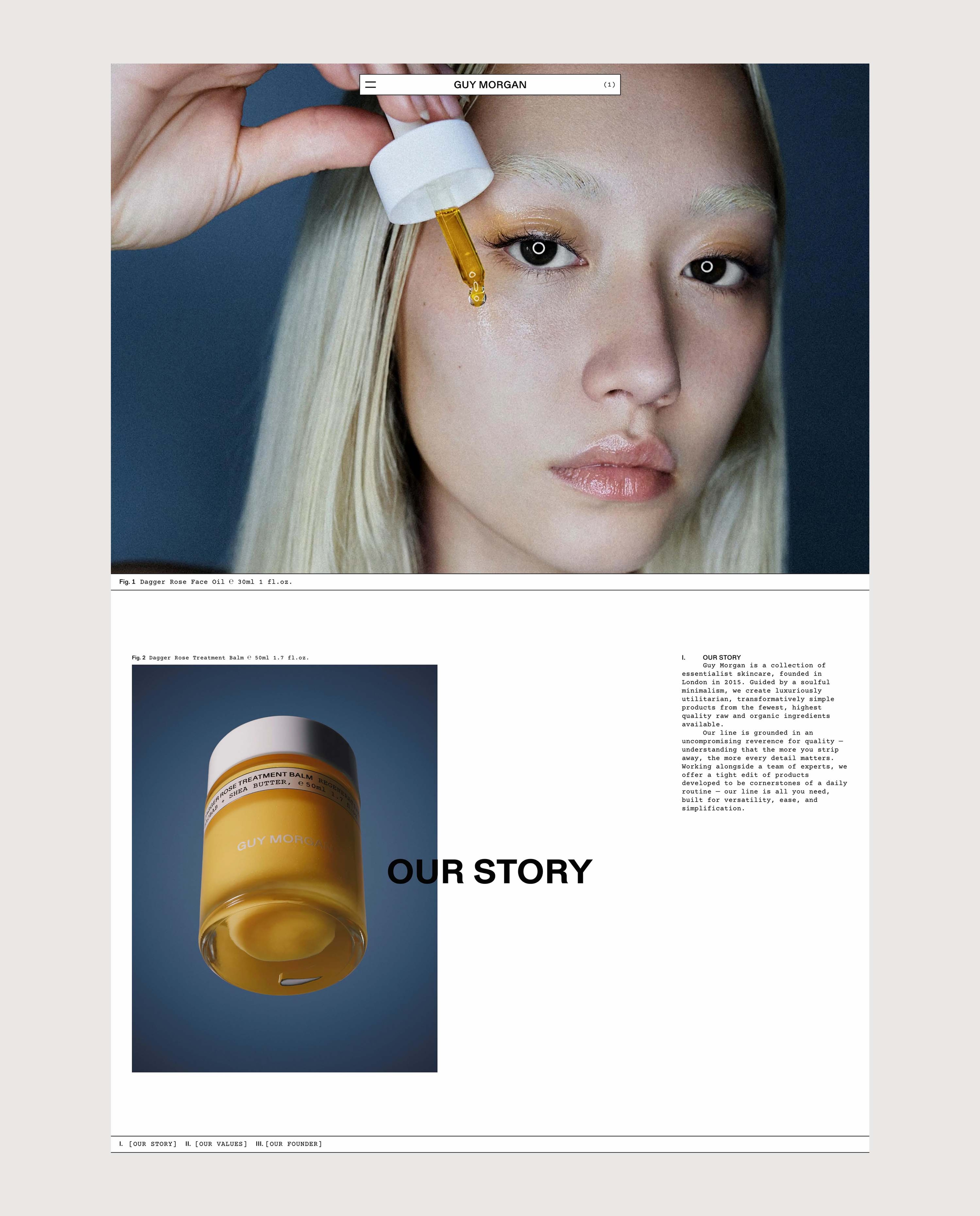
Overview
A full rebrand for Guy Morgan’s genderless modern apothecary line saw us lift the vibrant orange tones of his formulations’ pure ingredients to bridge his web and product presence, distinguished through a labelling system that updates traditional labels to reinforce the brand’s utilitarian premise.
Contents
Packaging
Branding

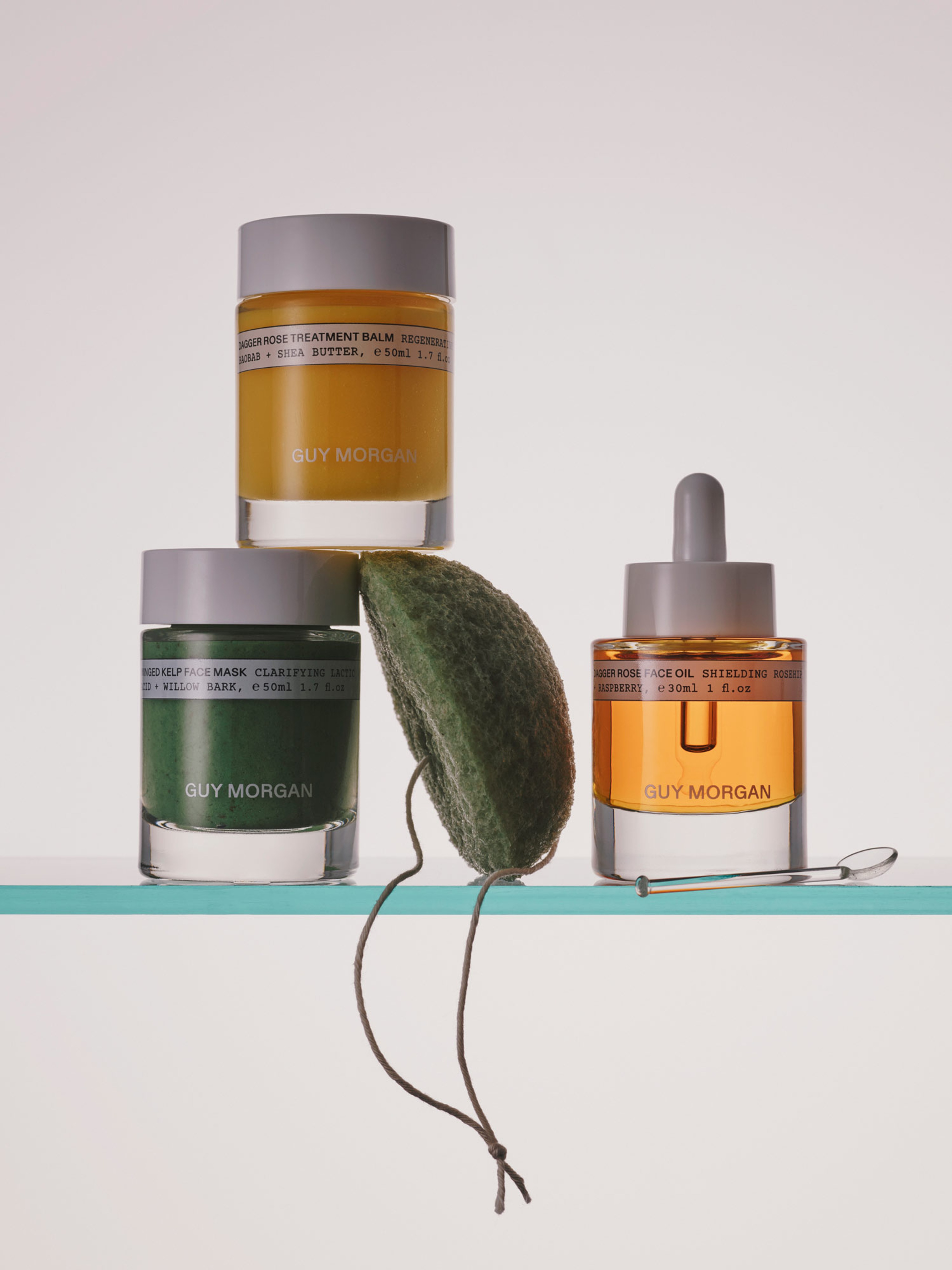
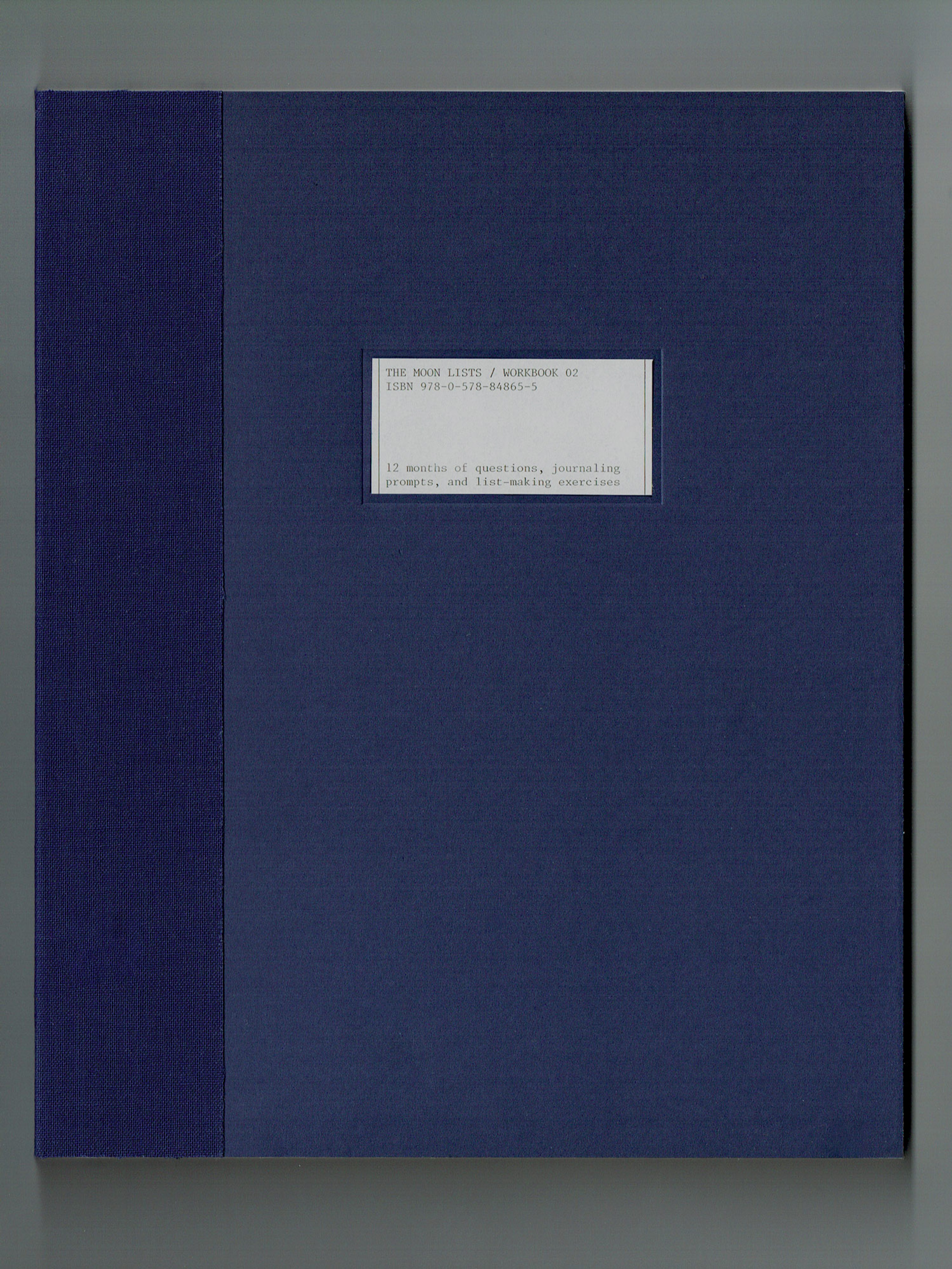
Dagger Rose Treatement Oil
Context
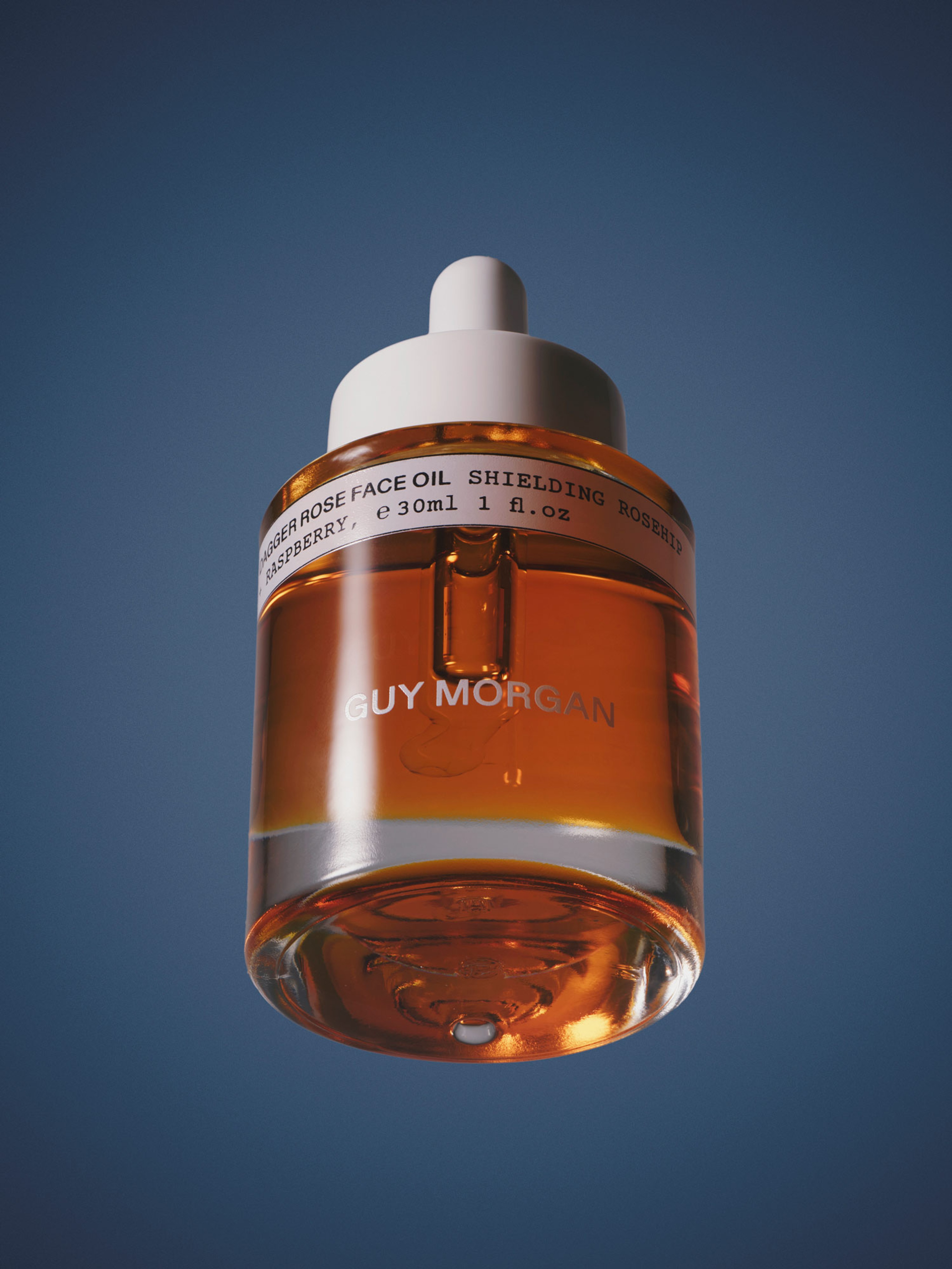
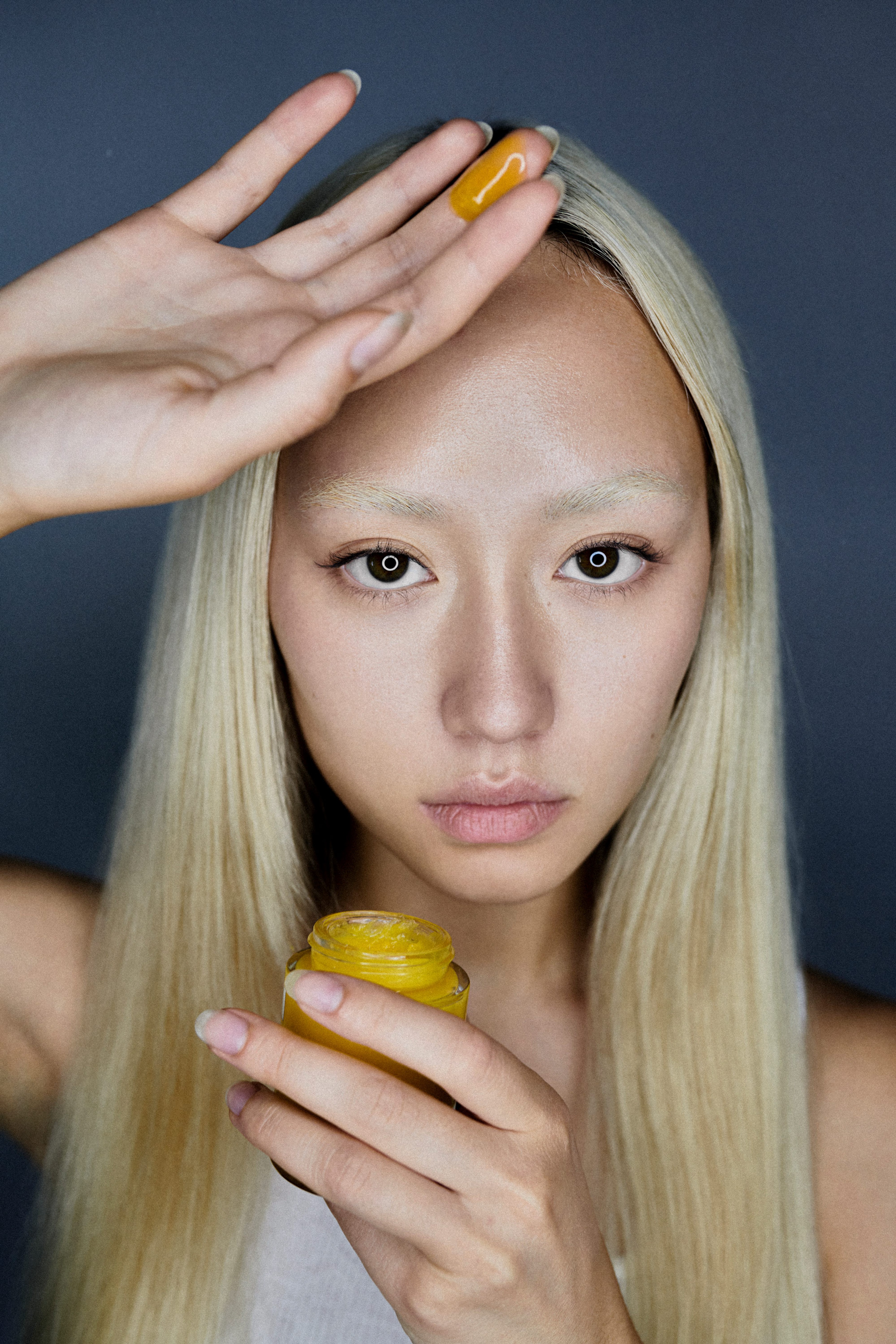
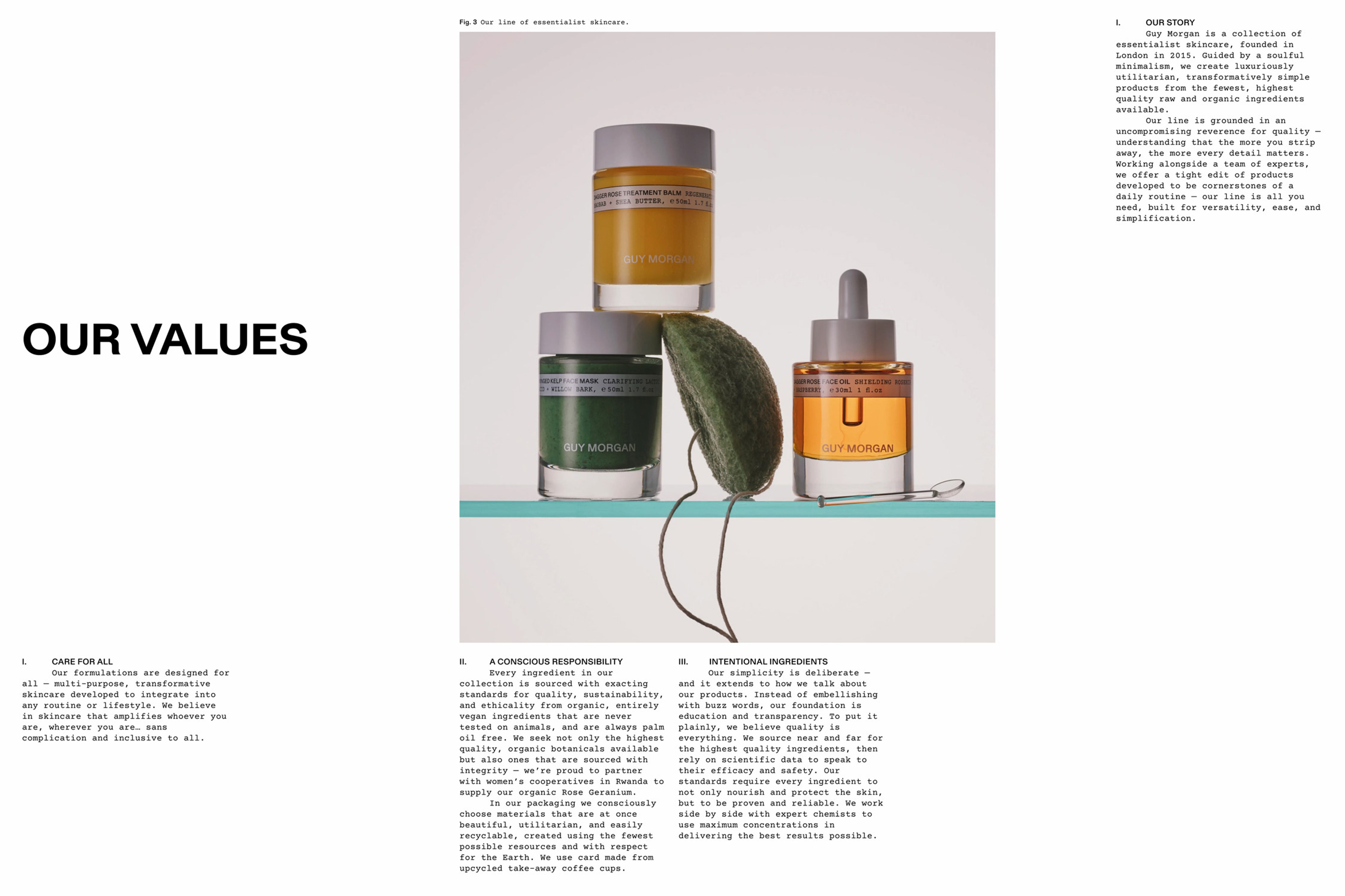
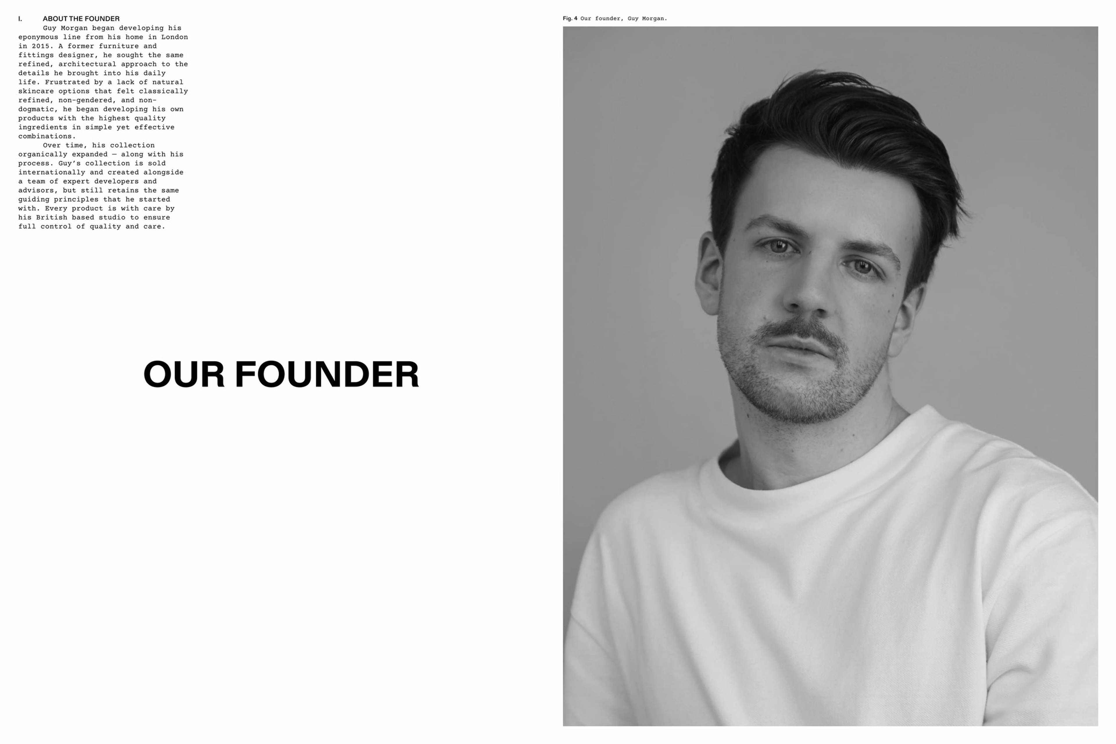
While Guy Morgan’s namesake skincare line was leading the charge for genderless modern apothecary, his existing branding wasn’t reflective of this positioning. We partnered with him to undertake a full rebrand, including end-to-end web design and a packaging refresh. To reflect the uniqueness of Guy’s offering, we departed from conventional industry codes to create an identity with a more utilitarian unisex look and feel. Lifting the vibrant yellow and orange tones of his hero products like the Dagger Rose Face Oil and Regenerative Balm, we developed an ownable system for brand and product presence.
Solutions
Brand Identity
Packaging
Print Assets
E-Commerce Design
E-Commerce Development
Digital Assets

Context
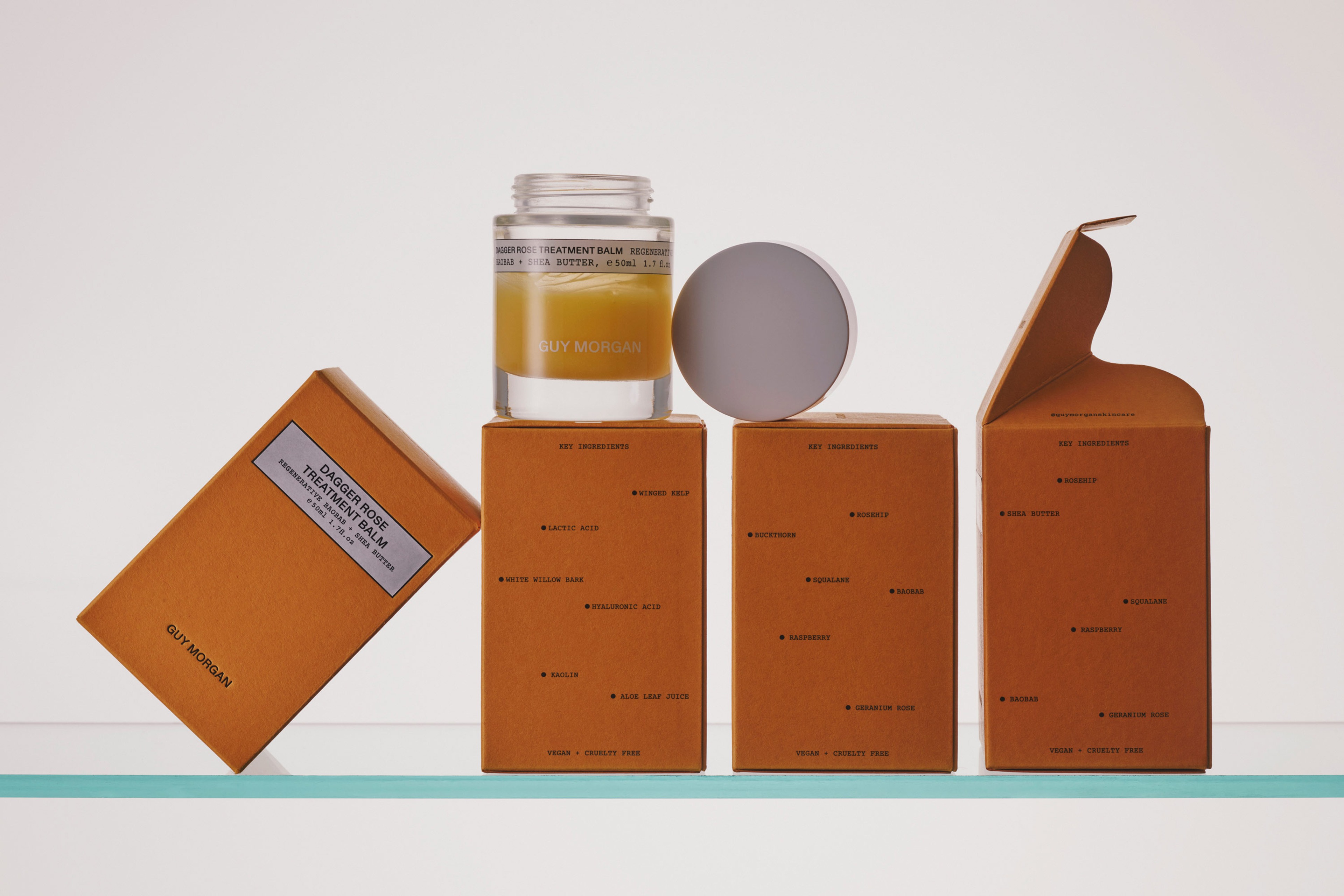
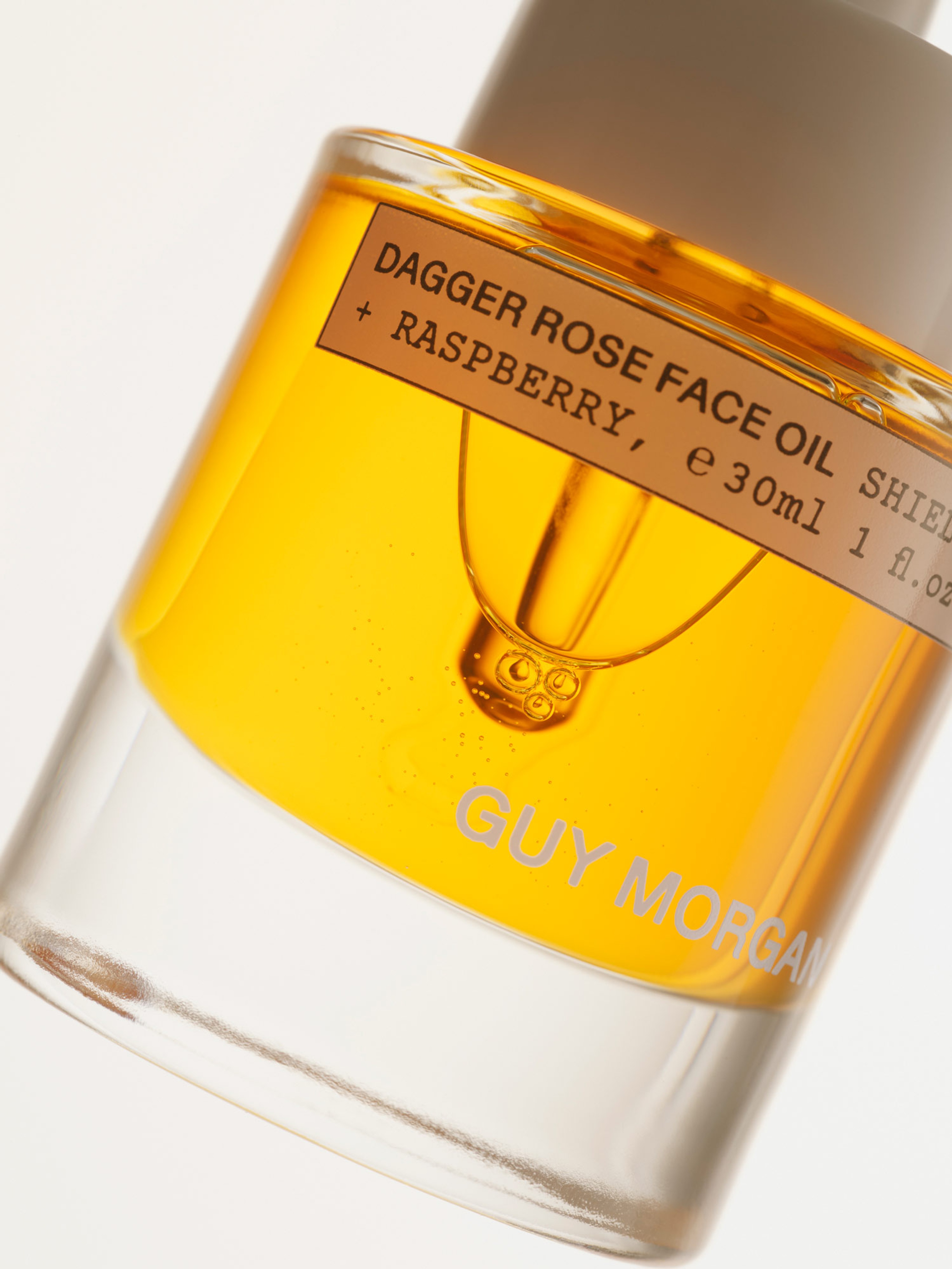
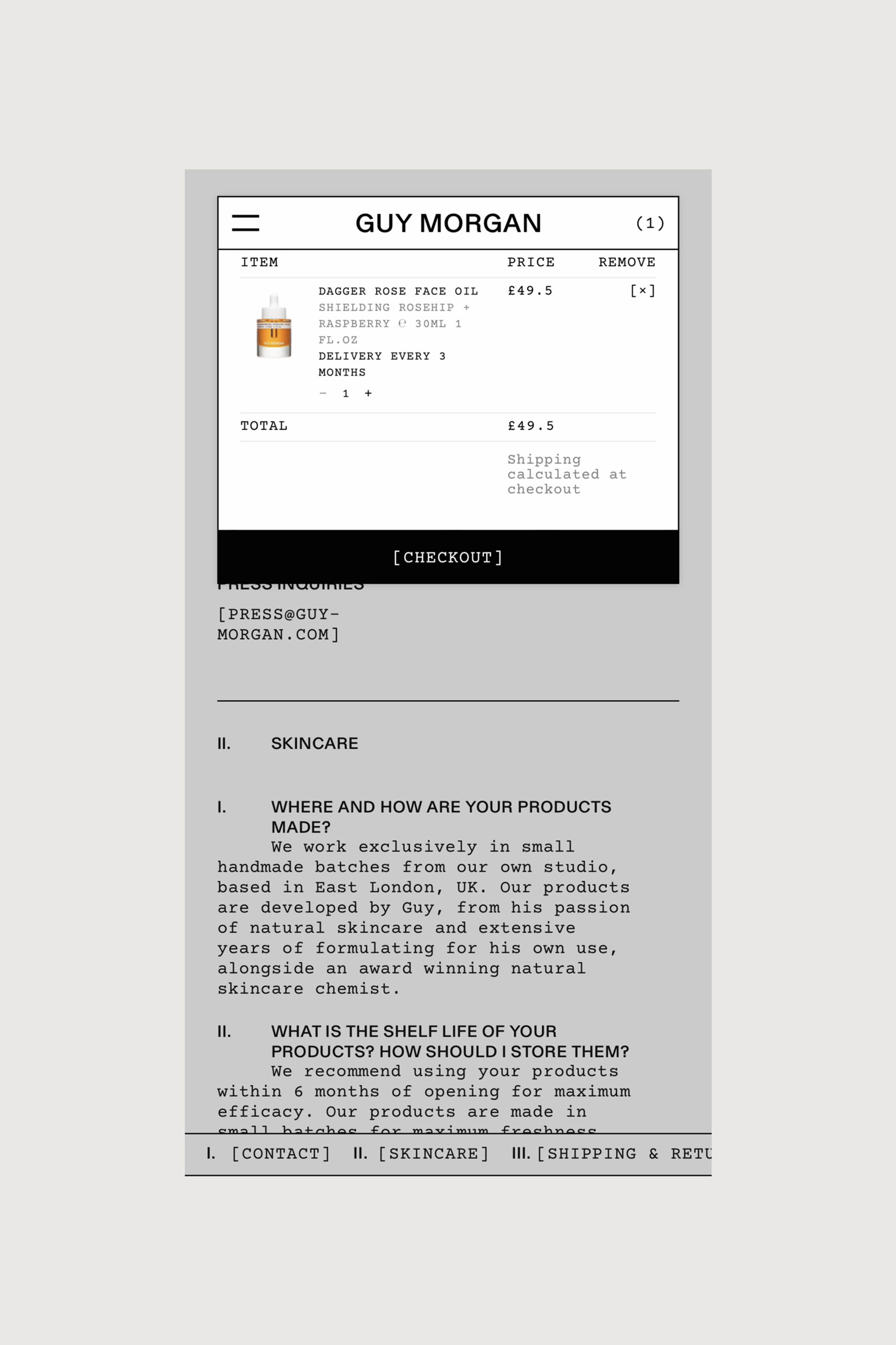
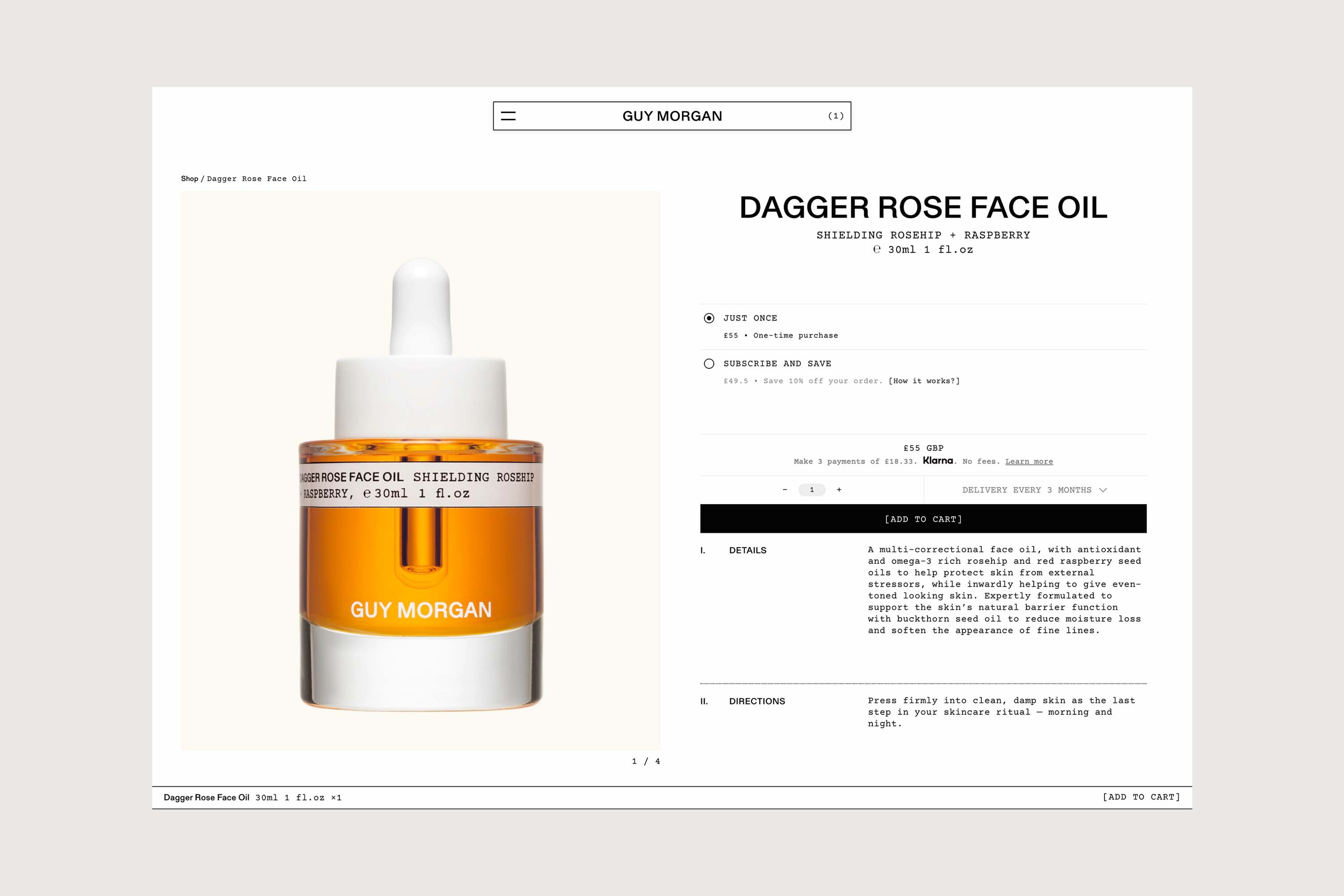
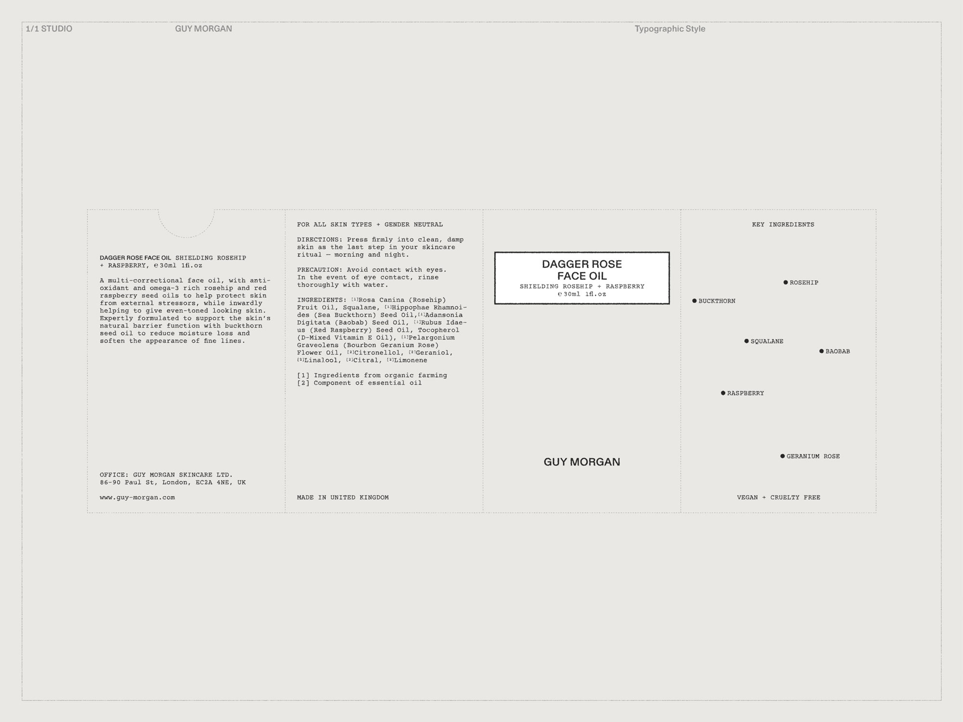
True to a mutual emphasis on environmental responsibility, sustainability considerations informed product materials and production techniques, such as direct printing on glass bottles. Encasing each is a package made of G. F. Smith extract box stock in an unmistakable orange tone that underscores the vitality of Guy’s formulations while standing out on the shelf. Each product is distinguished through a white labelling system that references traditional apothecary labels, inscribed in a balanced pairing of Courier monospace and Gerstner Programme that together reinforce the brand’s utilitarian premise.
Kelp Face Mask

How to Use, Dagger Rose Face Oil
Context
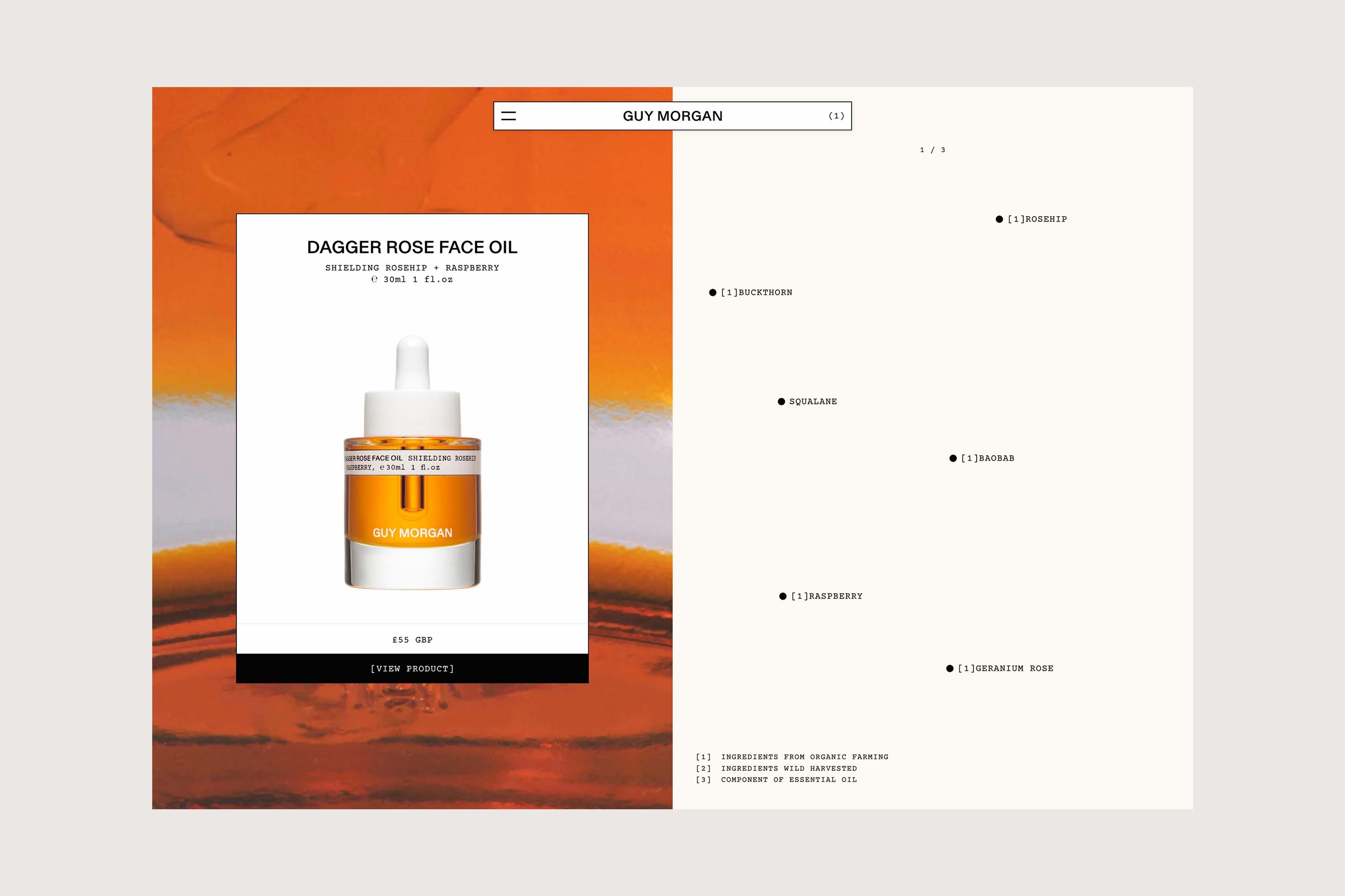
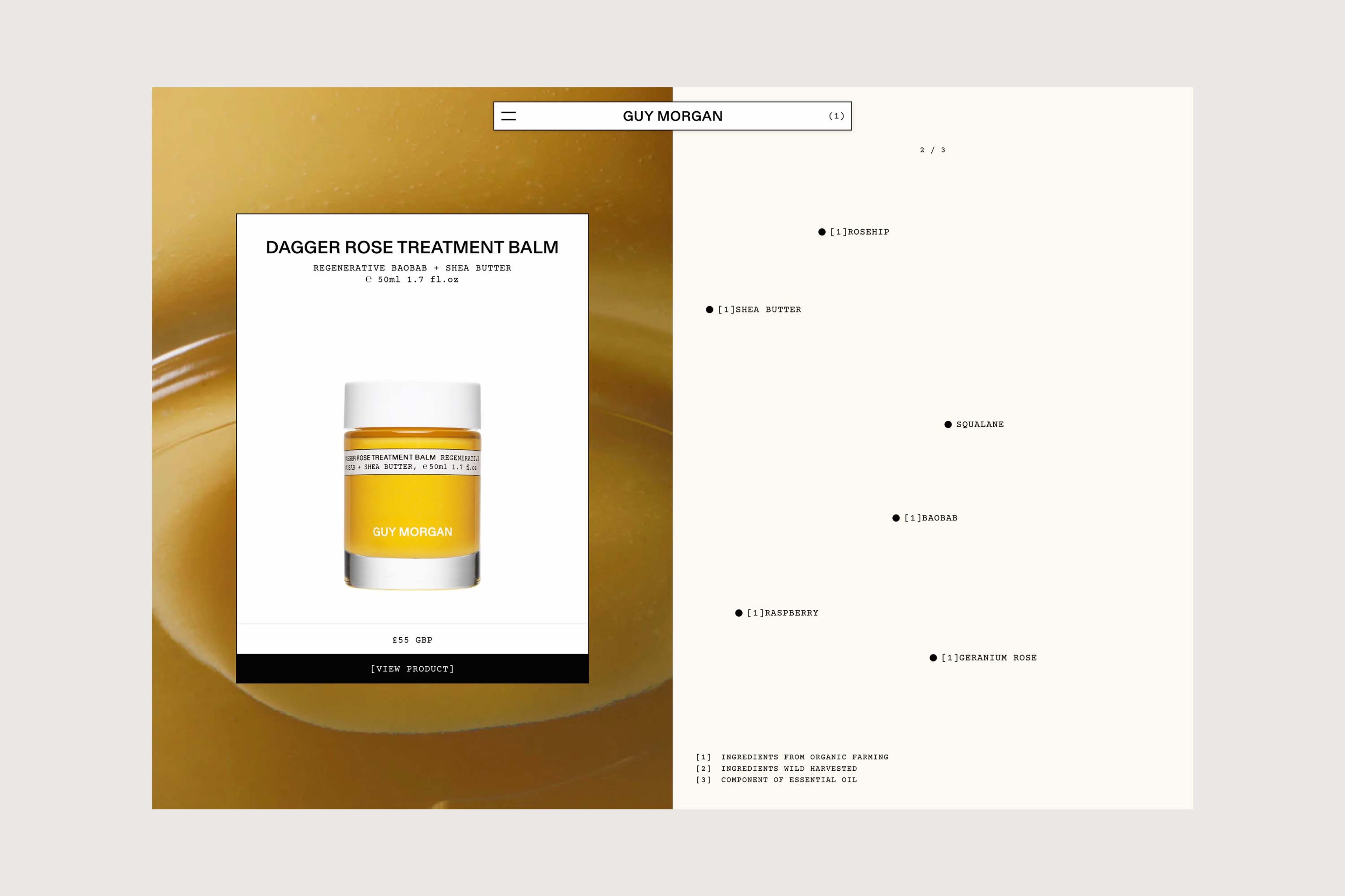
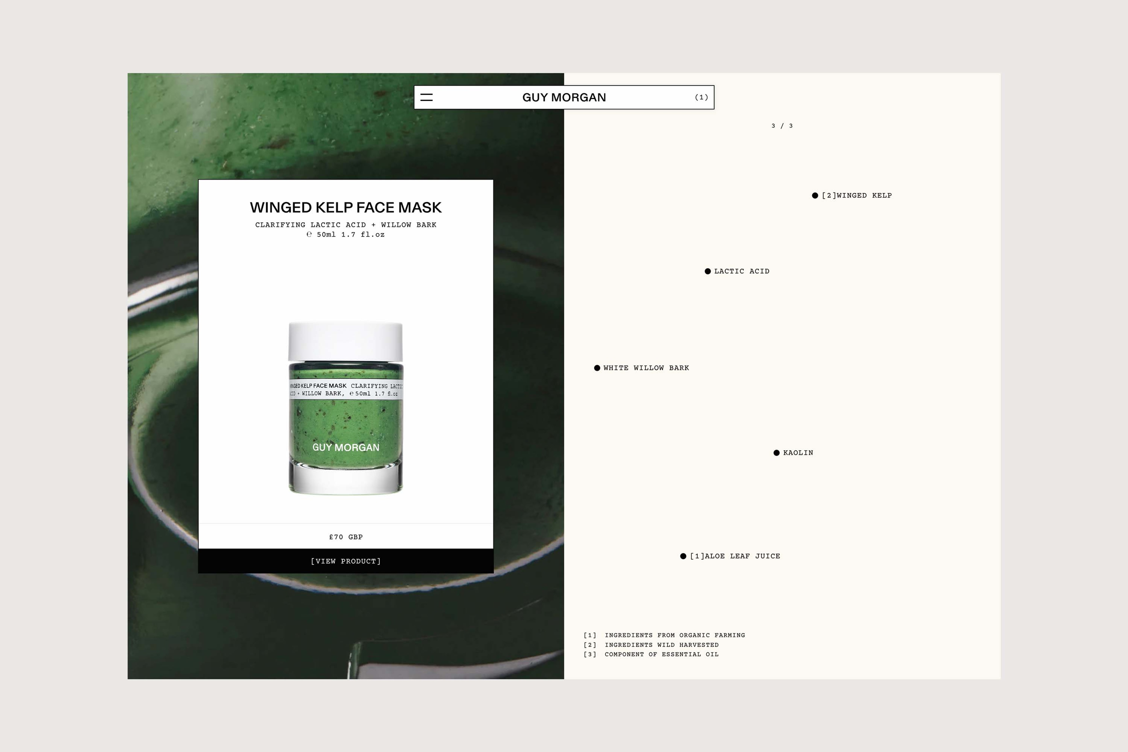
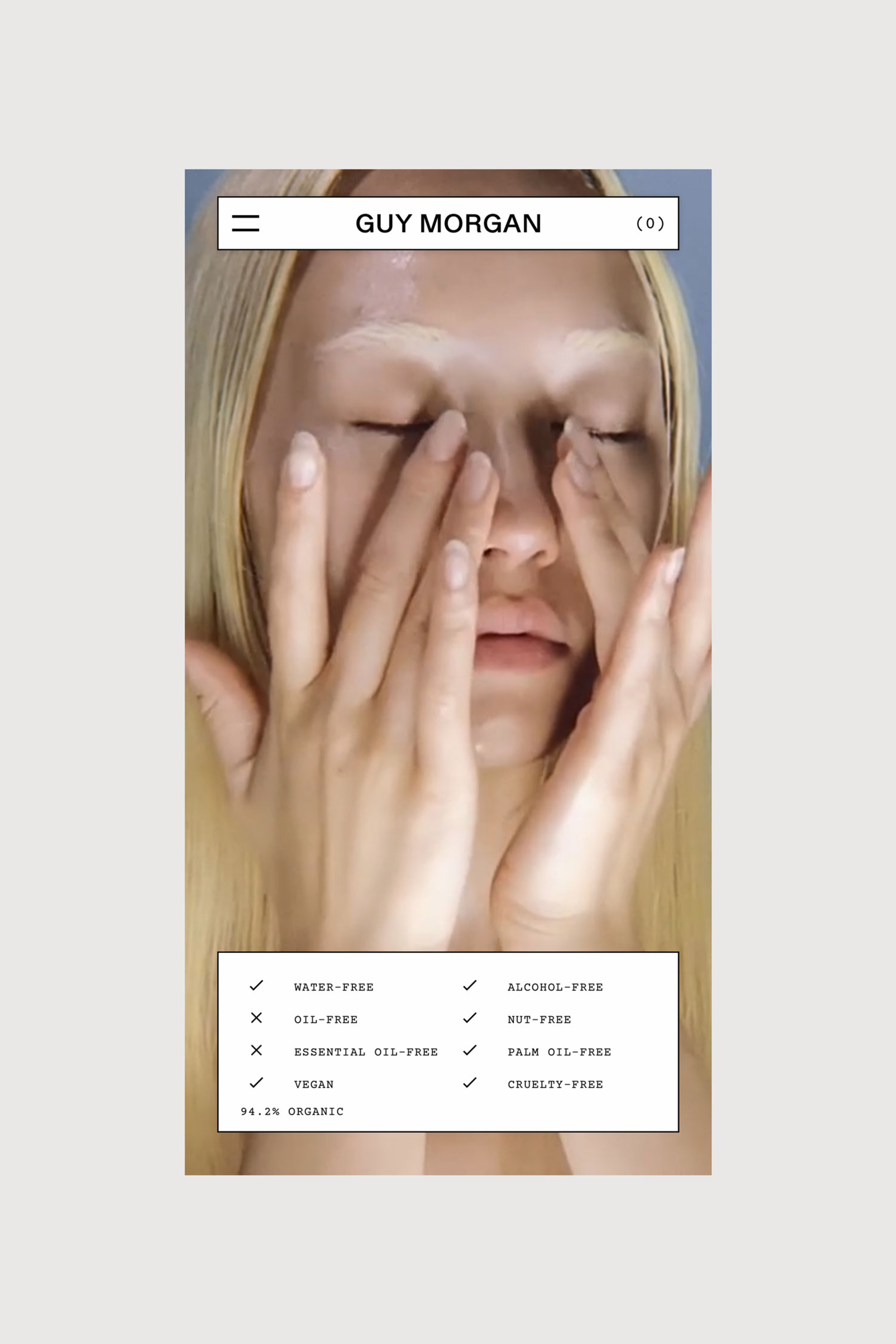
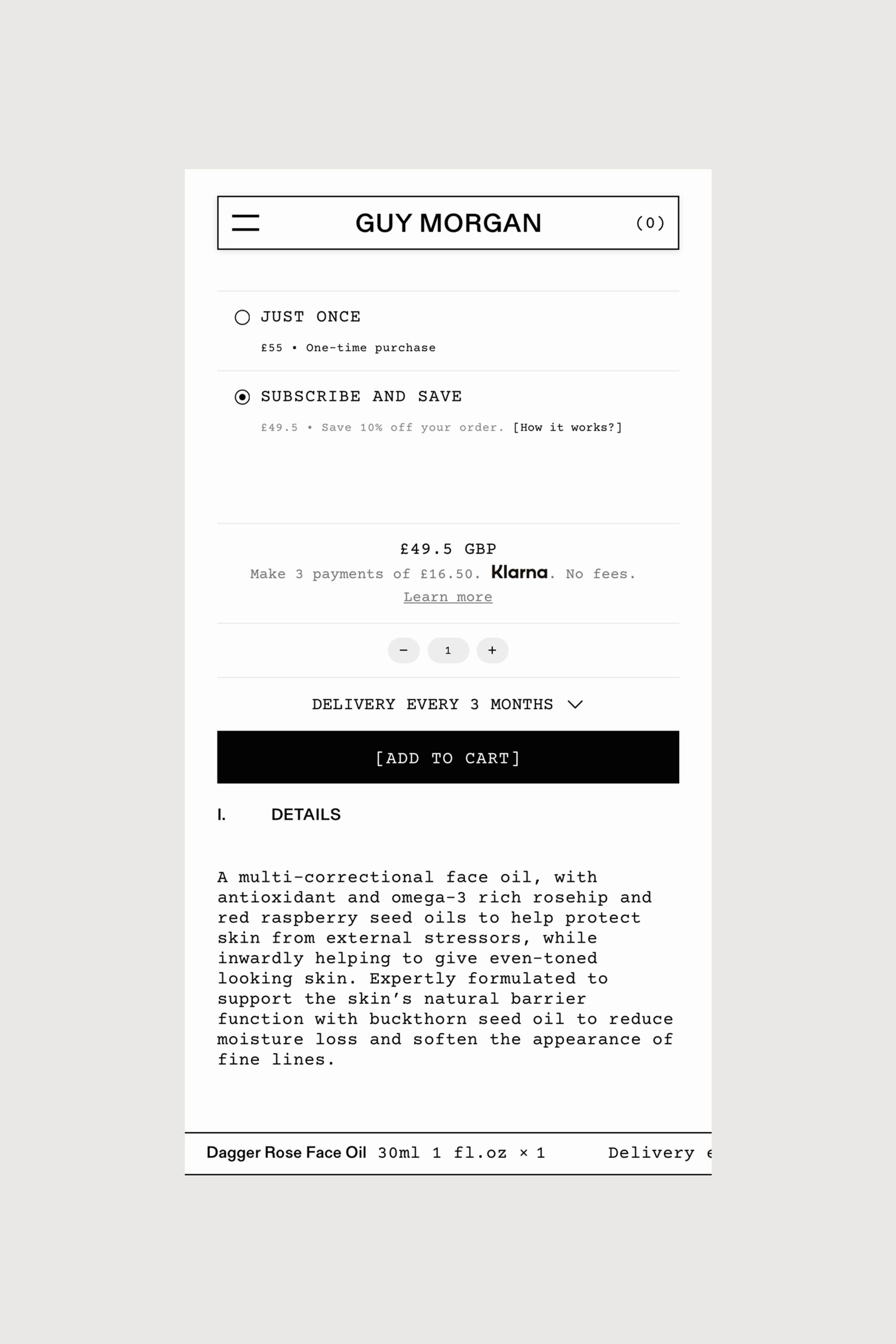
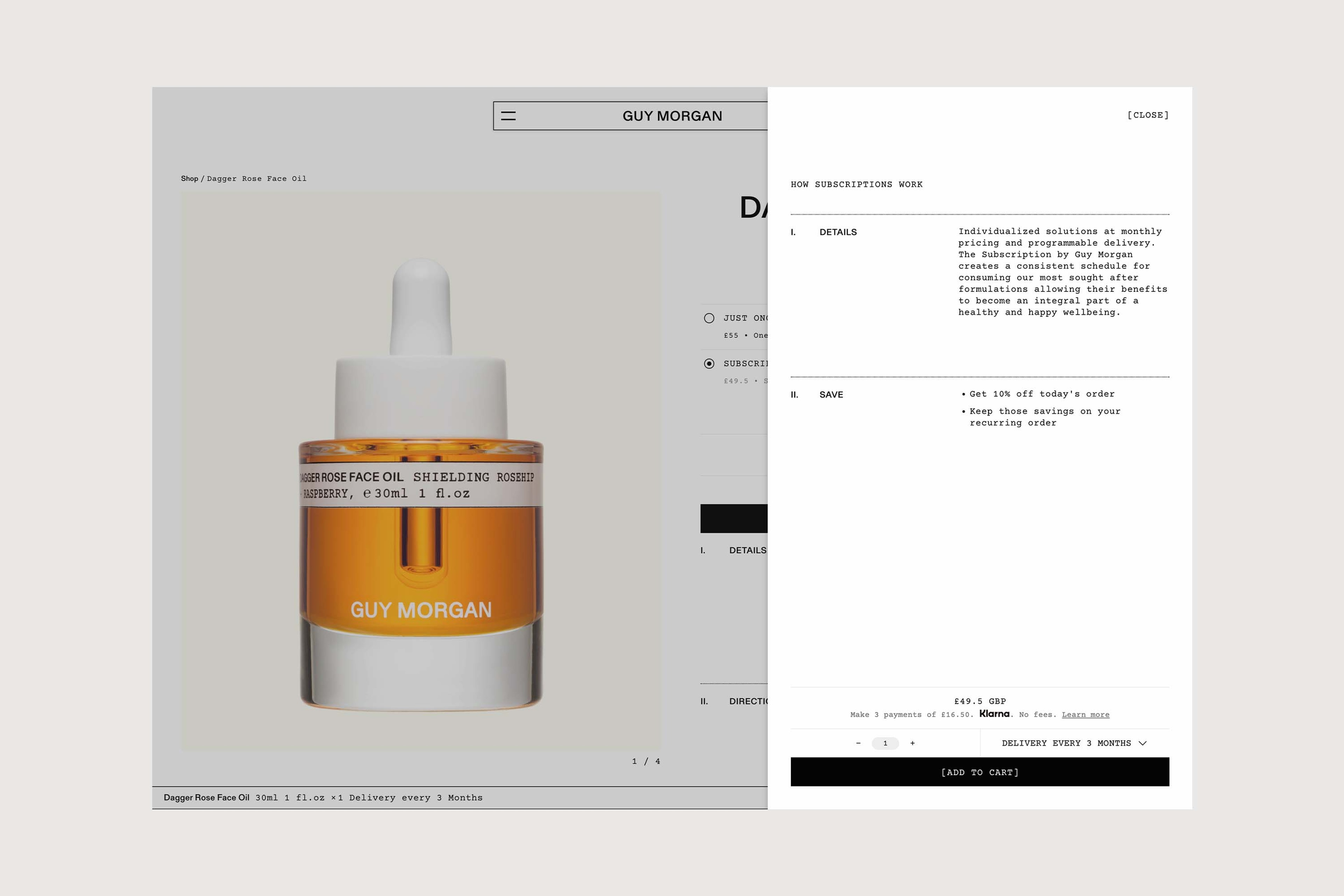
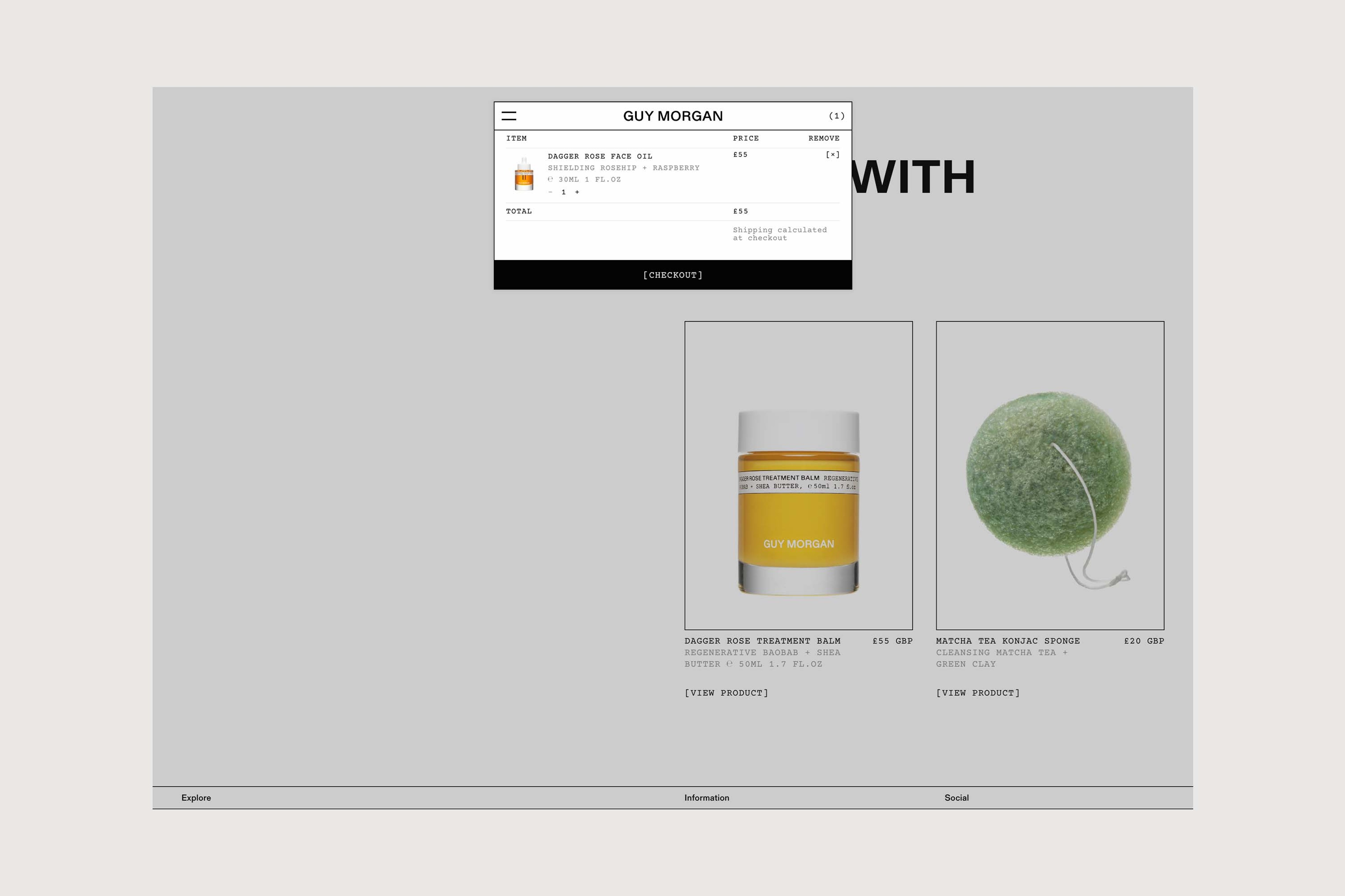
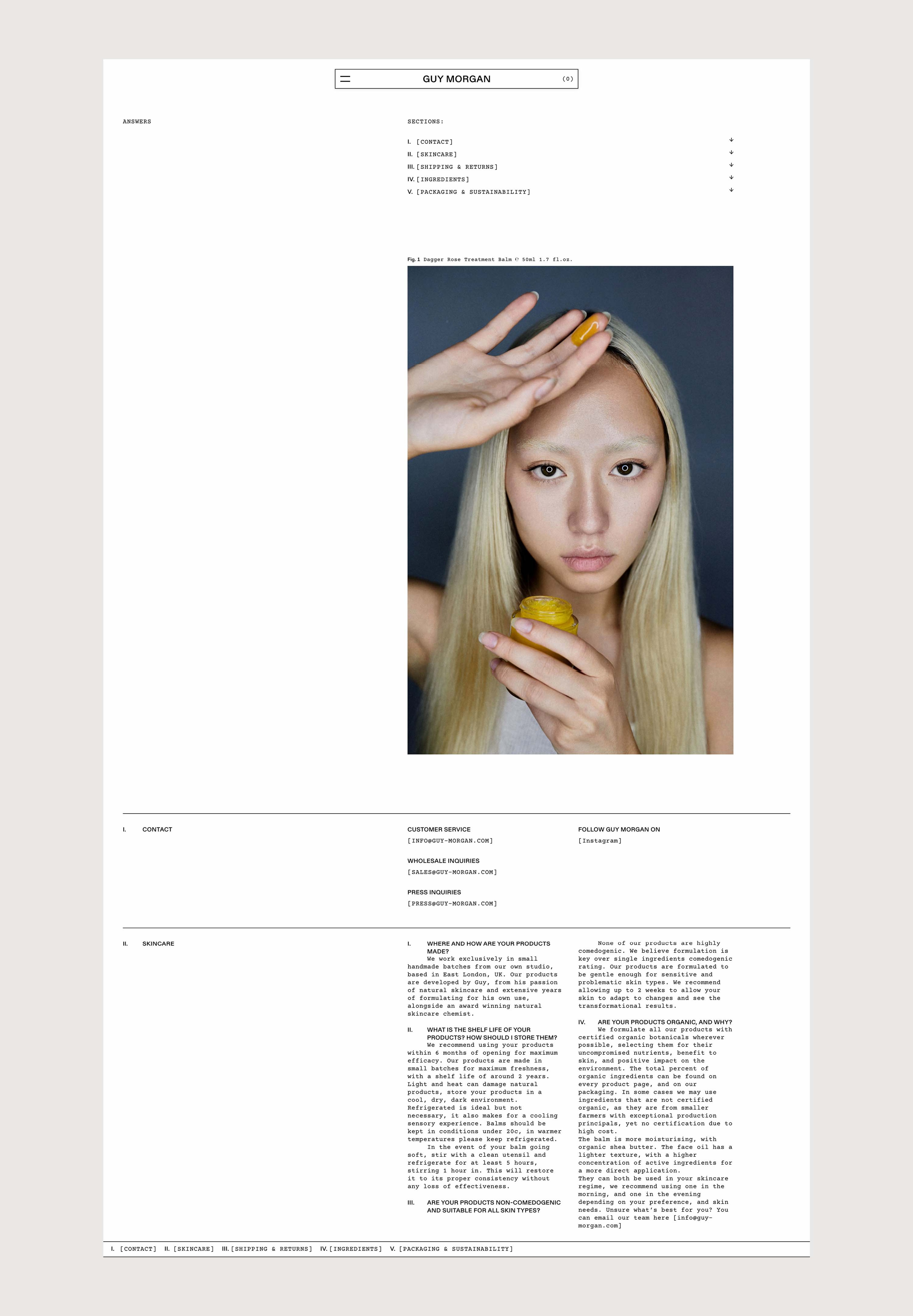
Specific and repeatable, the labelling system carries through to the website, where the menu and logo are situated in expandable boxes. We enhanced the e-commerce functionality with a subscription option. Attention is drawn to the provenance of each product’s natural ingredients through a visual map rendered in hover state on web and in debossed form on packaging. Cropped and close-up product photography further reinforces the simplicity, transparency and purity of ingredients for which this young and forward-looking line has fast gained a devoted following.

An adapted navigation system reflects the versatility of the brand’s philosophy while streamlining the website user experience.
A cartography of ingredients carries through from the website, where it is presented in combination with bold product photography, to the striking orange packaging made of G. F. Smith extract box stock onto which it is debossed.
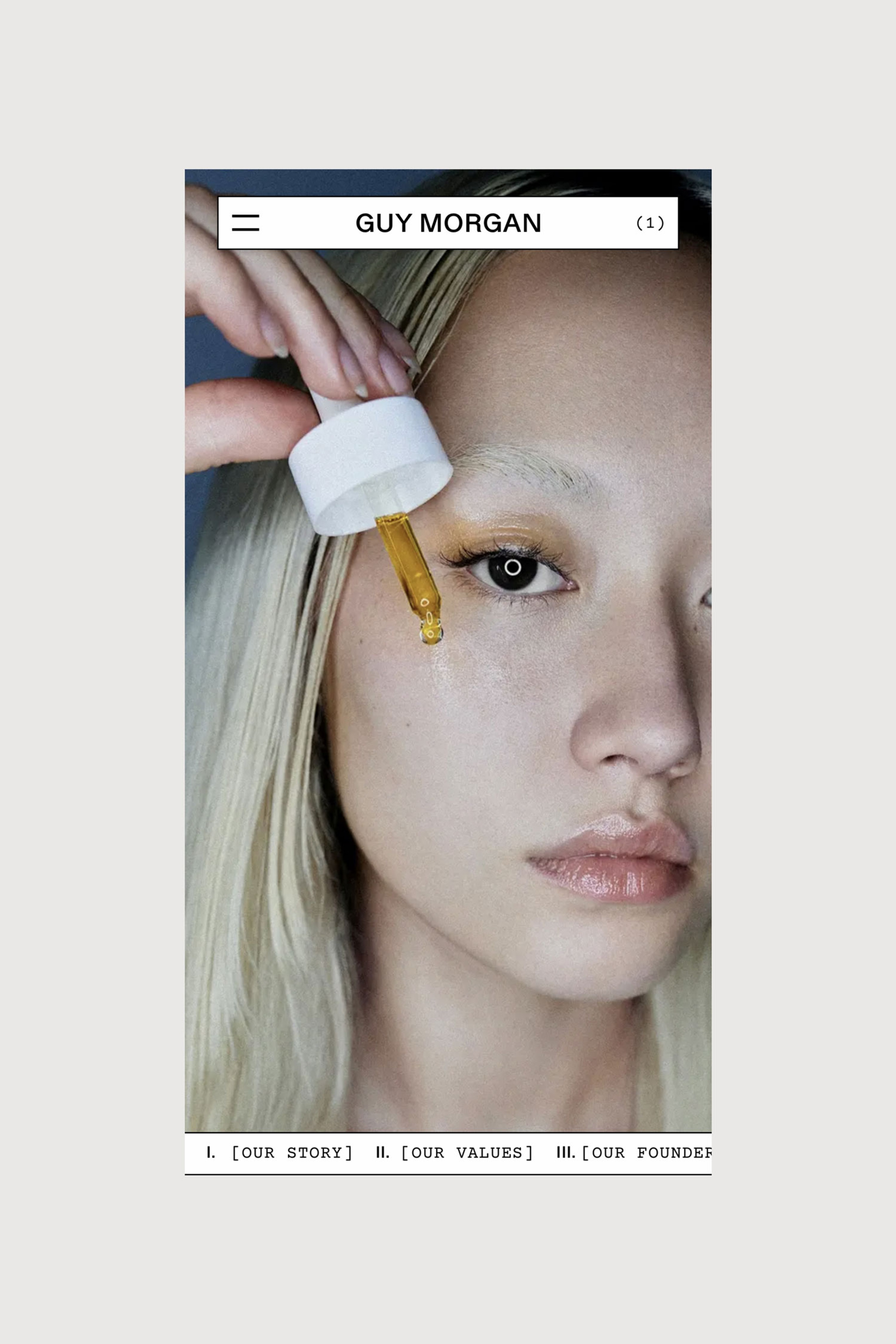
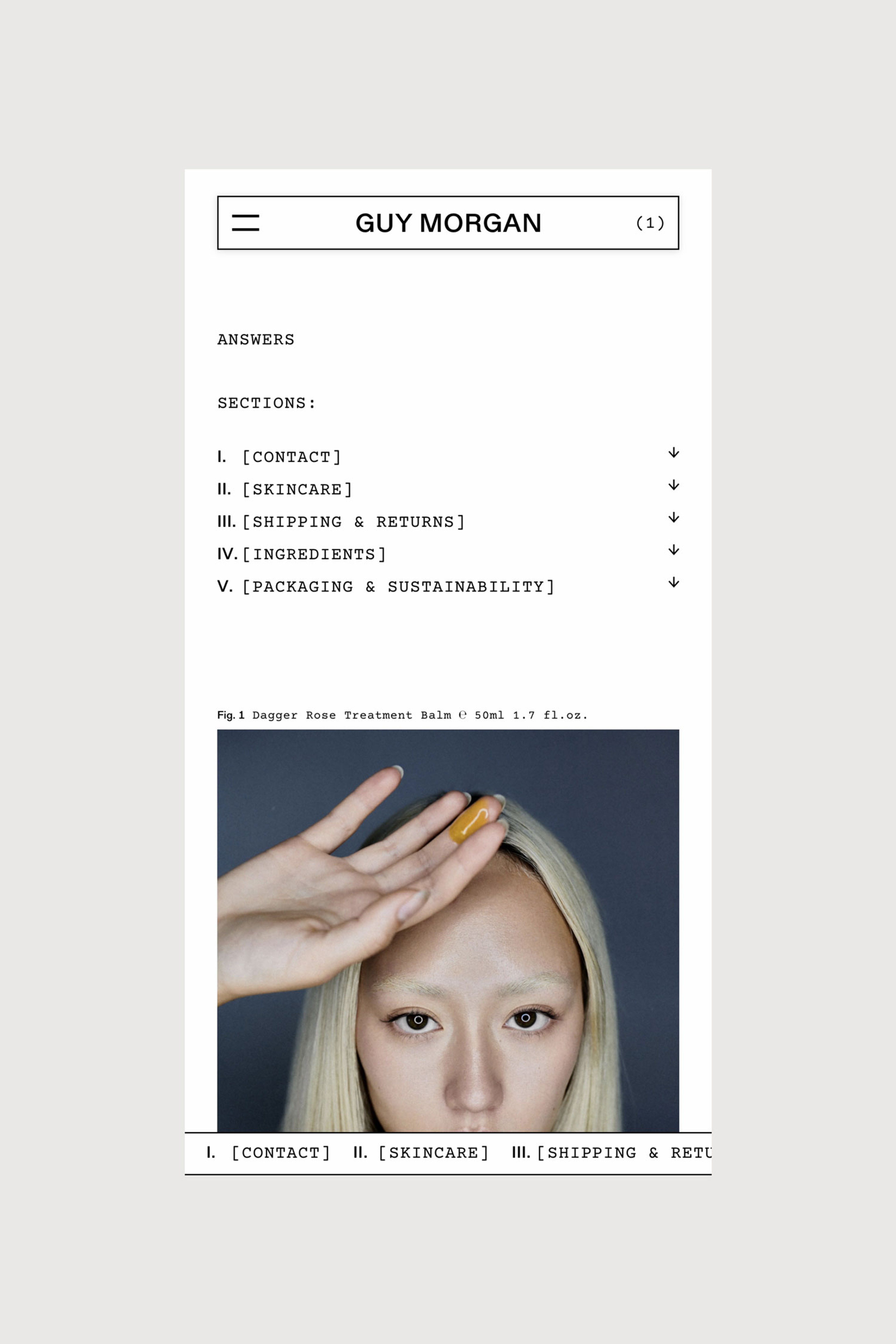
Decidedly close-up and cropped photography keeps the products’ pure origins sharp focus while previewing the pleasing nature of their textures.

A considered pairing of Courier monospace and Gerstner Programme reflects the brand’s gender-inclusive appeal while underscoring its utilitarian premise.

Graphic Systems
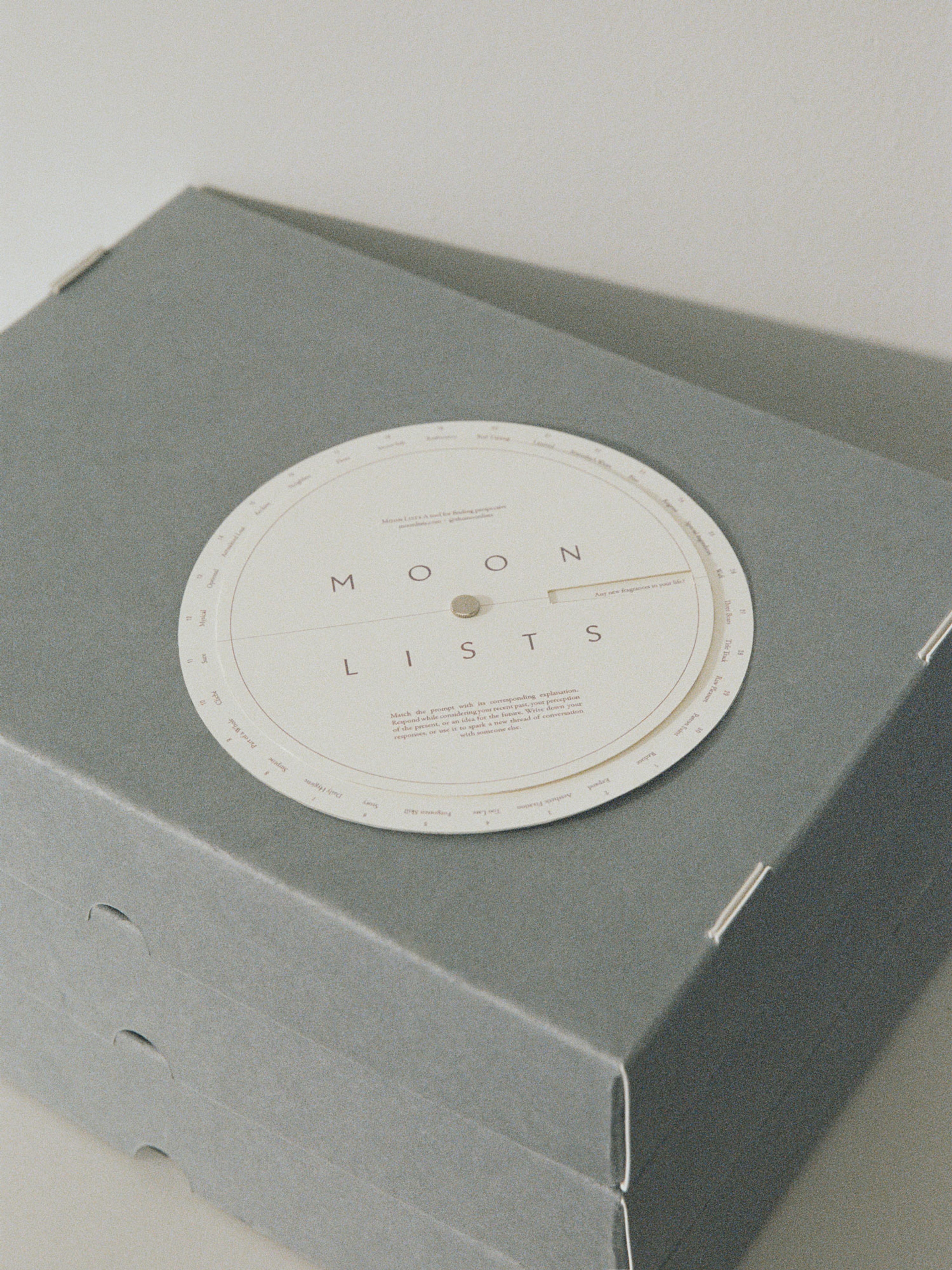
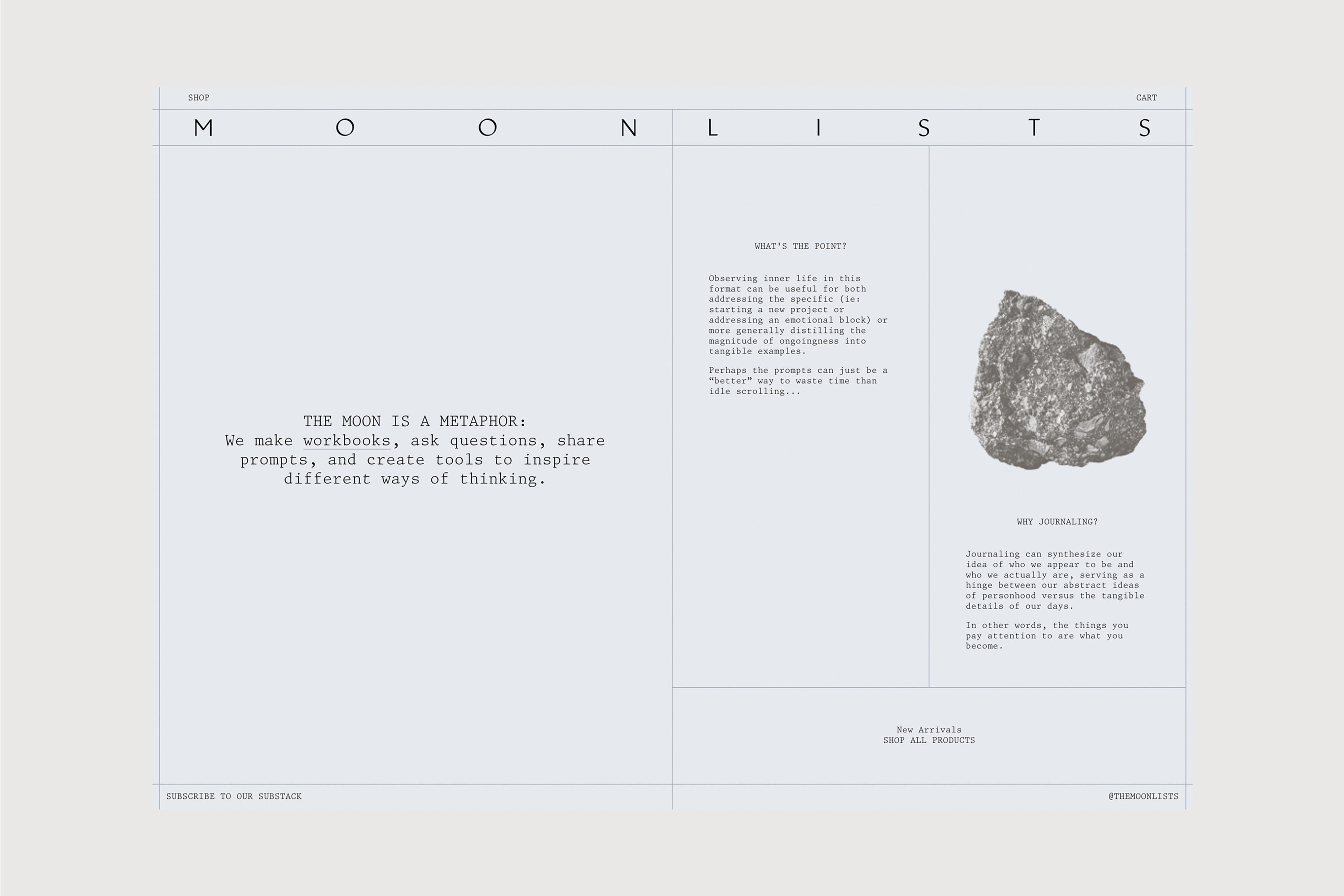
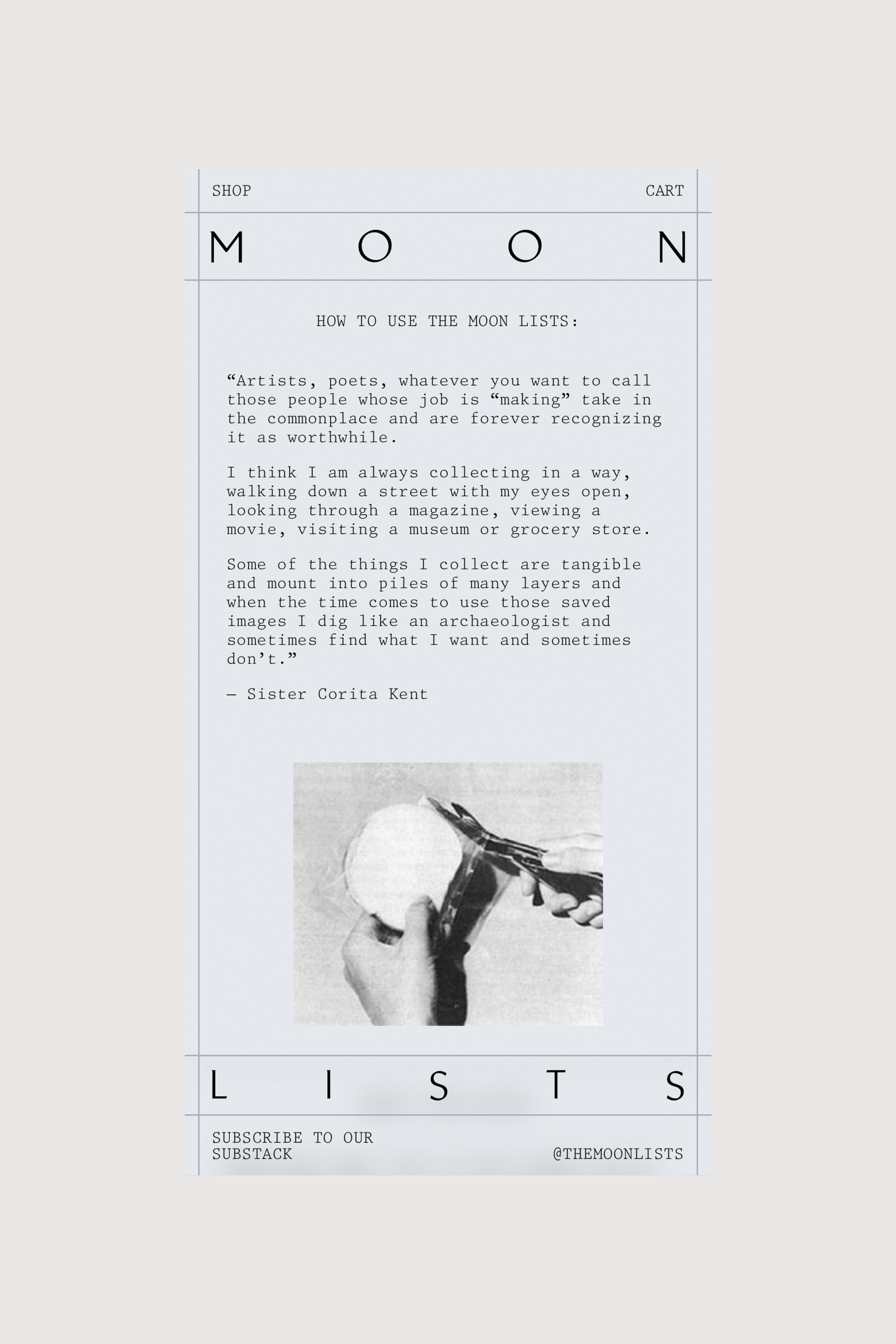
Moon Lists

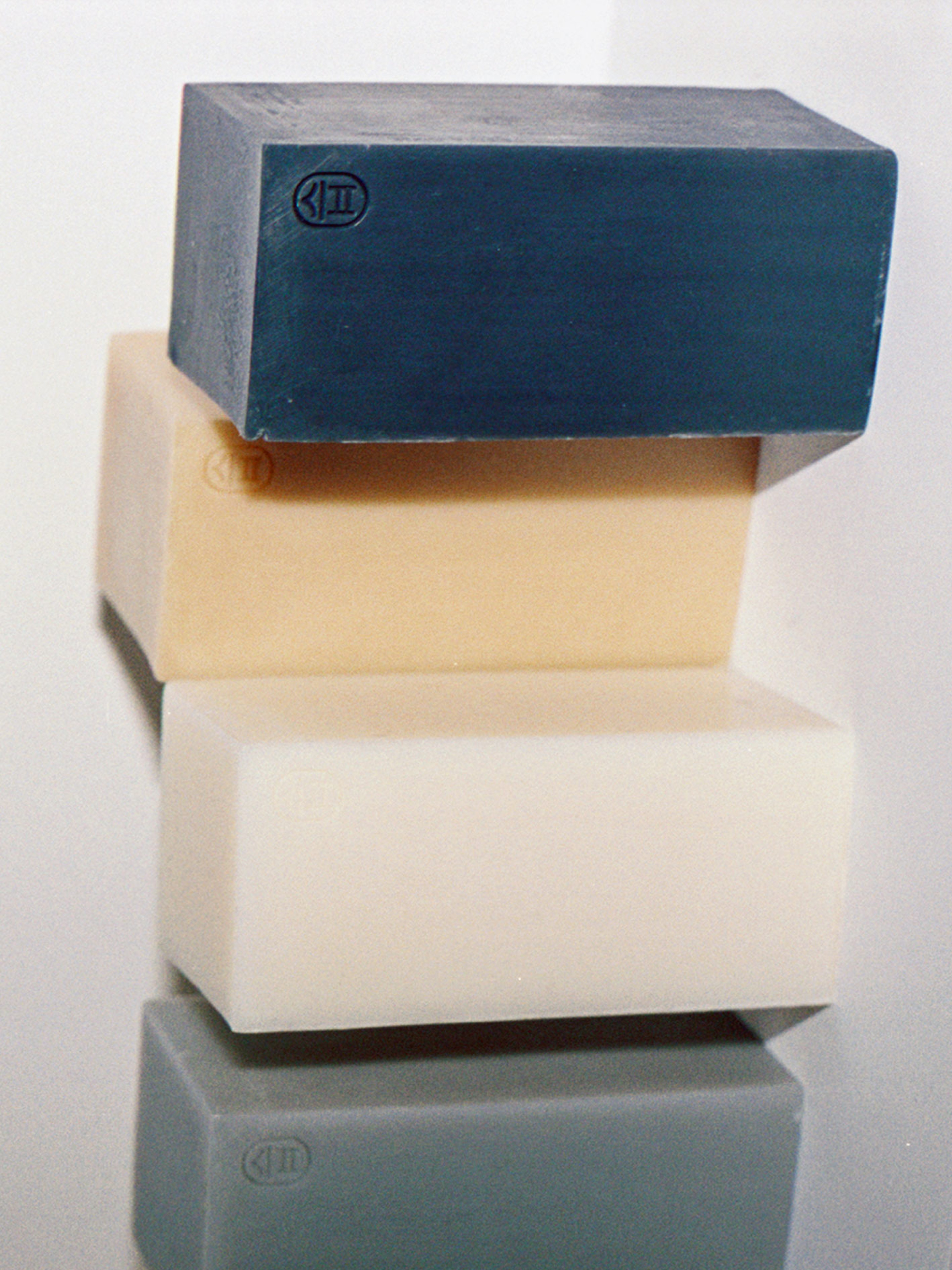
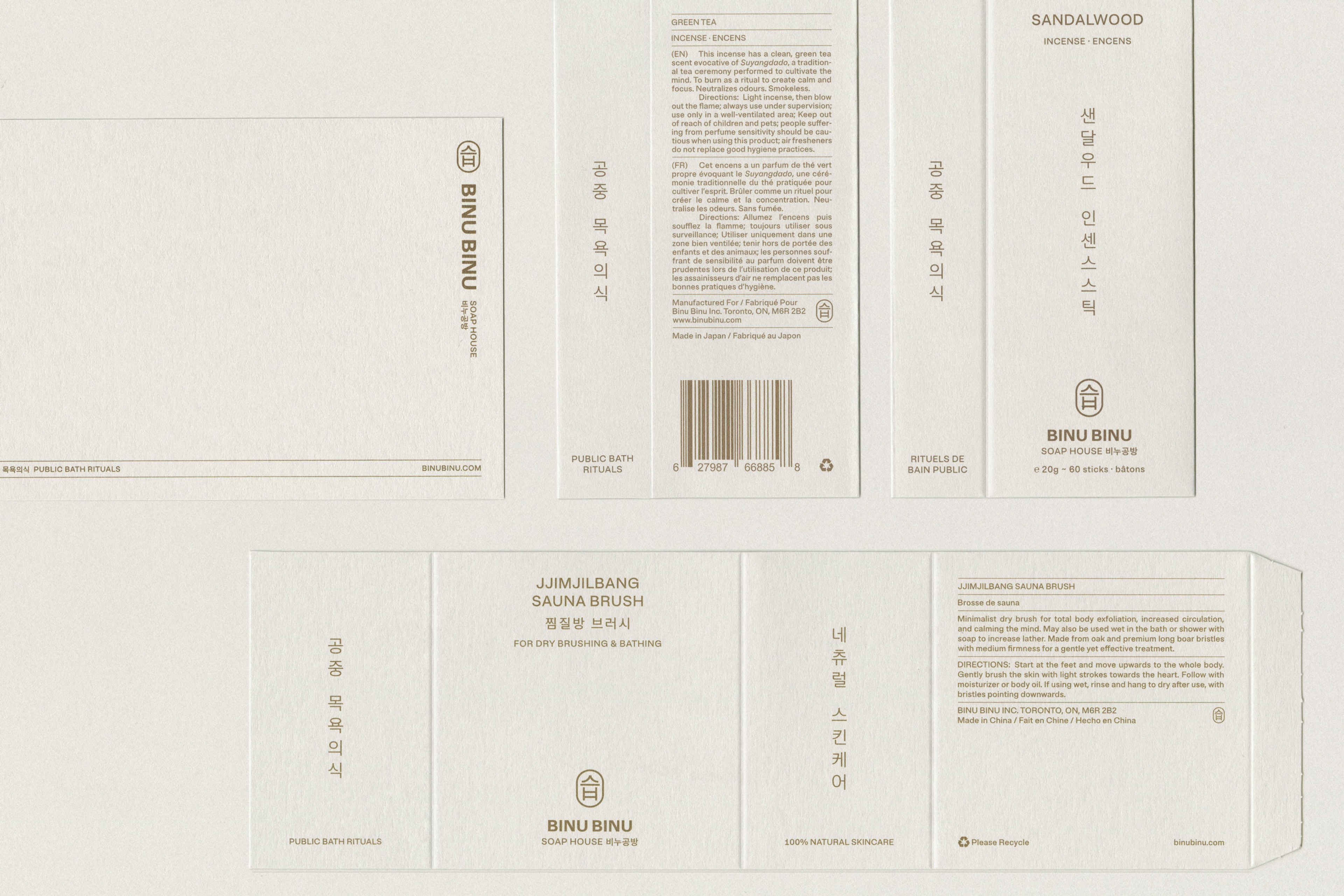
BINU BINU


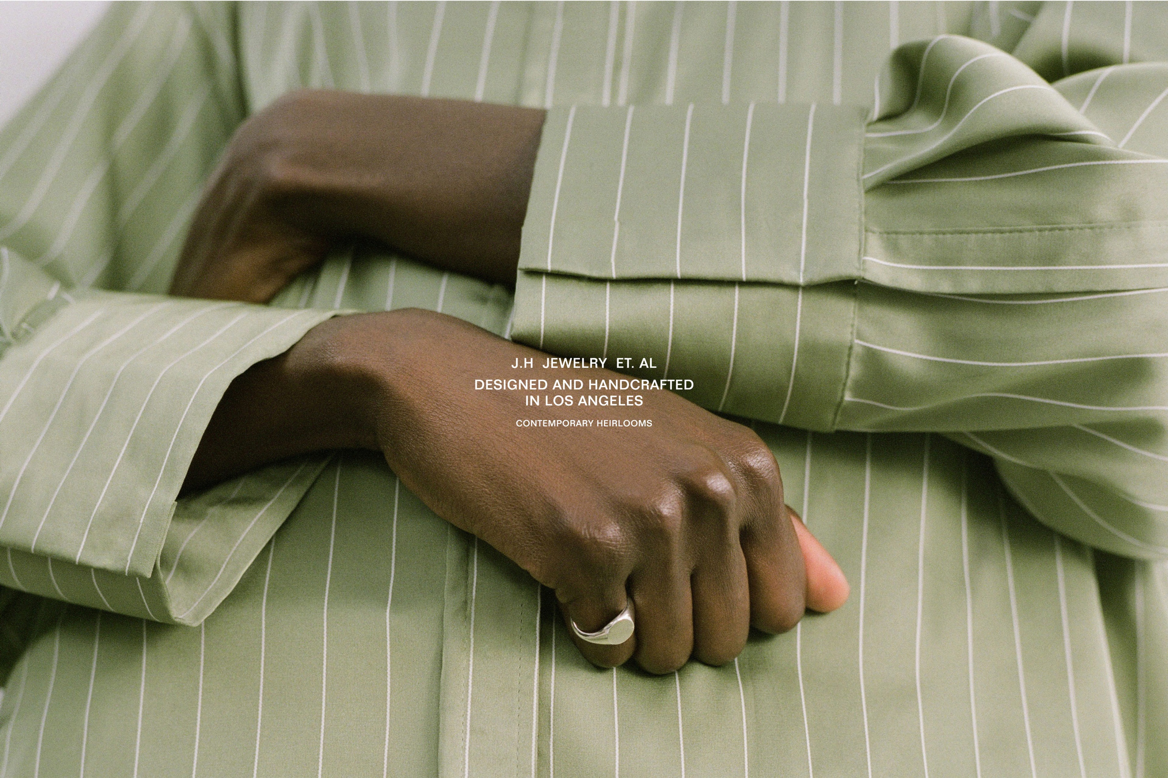
J.Hannah