Solutions
Collaborators
Interiors
Photography
Overview
Led by distinctive typography and tone, our brand identity for sourdough bakery Florets translated the values of substance, nutrition and slow fermentation into a cohesive presence in-store and online, transforming a new bakery into a beloved neighbourhood institution.
Contents
Branding
Context
When Maya Handley returned to New Zealand From New York, where she’d trained in artisanal bread making, she approached us to establish an identity for the bakery she intended to open, focused on slow-fermented sourdough loaves made from organic flour. The notion of wholesomeness accordingly informed our positioning of what would become the Florets brand.
Solutions
Brand Identity
Packaging
Print Assets
E-Commerce Design
E-Commerce Development
Digital Assets
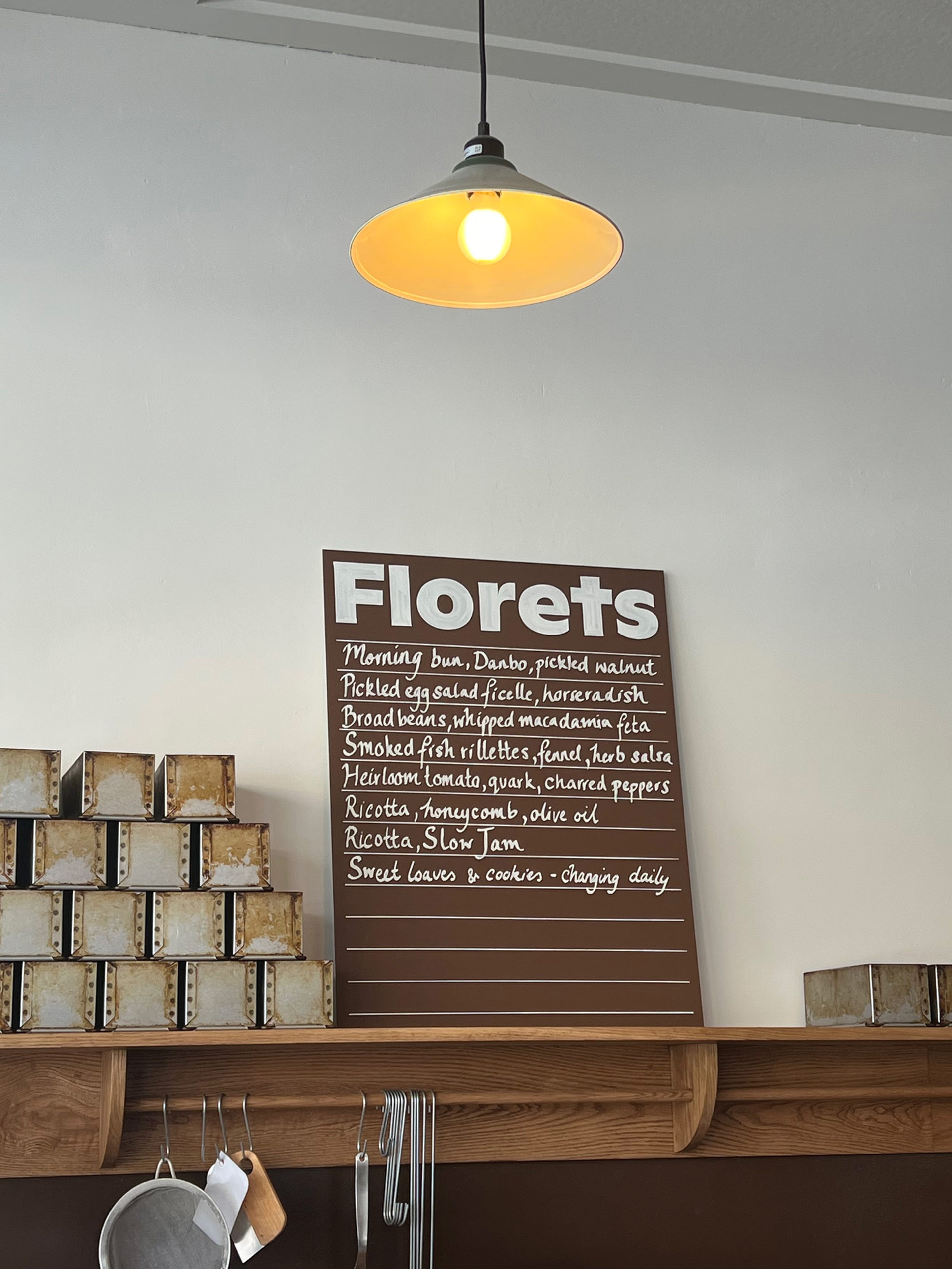
Hand Painted Bakery Signage
Context
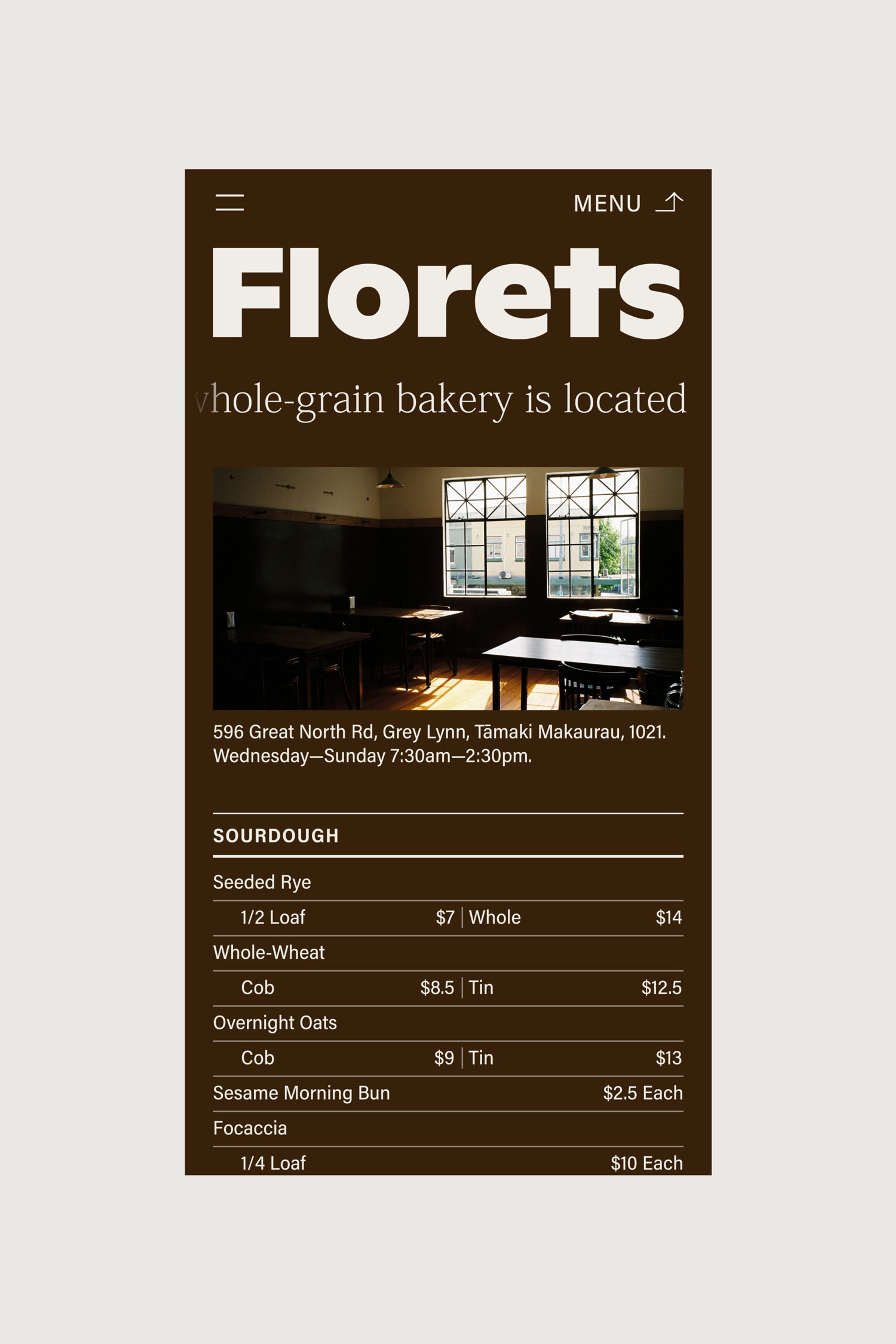
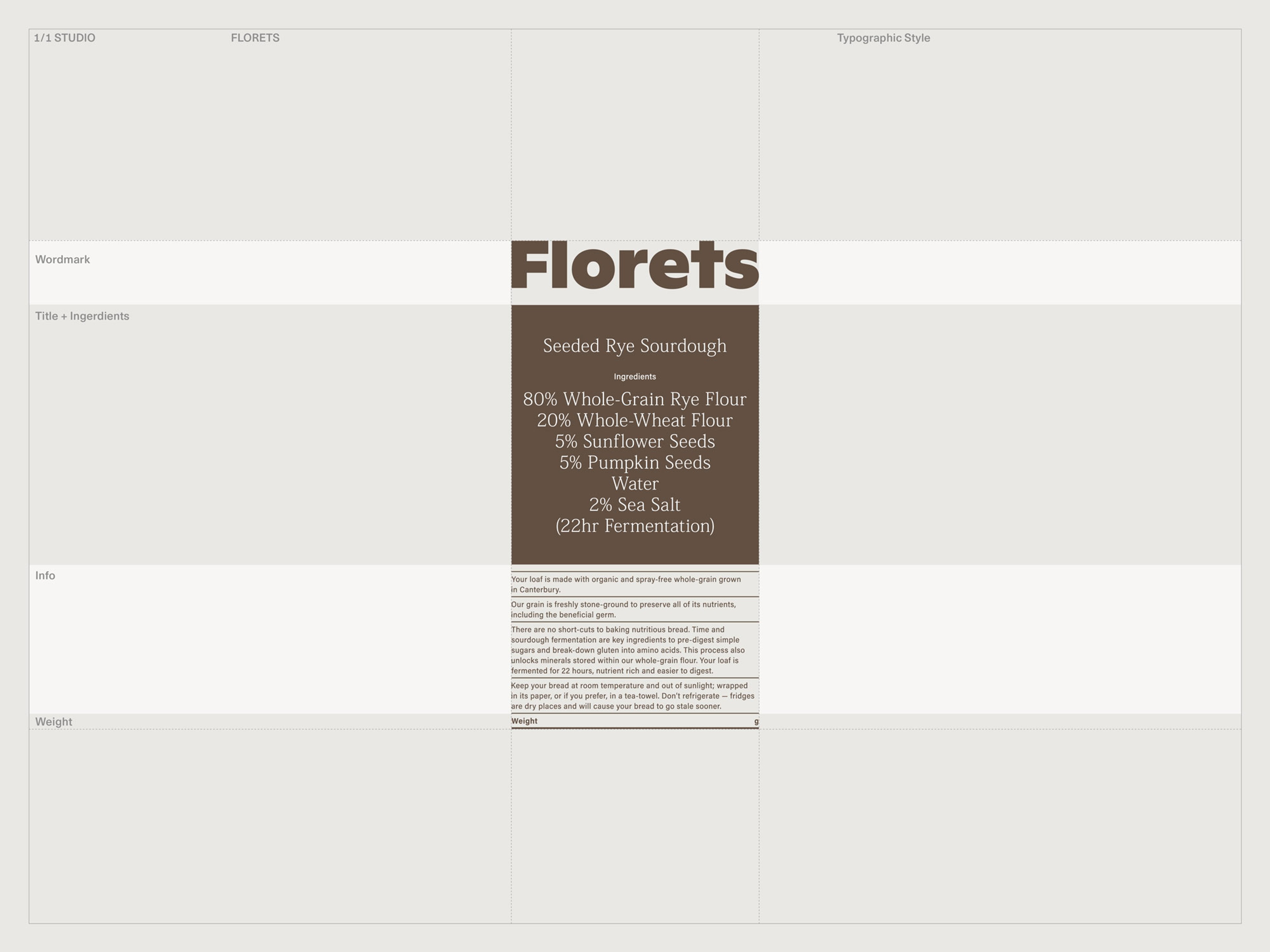
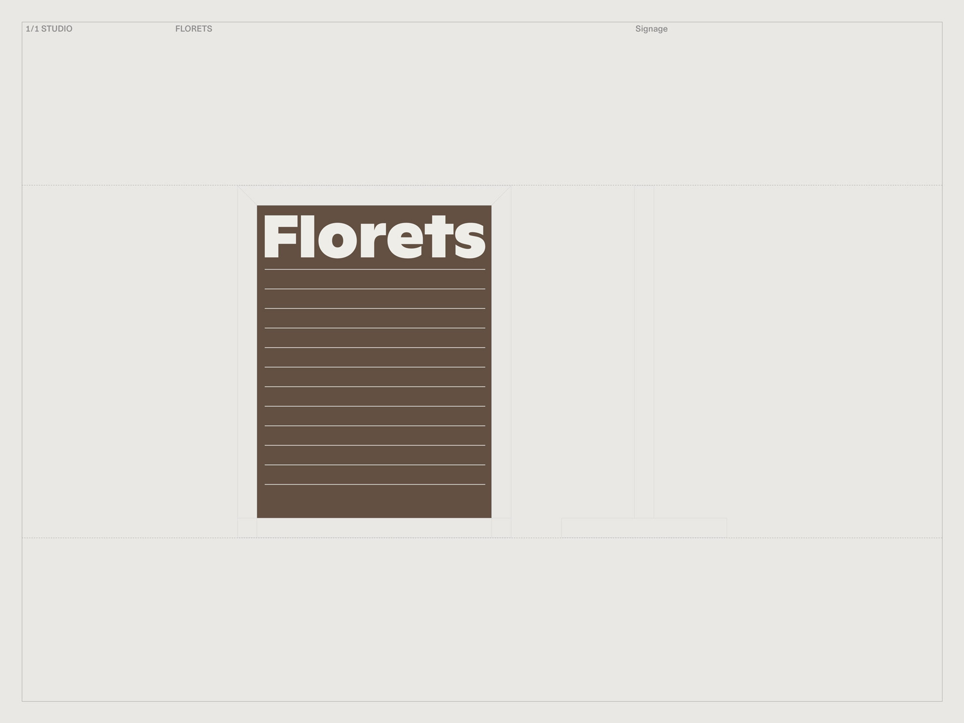
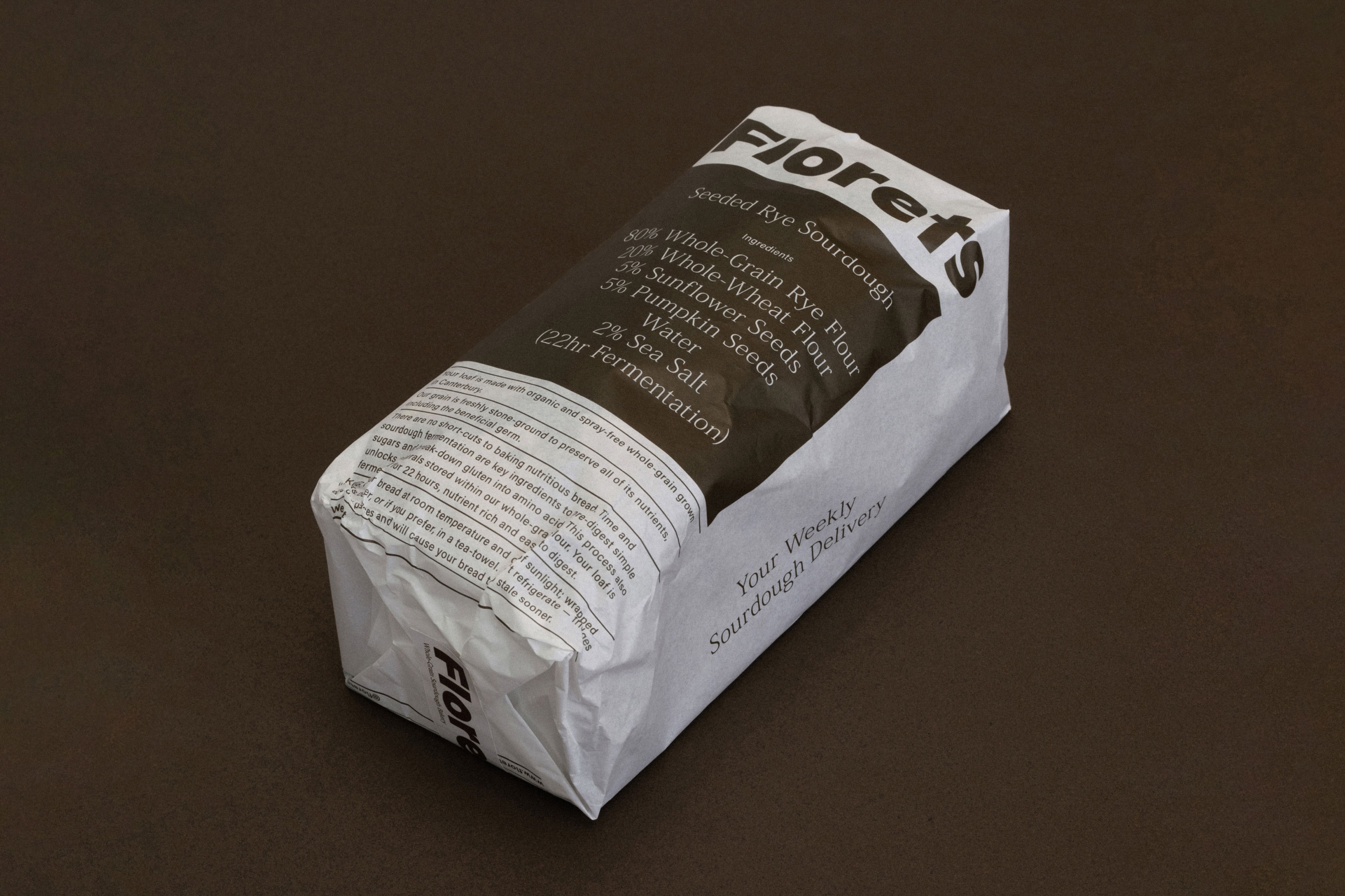
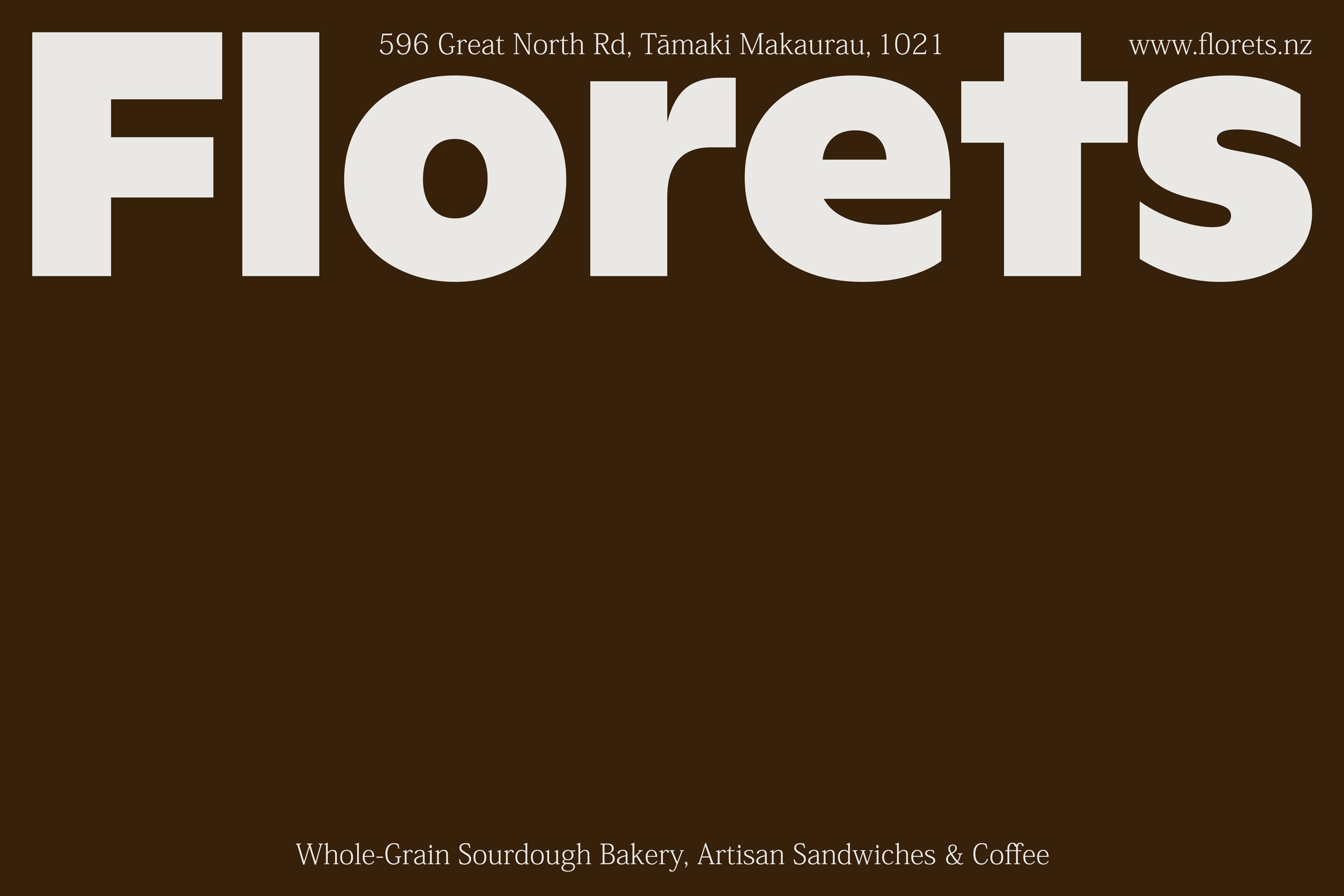
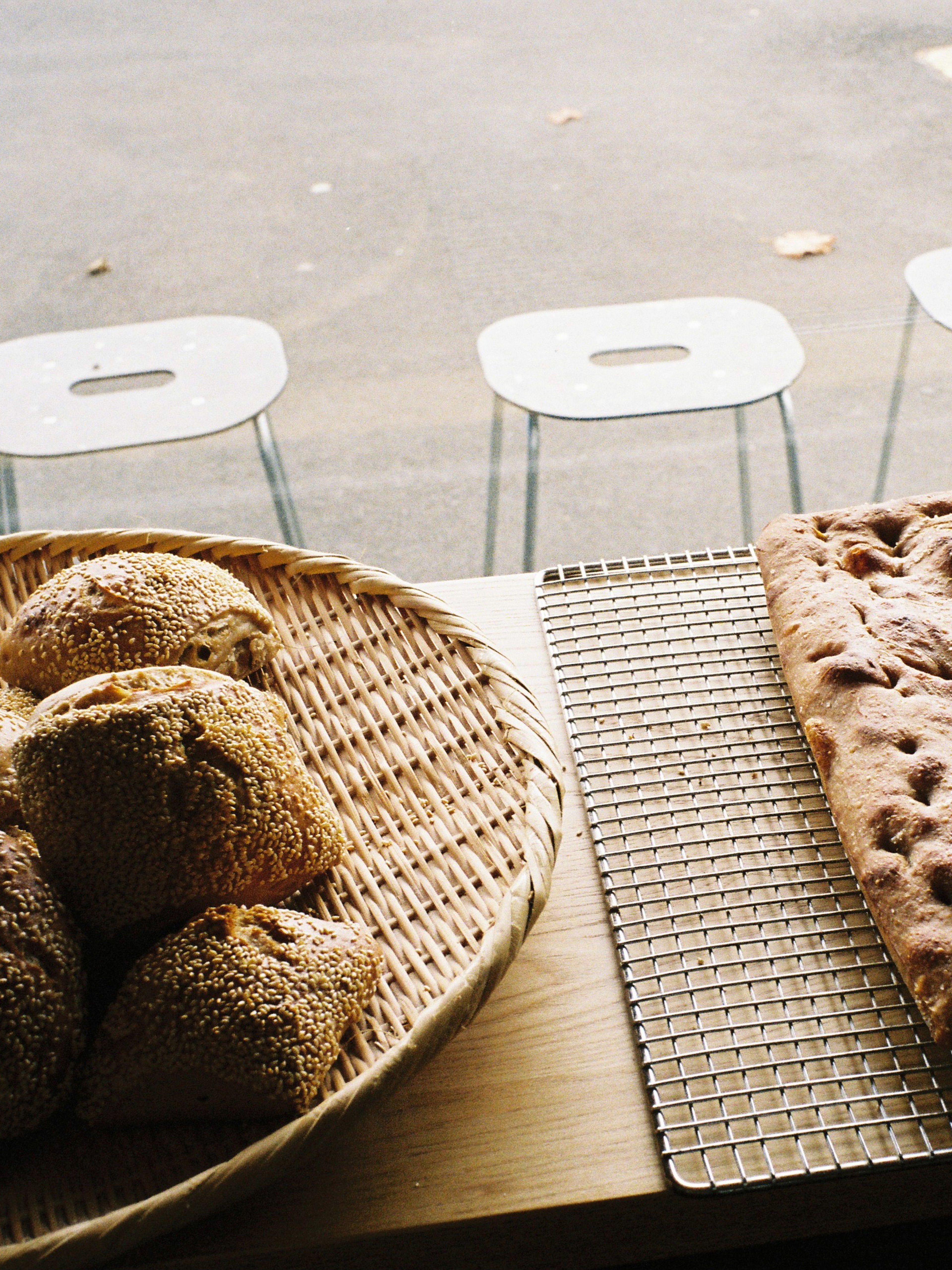
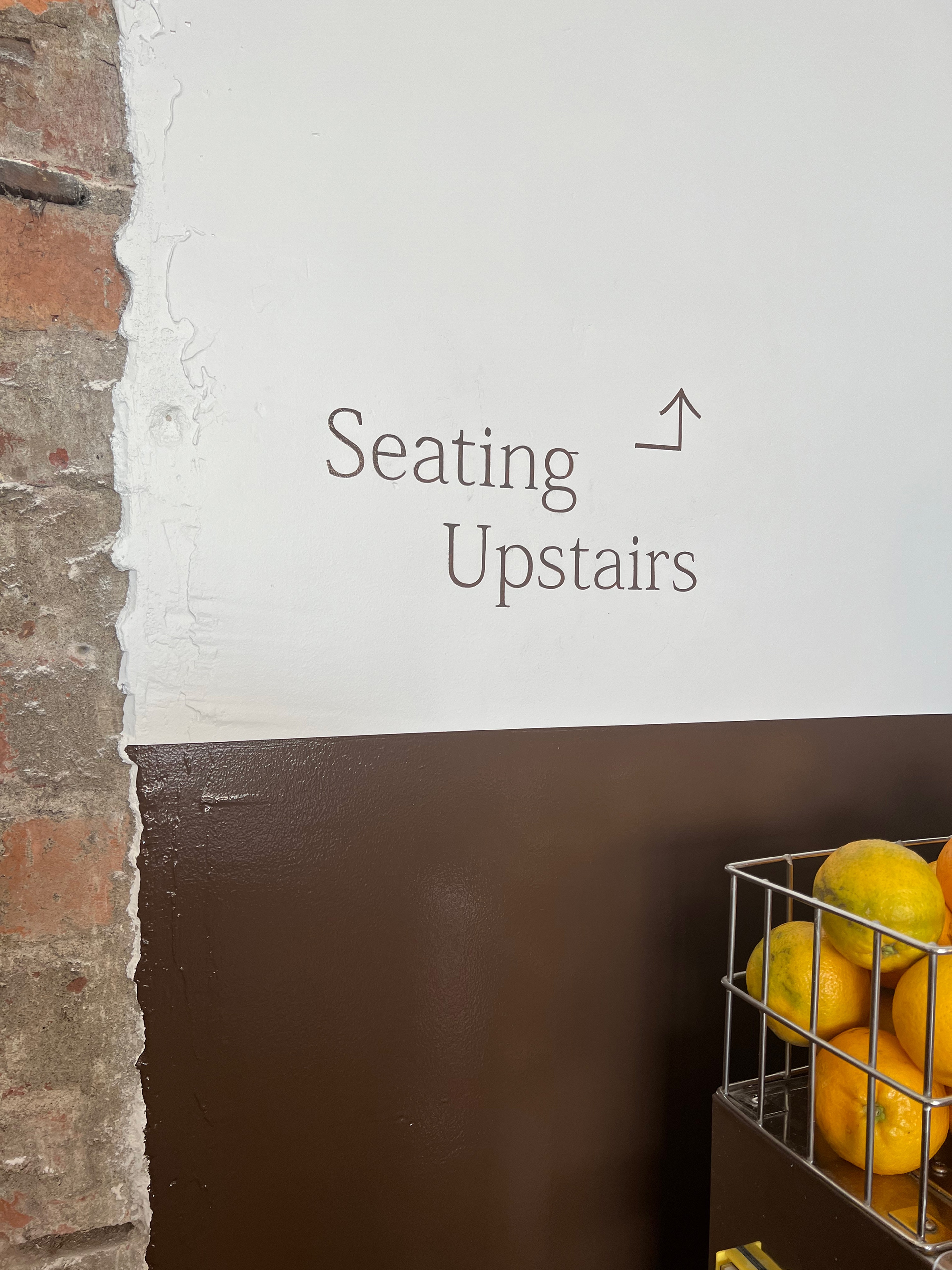
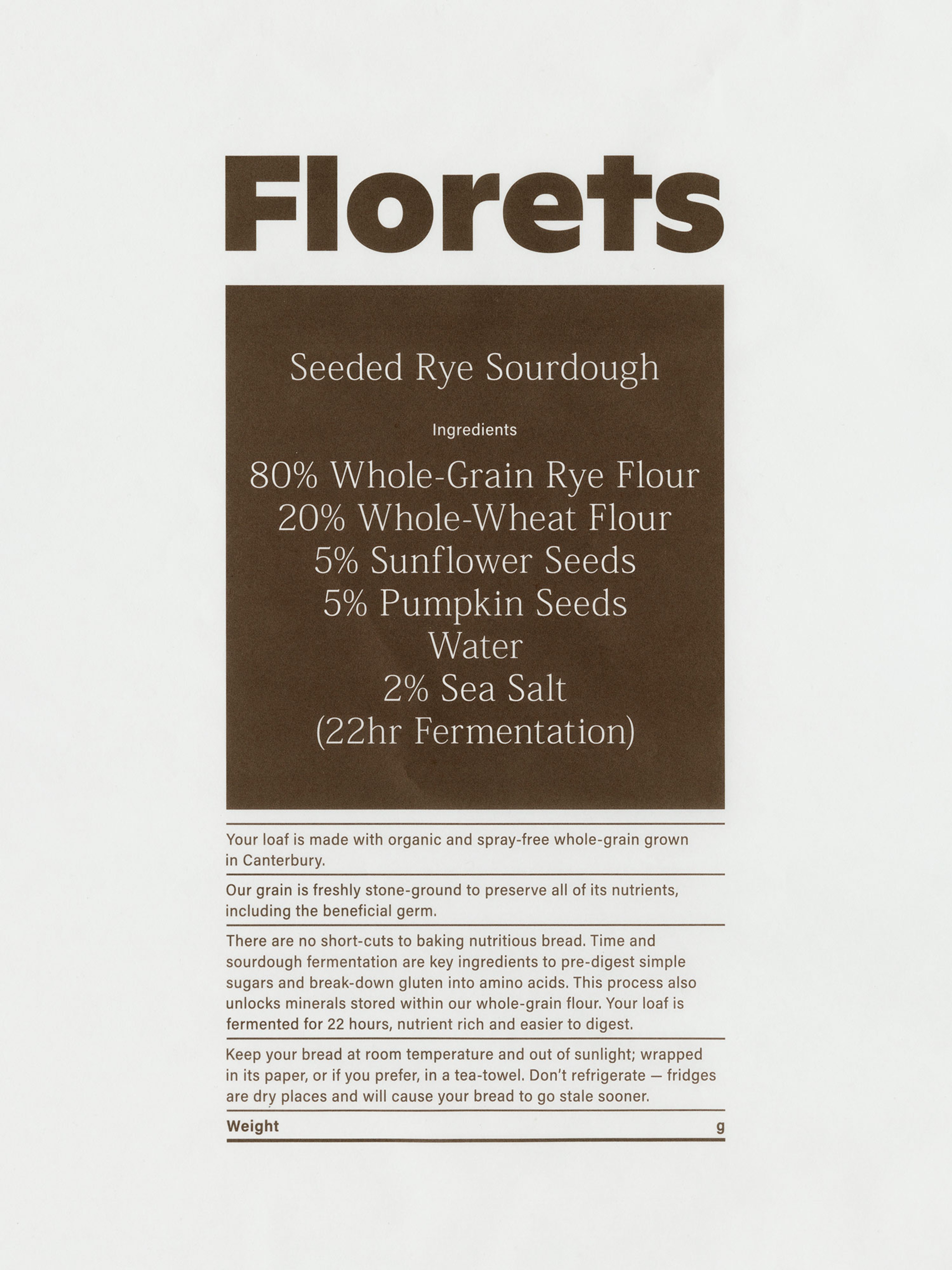
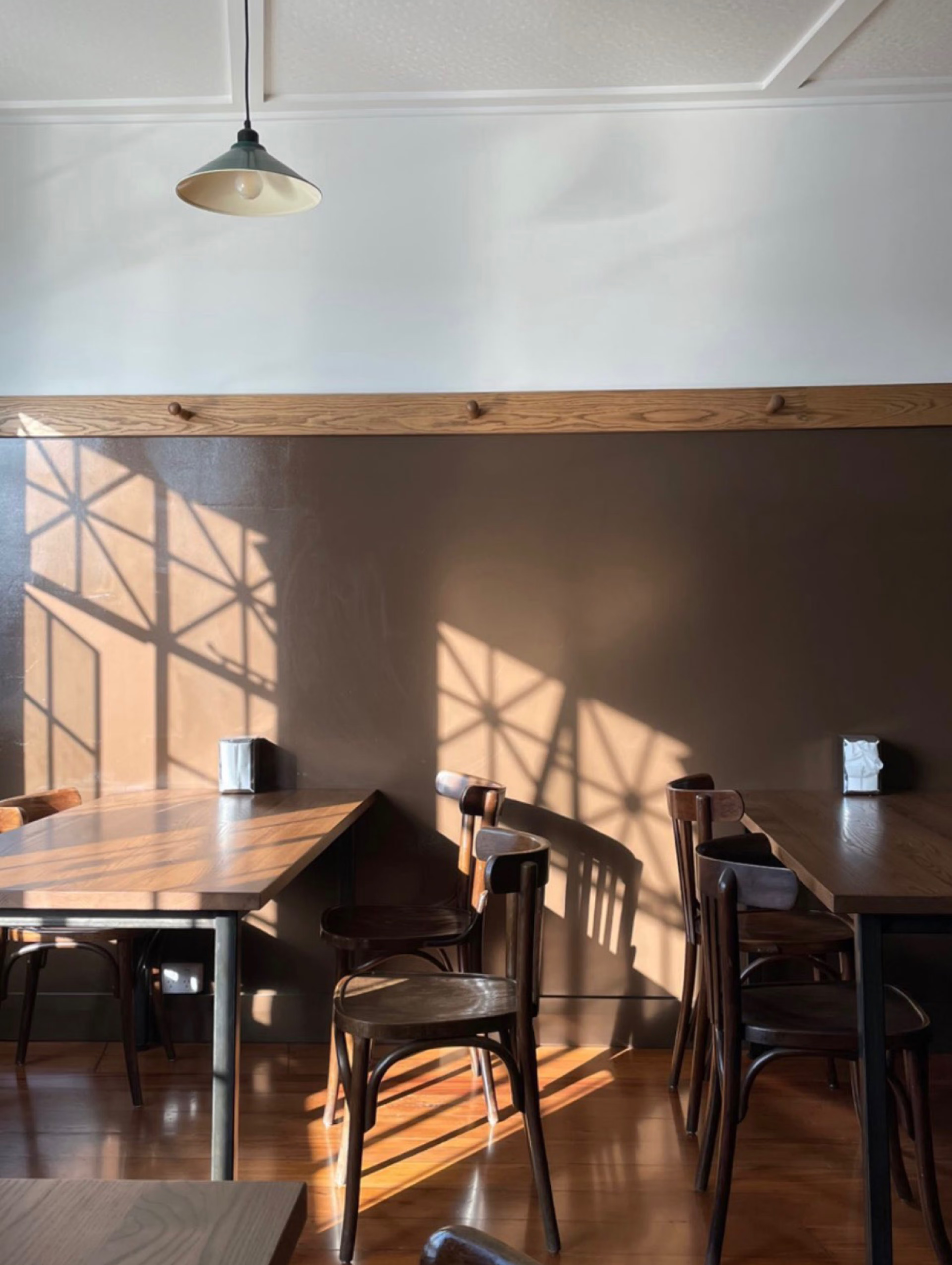
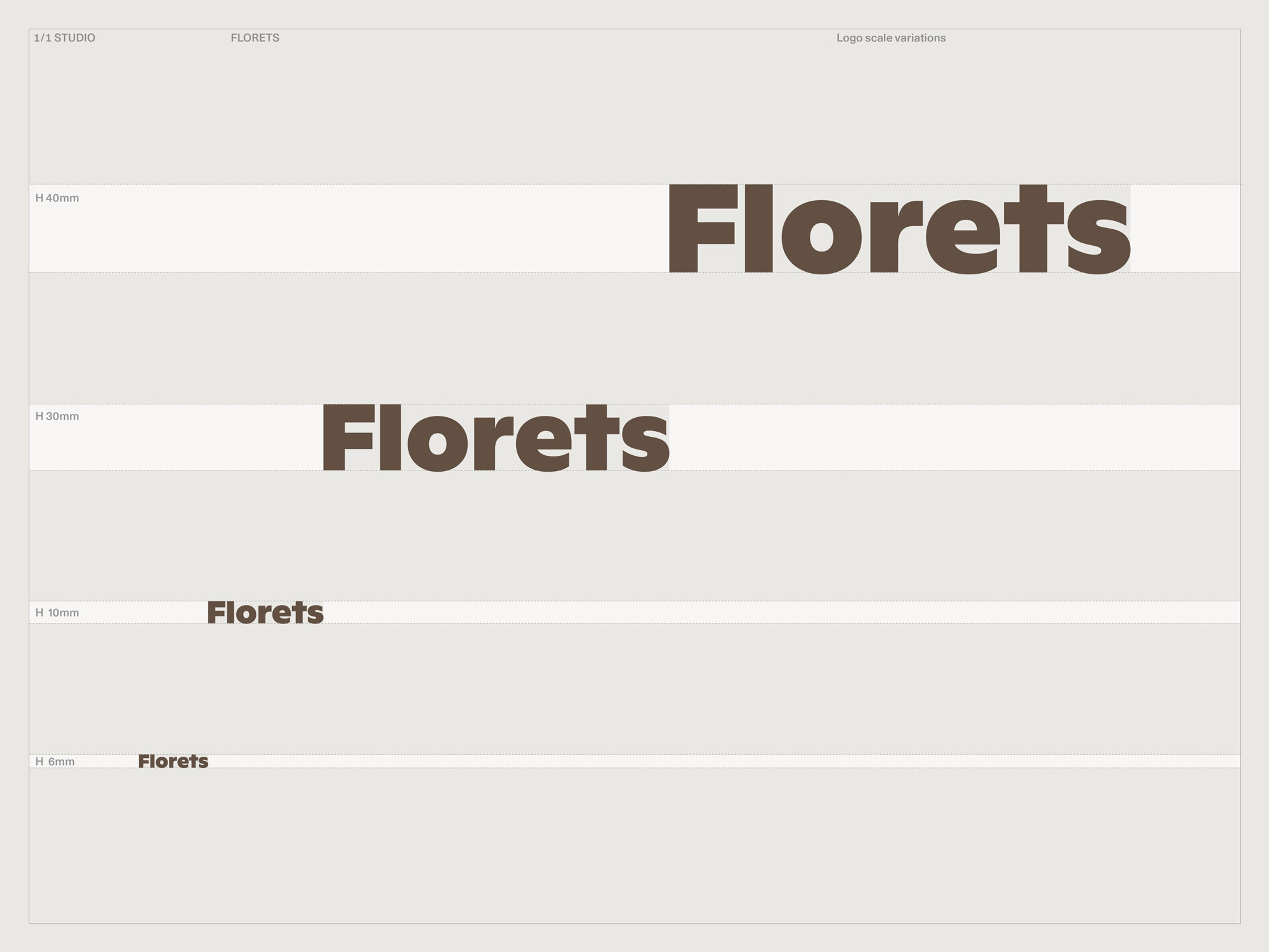
Setting the foundations for a unified presence across the physical store and its digital representation through typography and tone inflected with a gentle nostalgia, we referenced the format of old flour bags to pair a humanist wordmark offset by informative typography with a rich umber tone. In the bakery-café in Auckland’s Grey Lynn neighbourhood, this translated to hand-painted, corner store-inspired signage and wall vinyl applied in collaboration with design practice Hatch Workshop, who fitted out the interior. Carrying the identity through to product packaging, we designed the compostable and recyclable paper wrap that envelops each loaf to double as a canvas for sharing the story of Florets and the components of its bread, conveying the centrality of time to Maya’s craft while offering a comforting and memorable takeaway.

Context
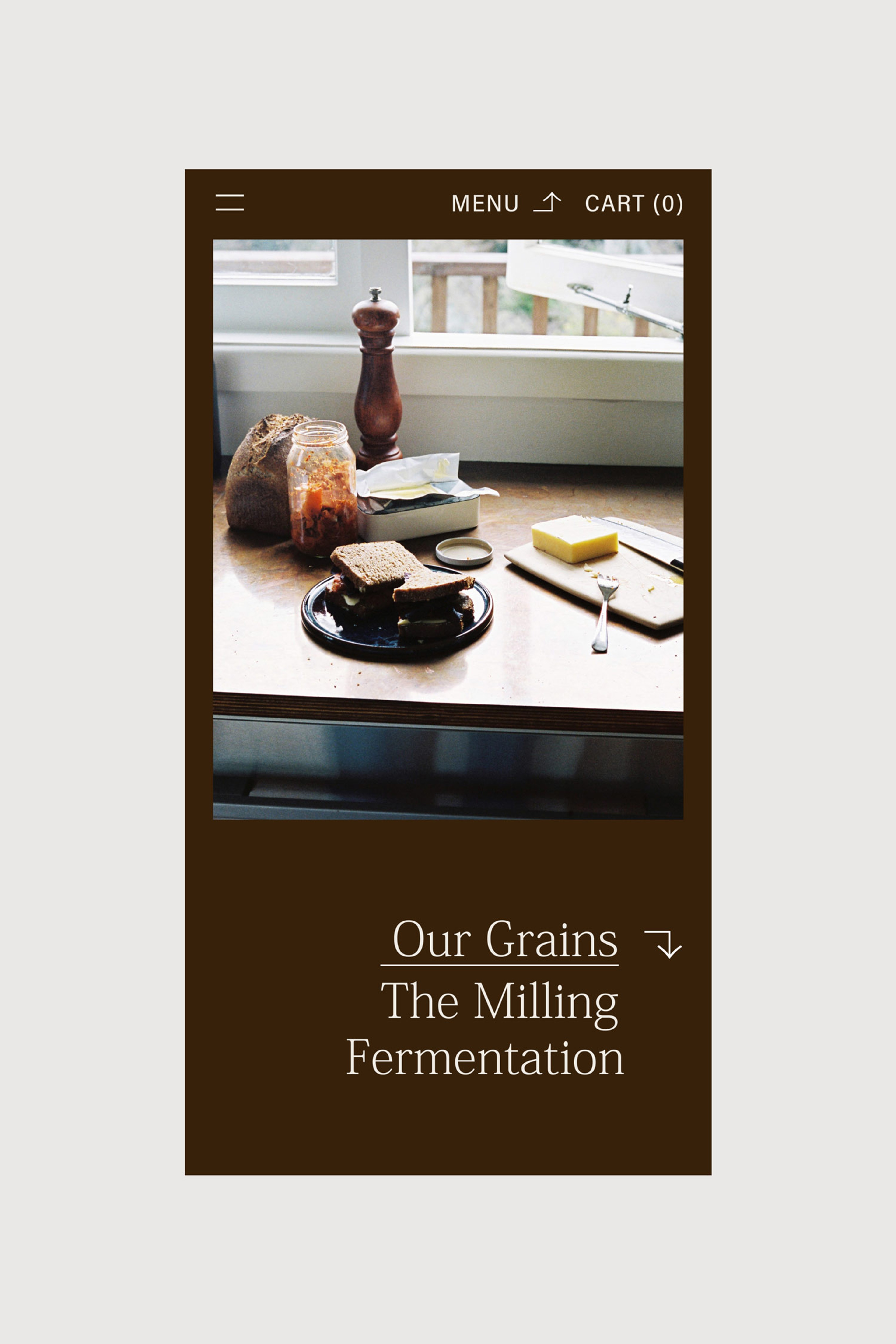
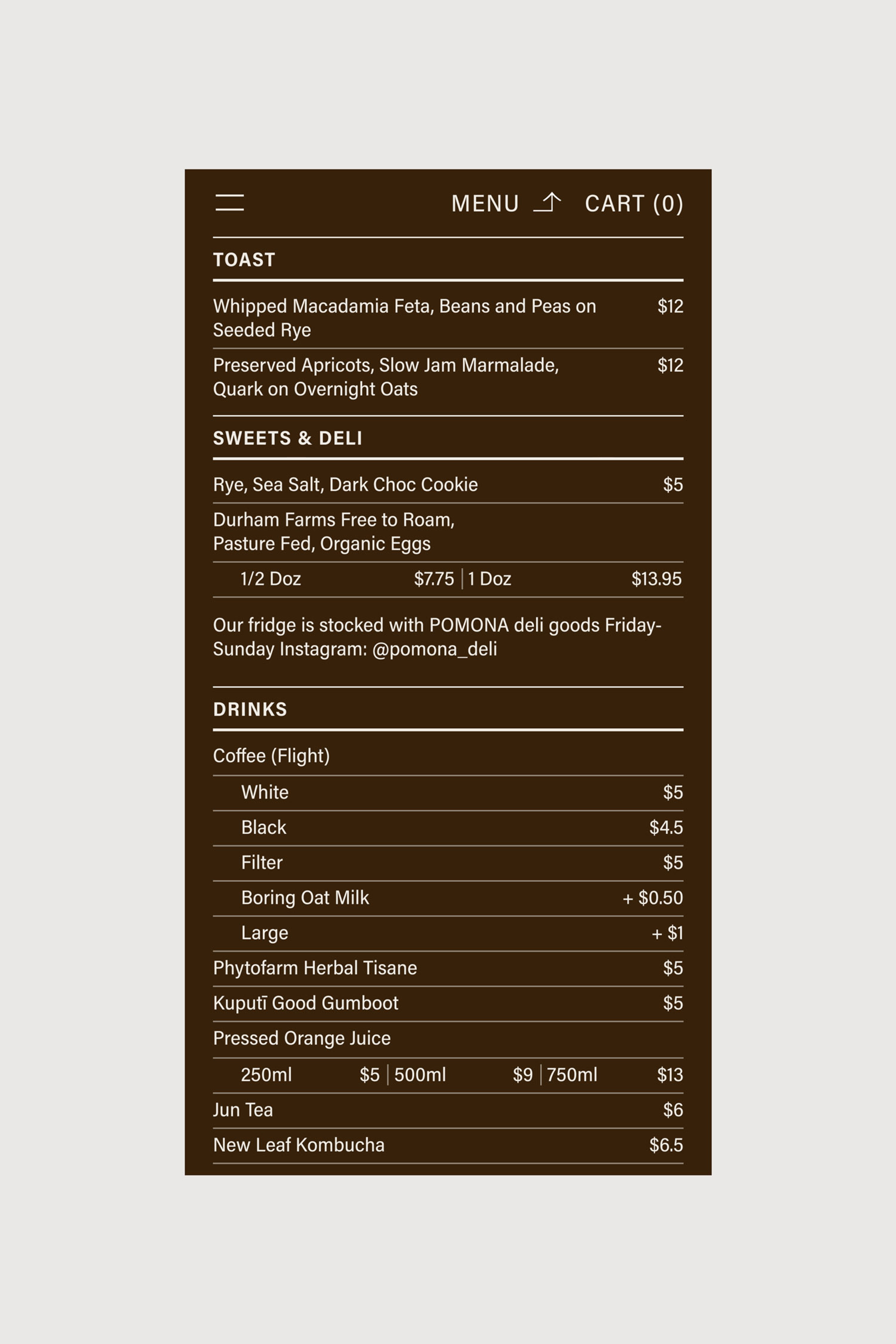
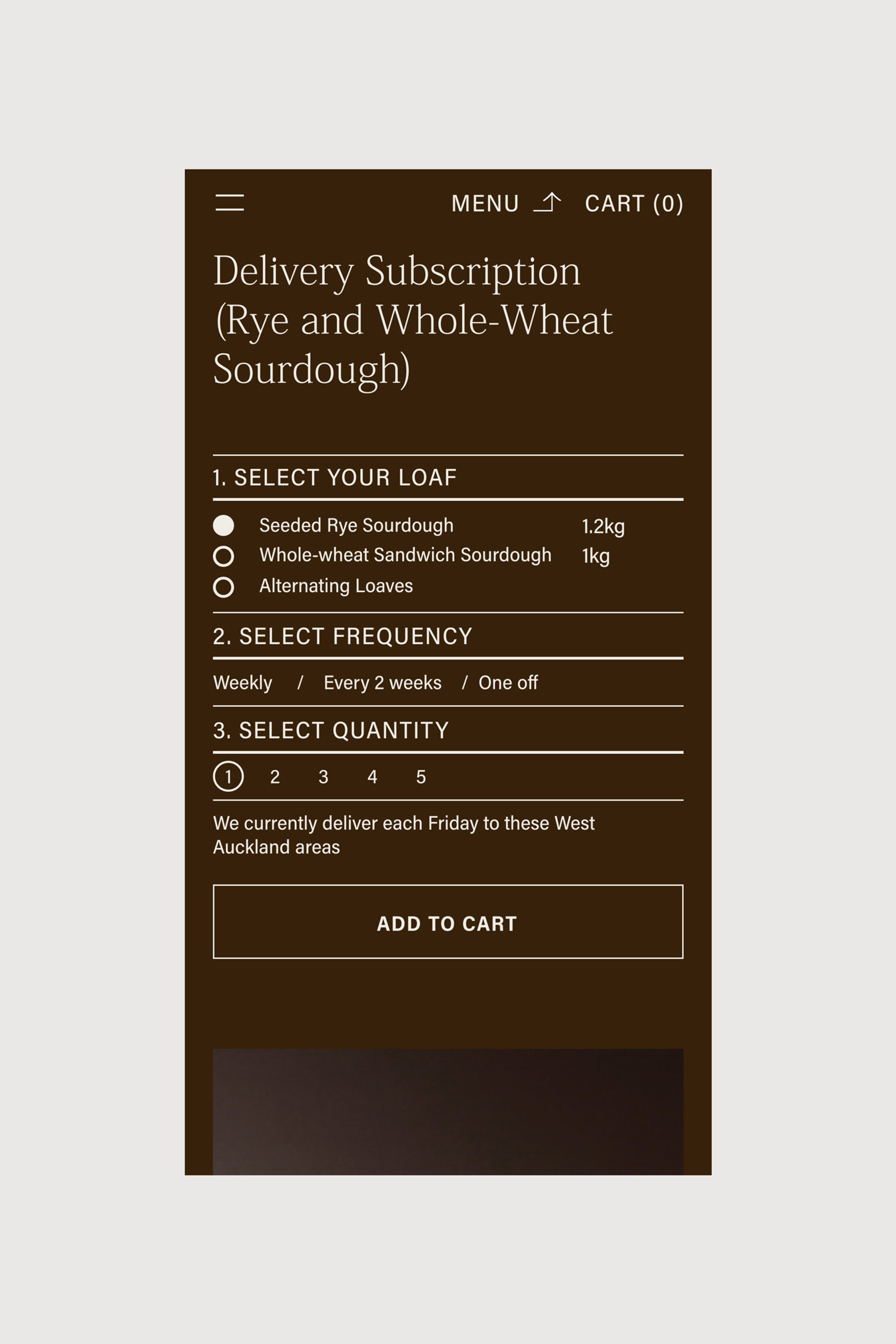
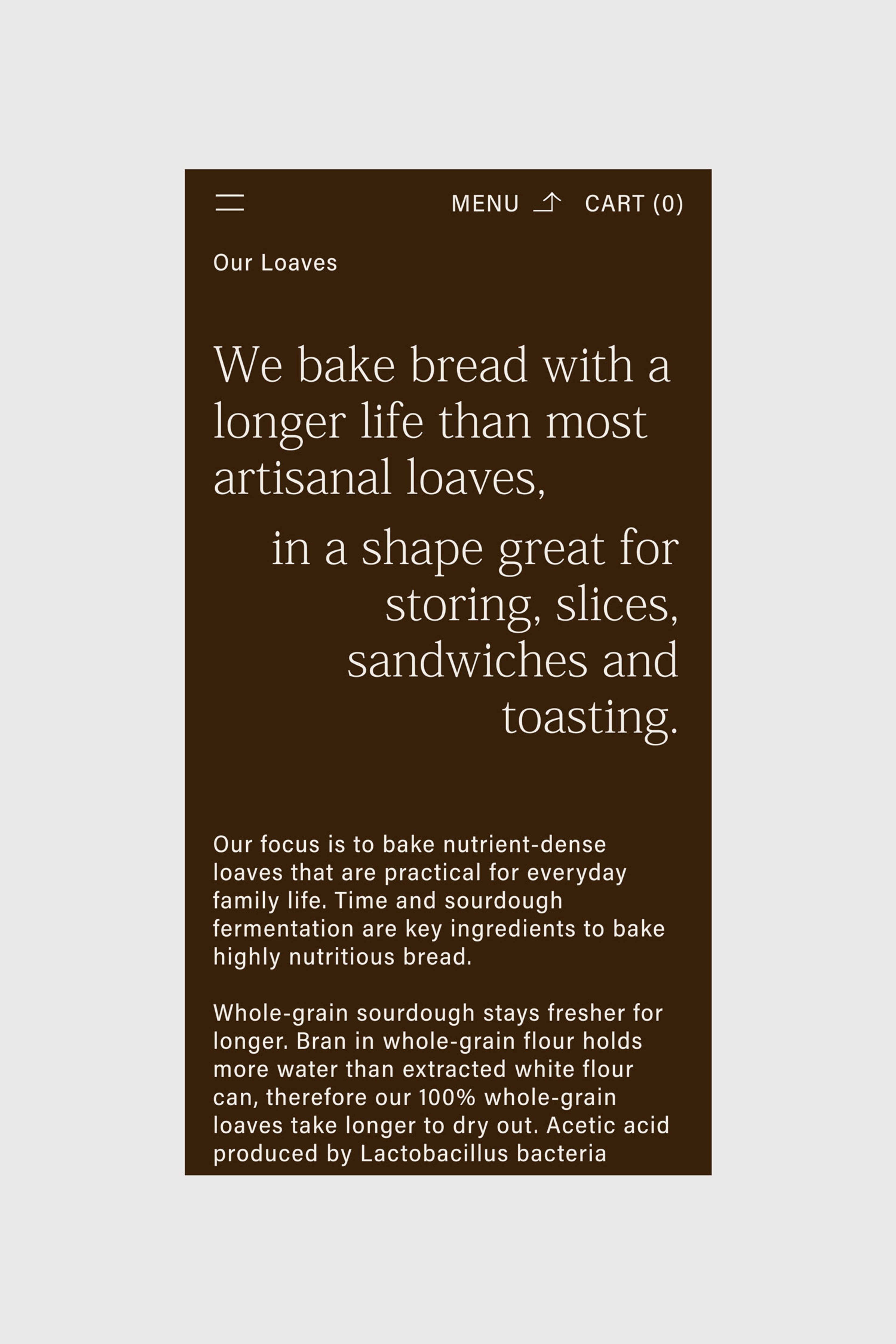
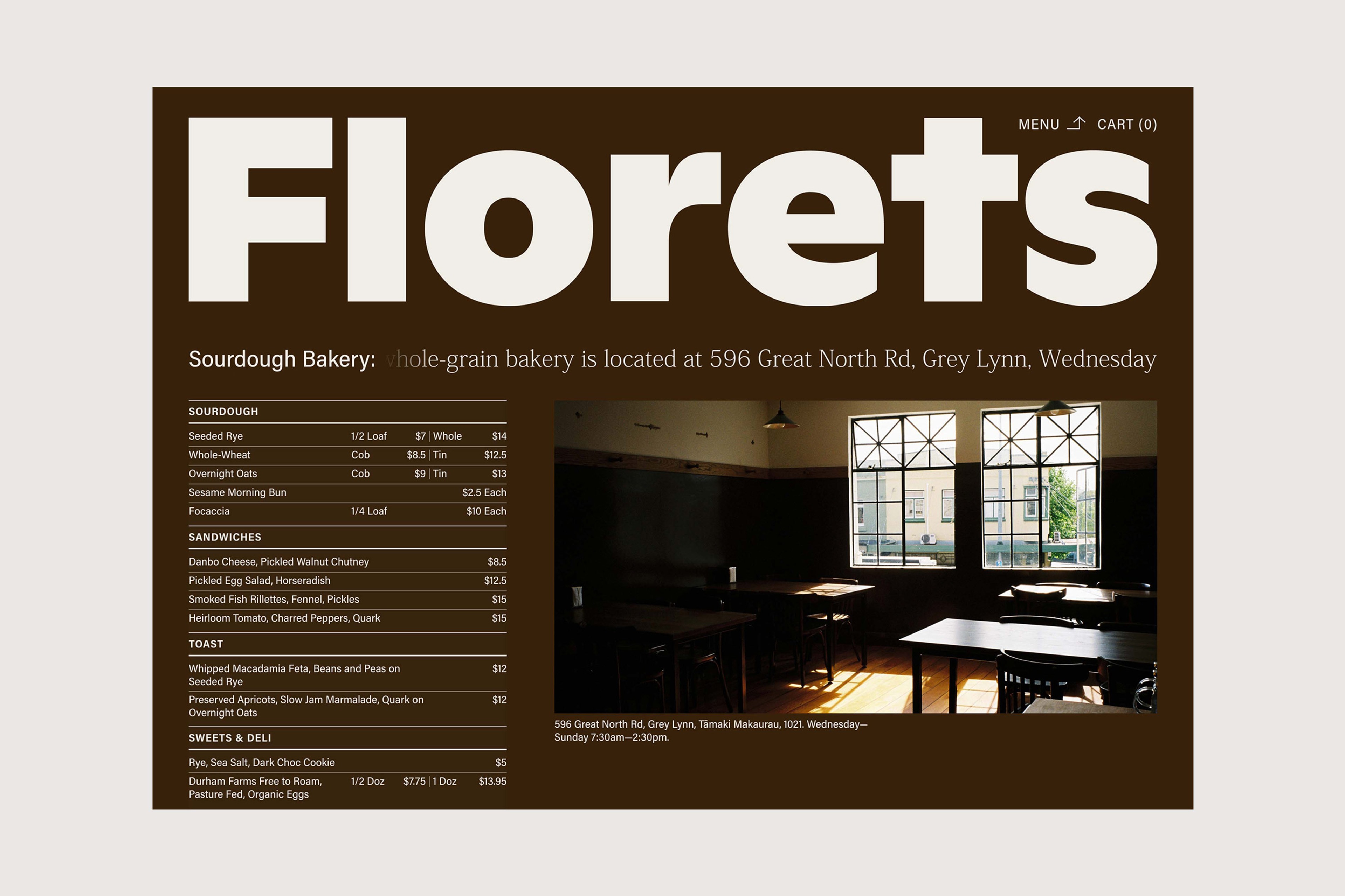
A tonal website goes deeper into the Florets philosophy, playing on the contrast between substance and levity to convey nutritional value, completing an identity that has gained recognition and resonated with the local community as much as the product it represents, enabling Florets to establish itself as a beloved neighbourhood institution.

Graphic Systems
