Solutions
Collaborators
Photographers
Videography
Overview
For REOME, a skincare brand bridging time-honoured beauty rituals and biotechnological innovation, we established a comprehensive identity around a single product, pairing material references from art and architecture with a structured type system to emphasise the brand’s alignment of advanced scientific research and celebration of natural skin texture.
Contents
Packaging
Branding
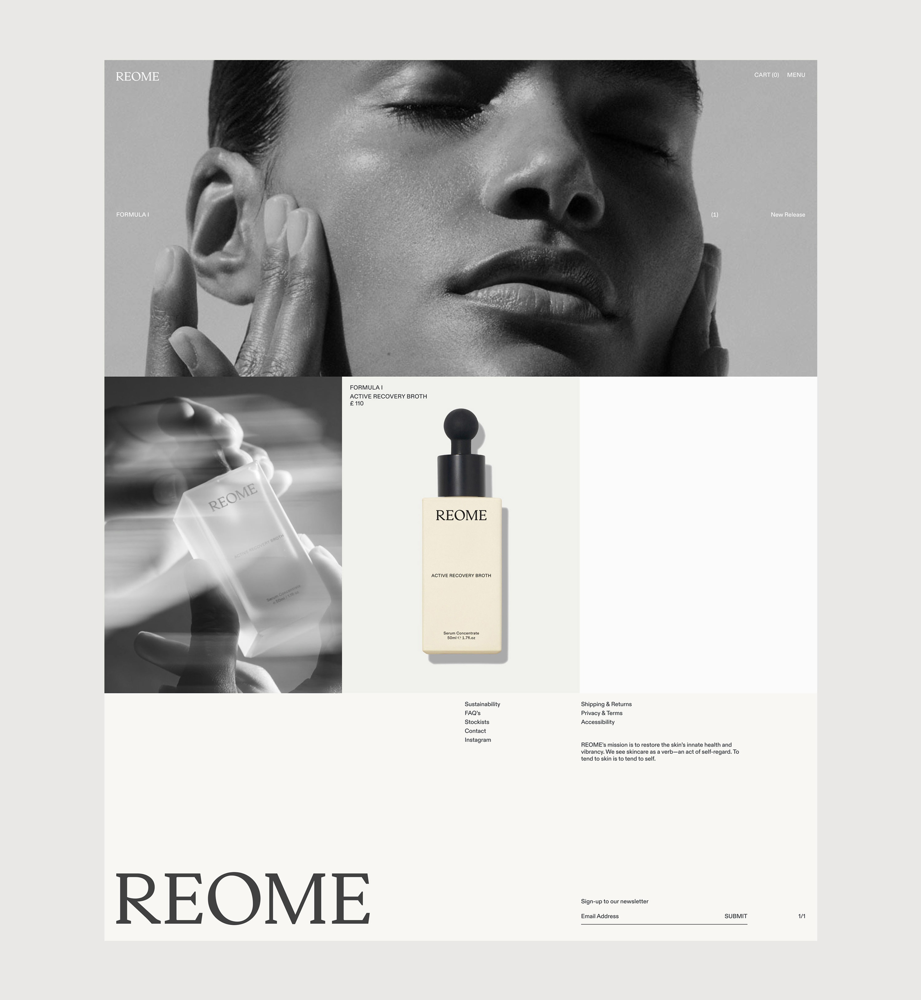
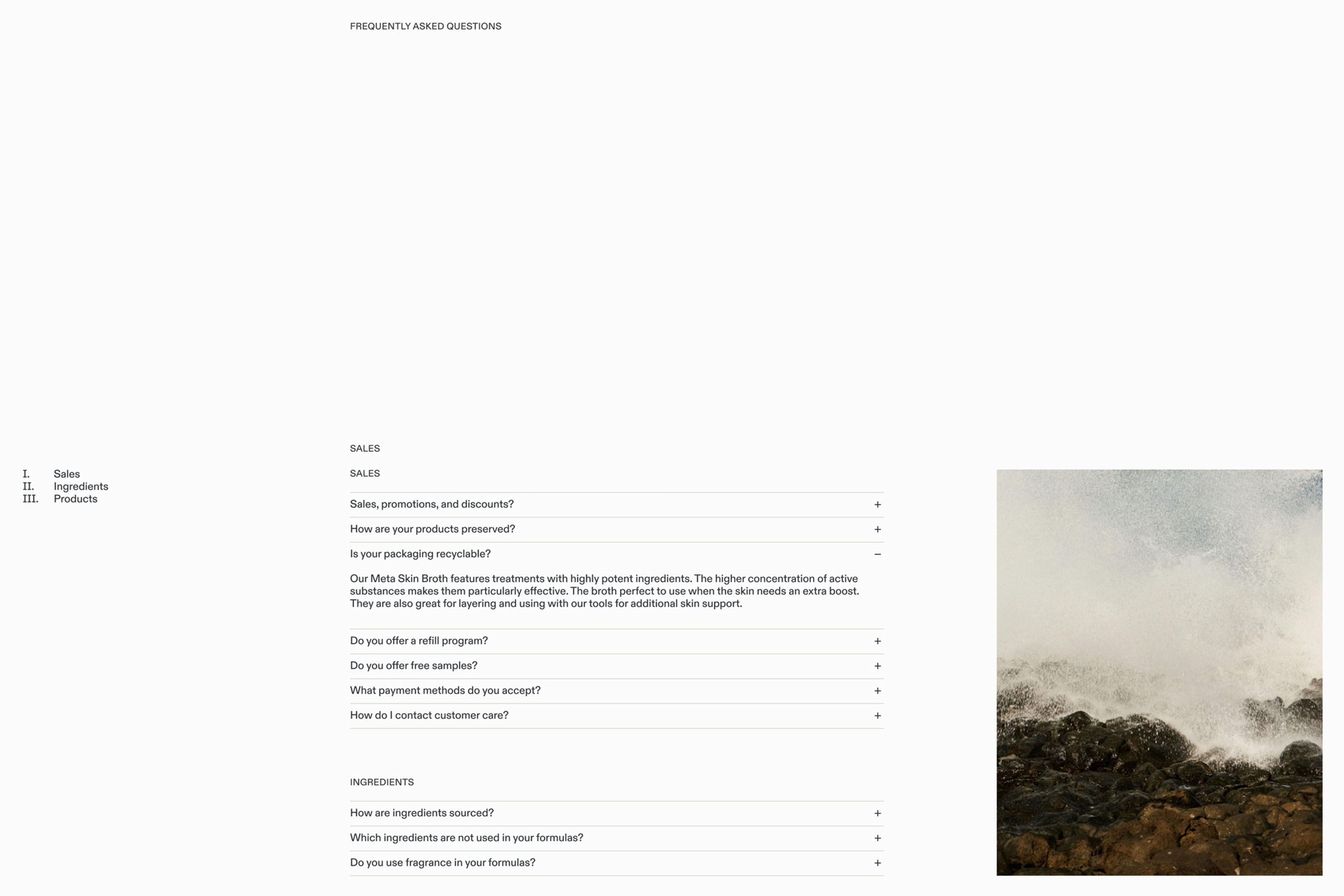
Website
UV Overgloss Treatment
Context
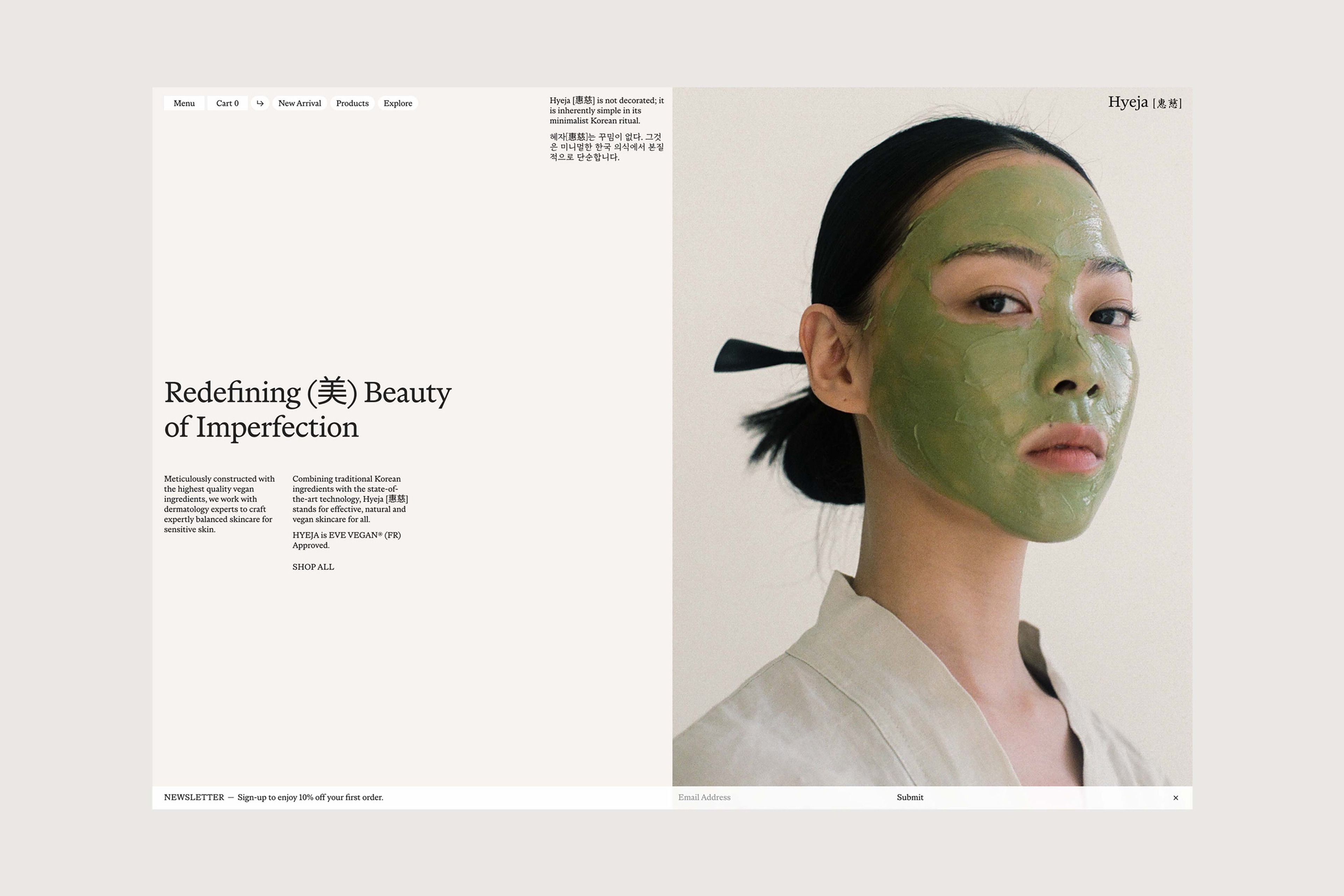
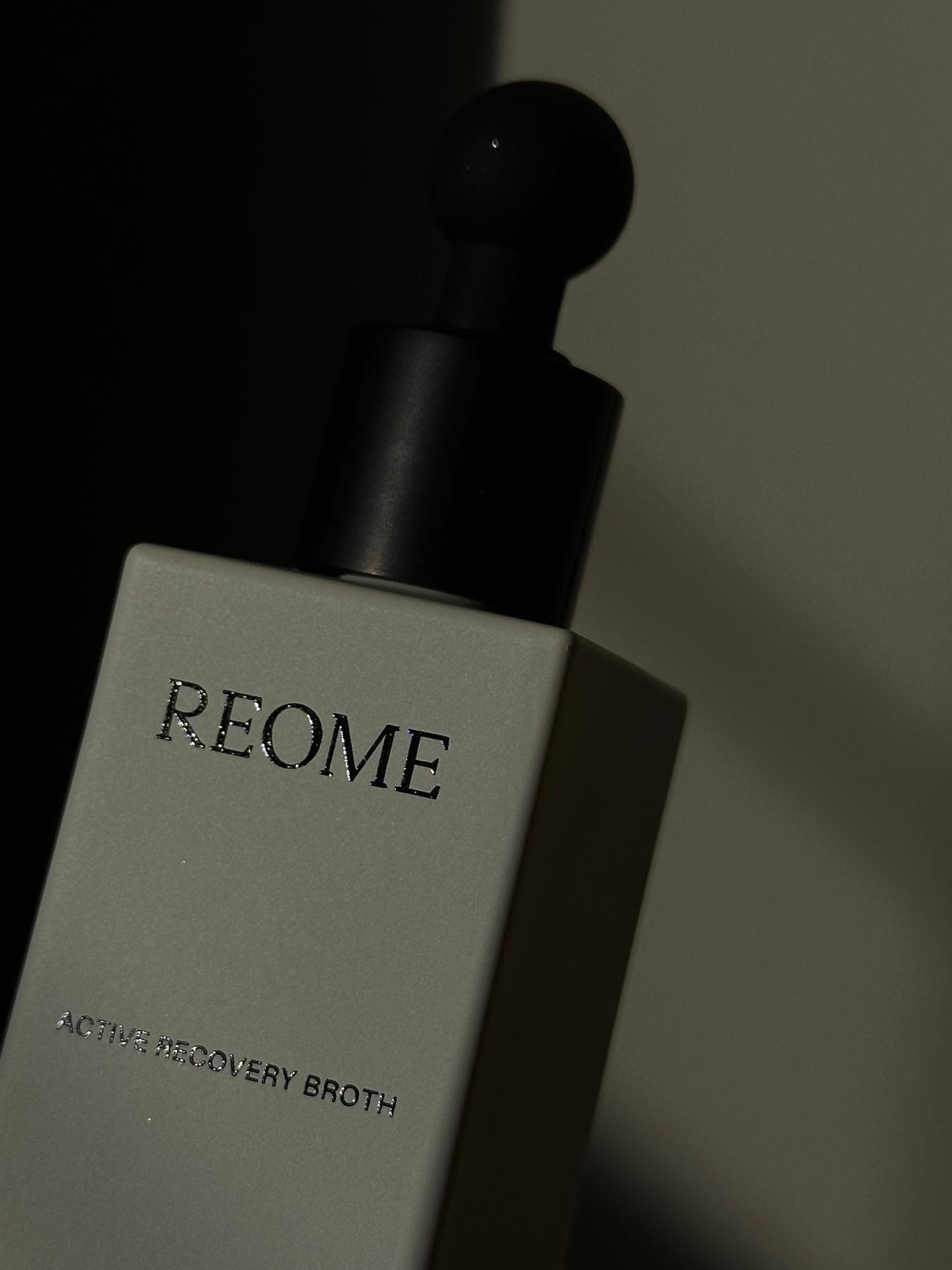
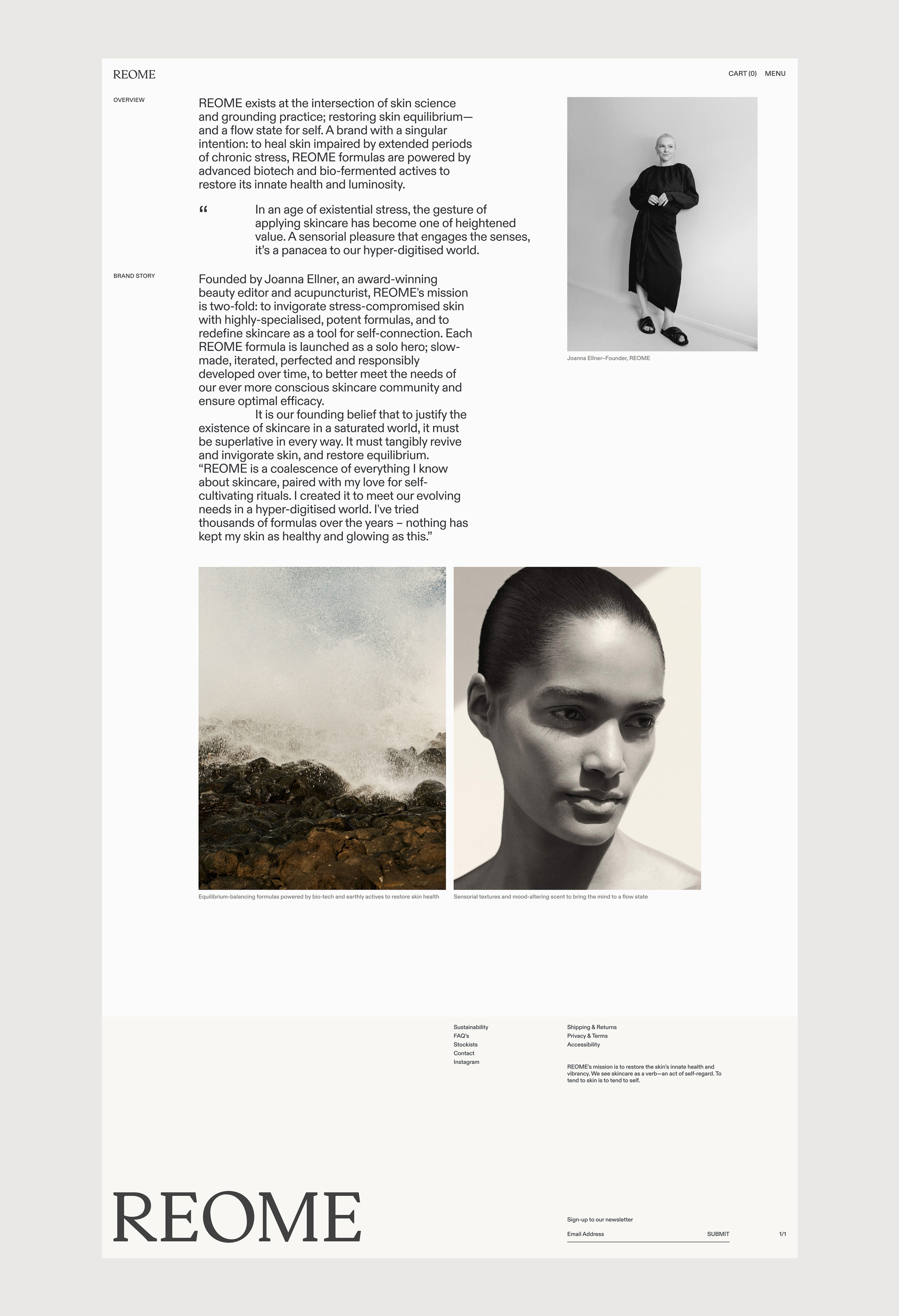
As beauty editor turned acupuncturist Joanna Ellner was founding her skincare line REOME on the notion of fostering self-connection, she approached us to realise an end-to-end brand identity around a single flagship product, Active Recovery Broth. Bridging time-honoured beauty traditions and biotechnological innovation, Ellner aspires to recast the conversation on skin texture from a disregarded topic into a quality to be embraced and enhanced through sensory rituals.
Solutions
Brand Identity
Packaging
Print Assets
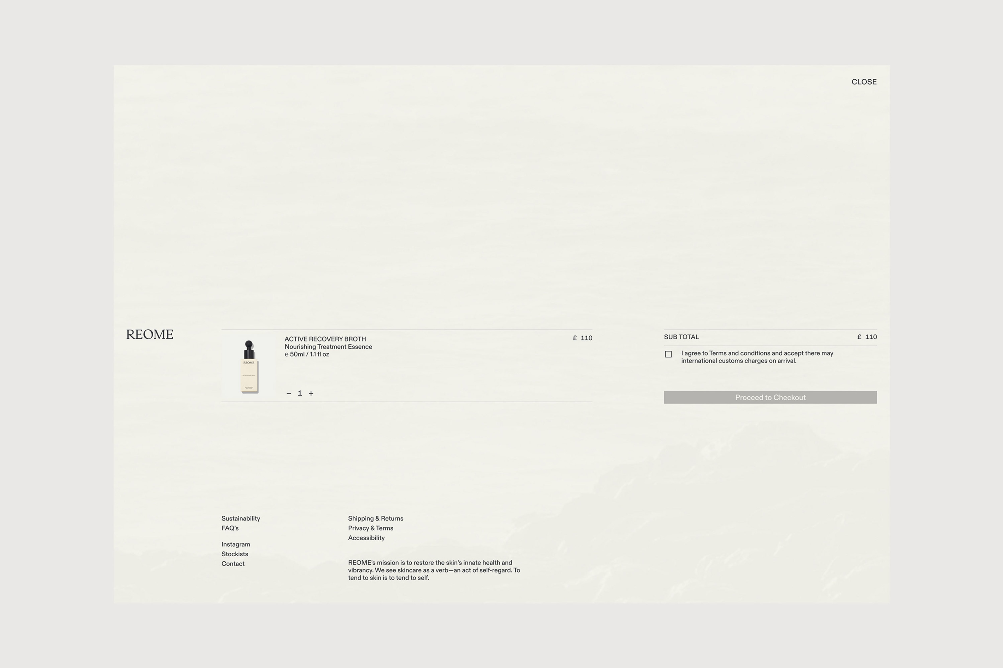
E-Commerce Design
E-Commerce Development
Digital Assets
Context
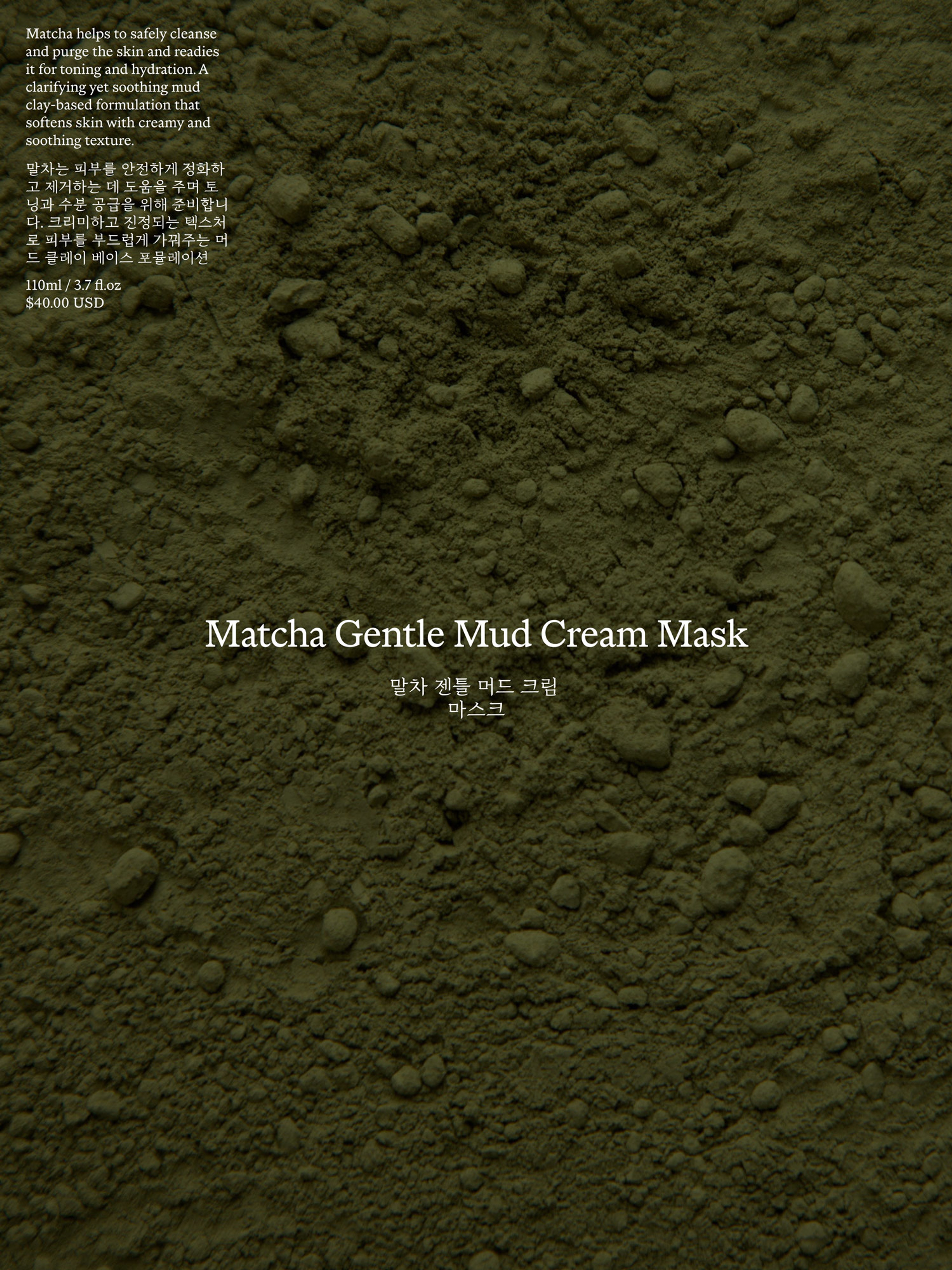
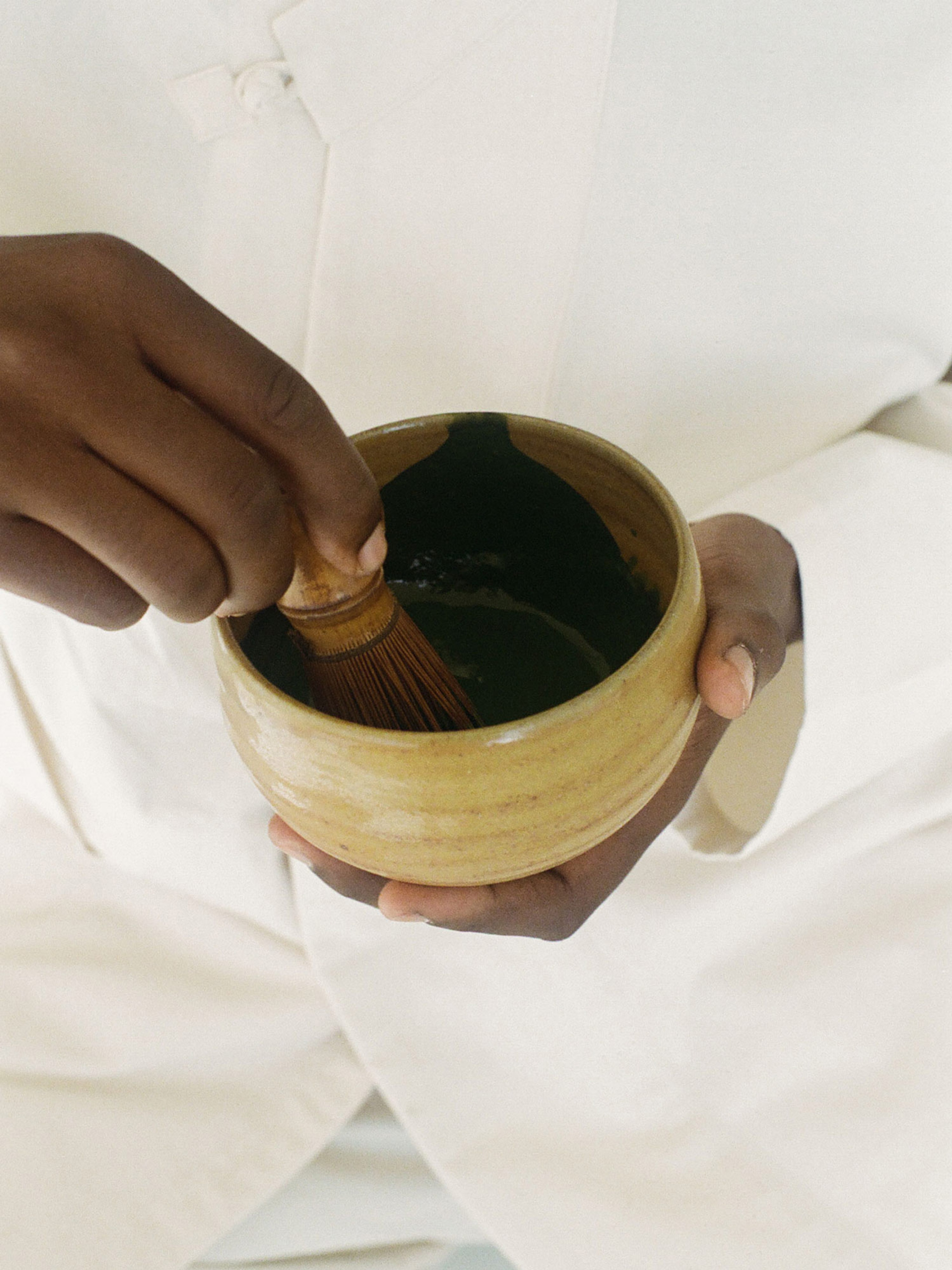
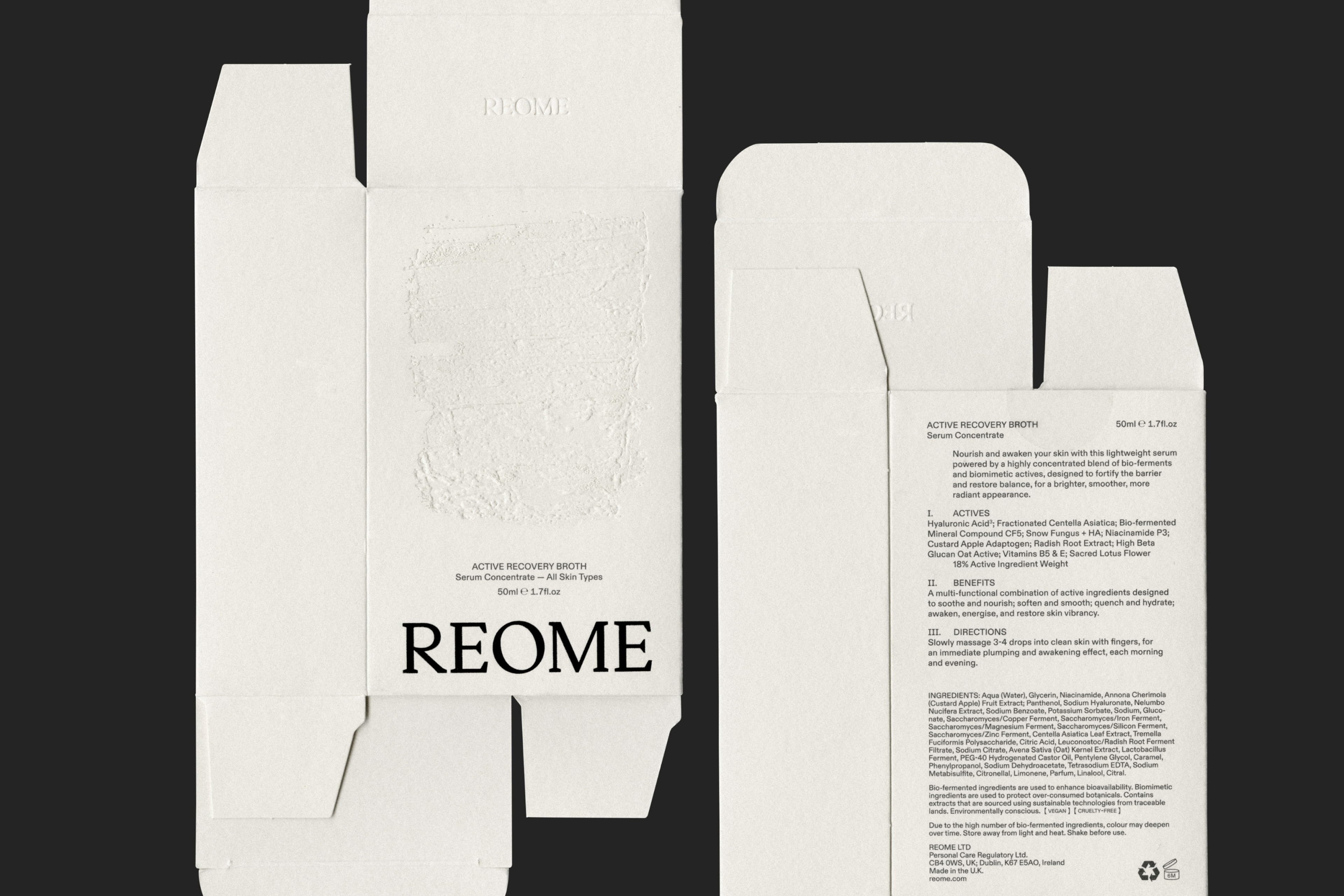
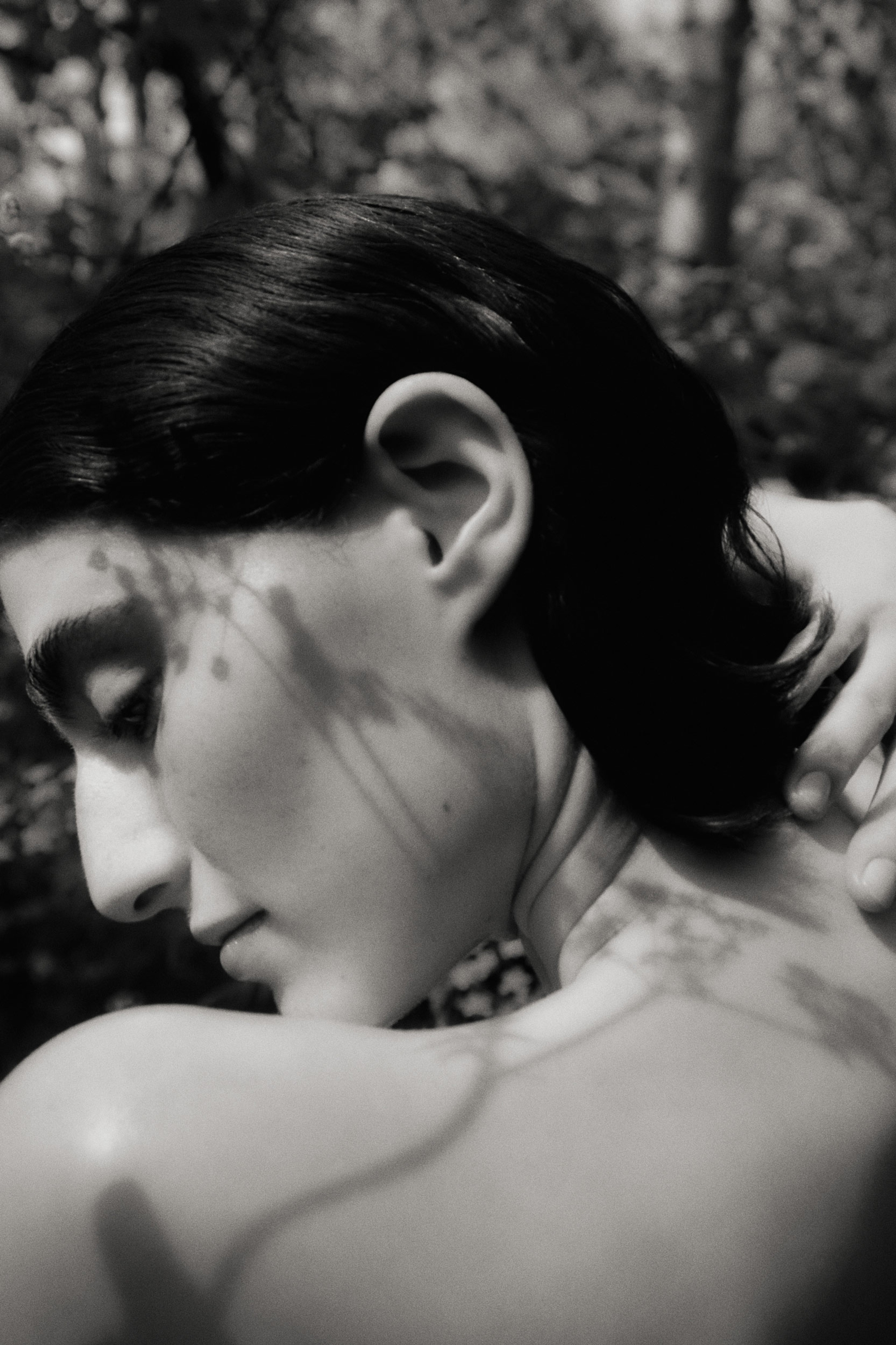
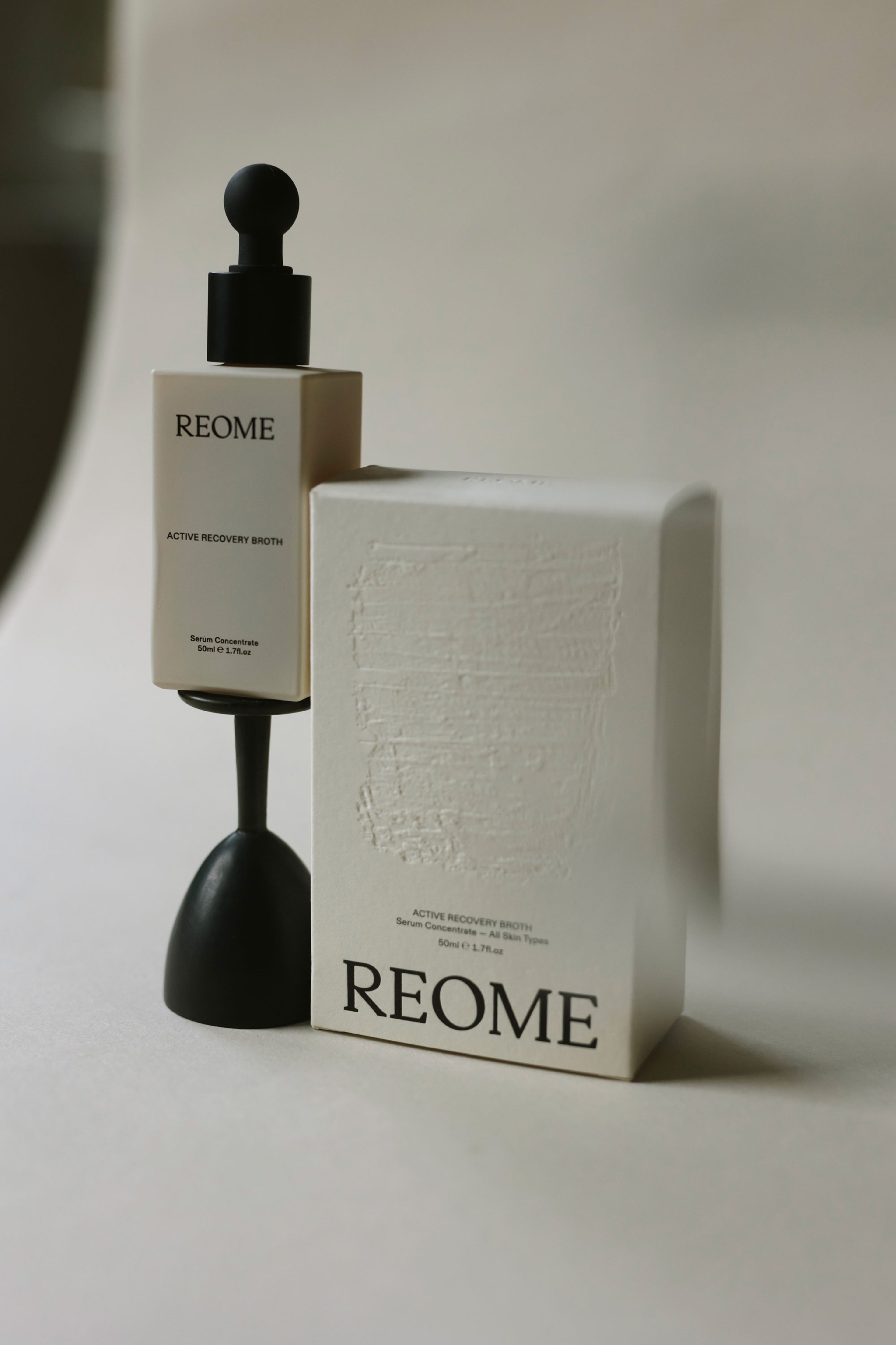
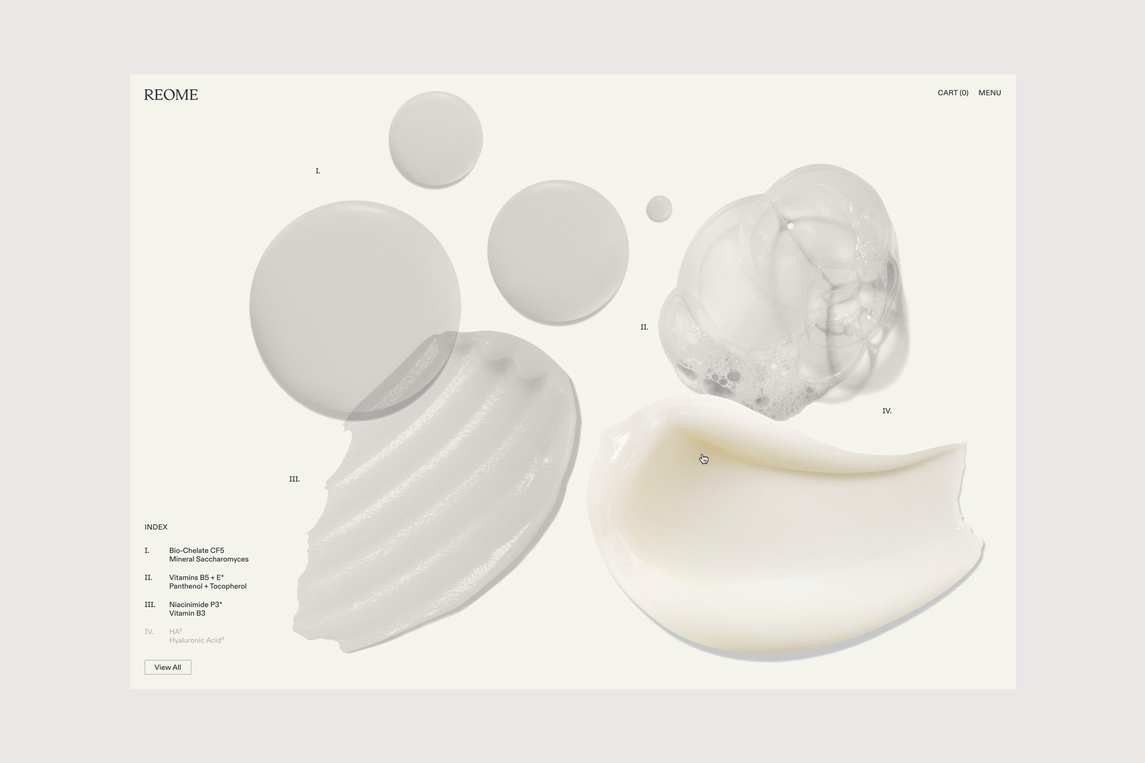
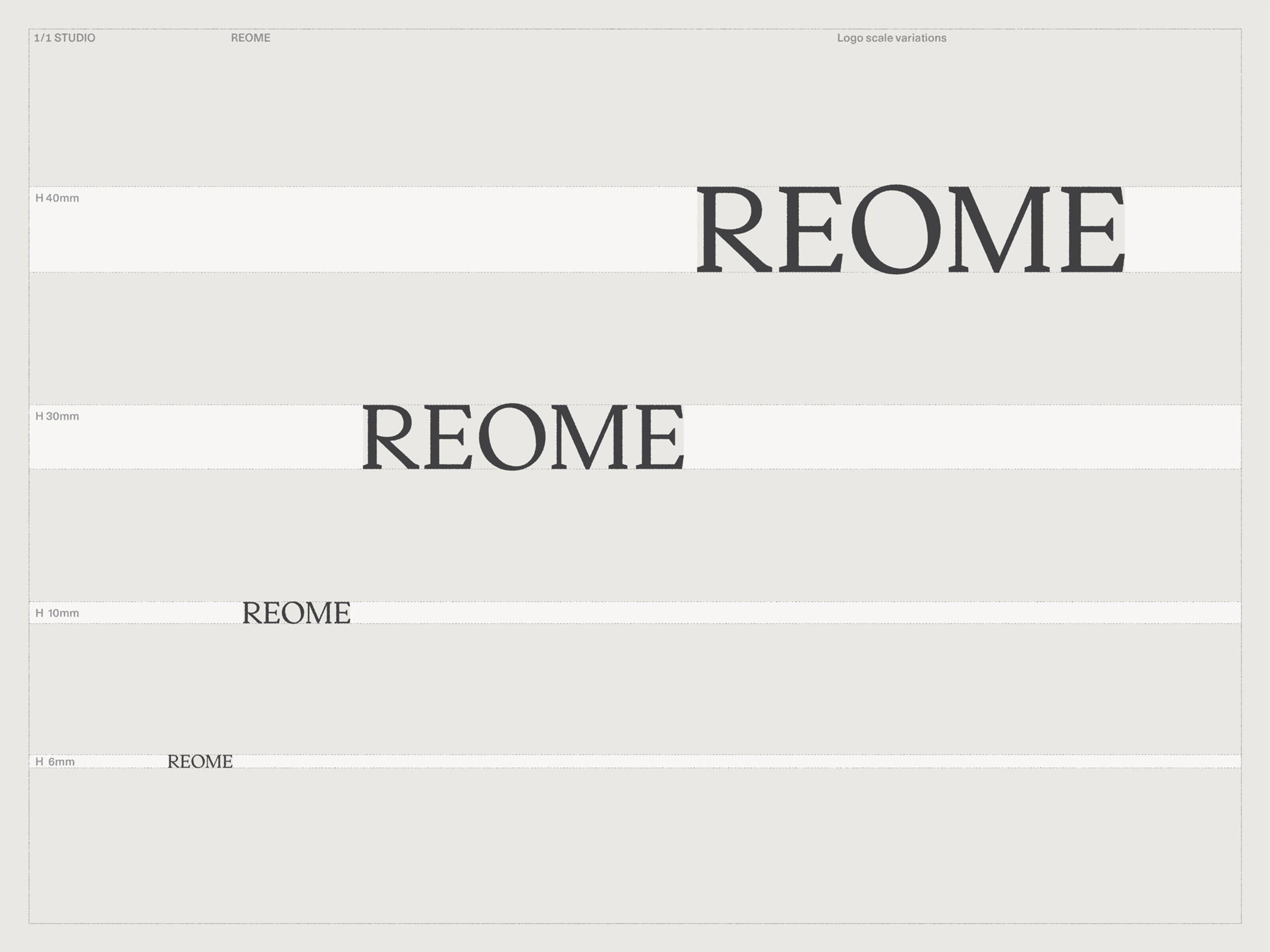
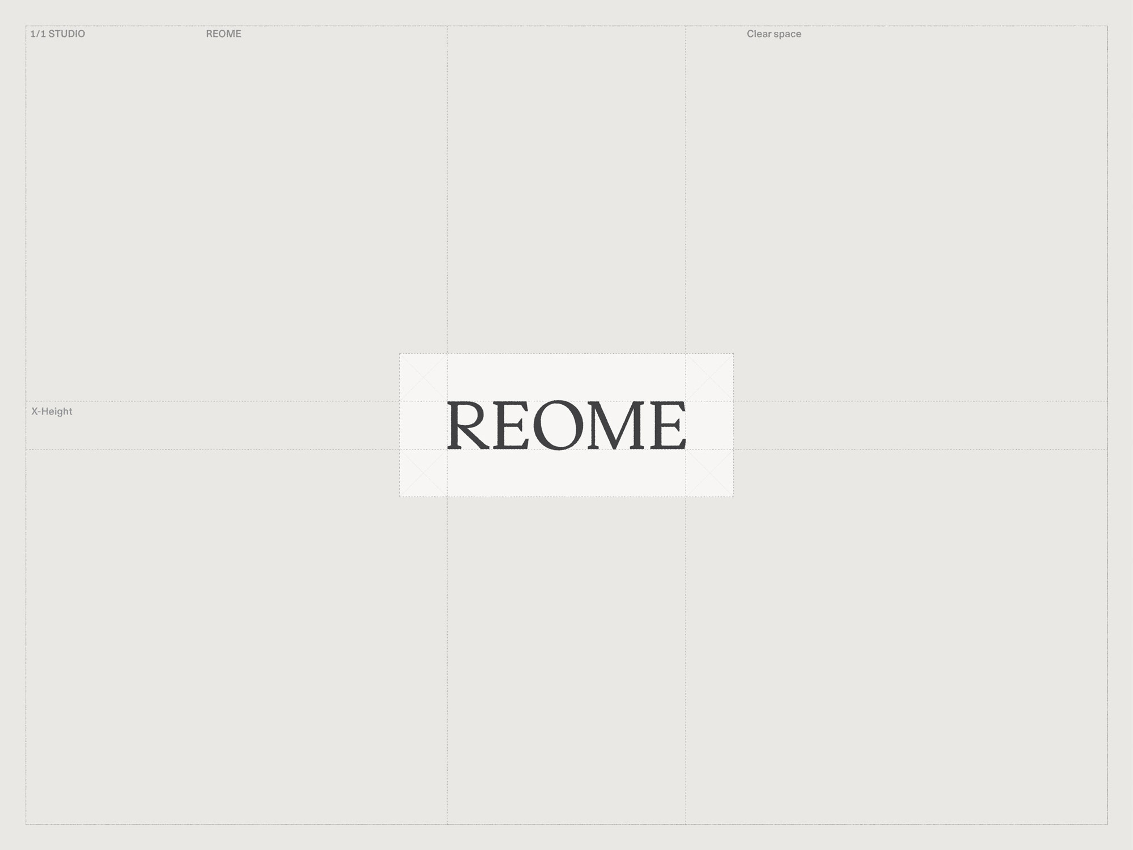
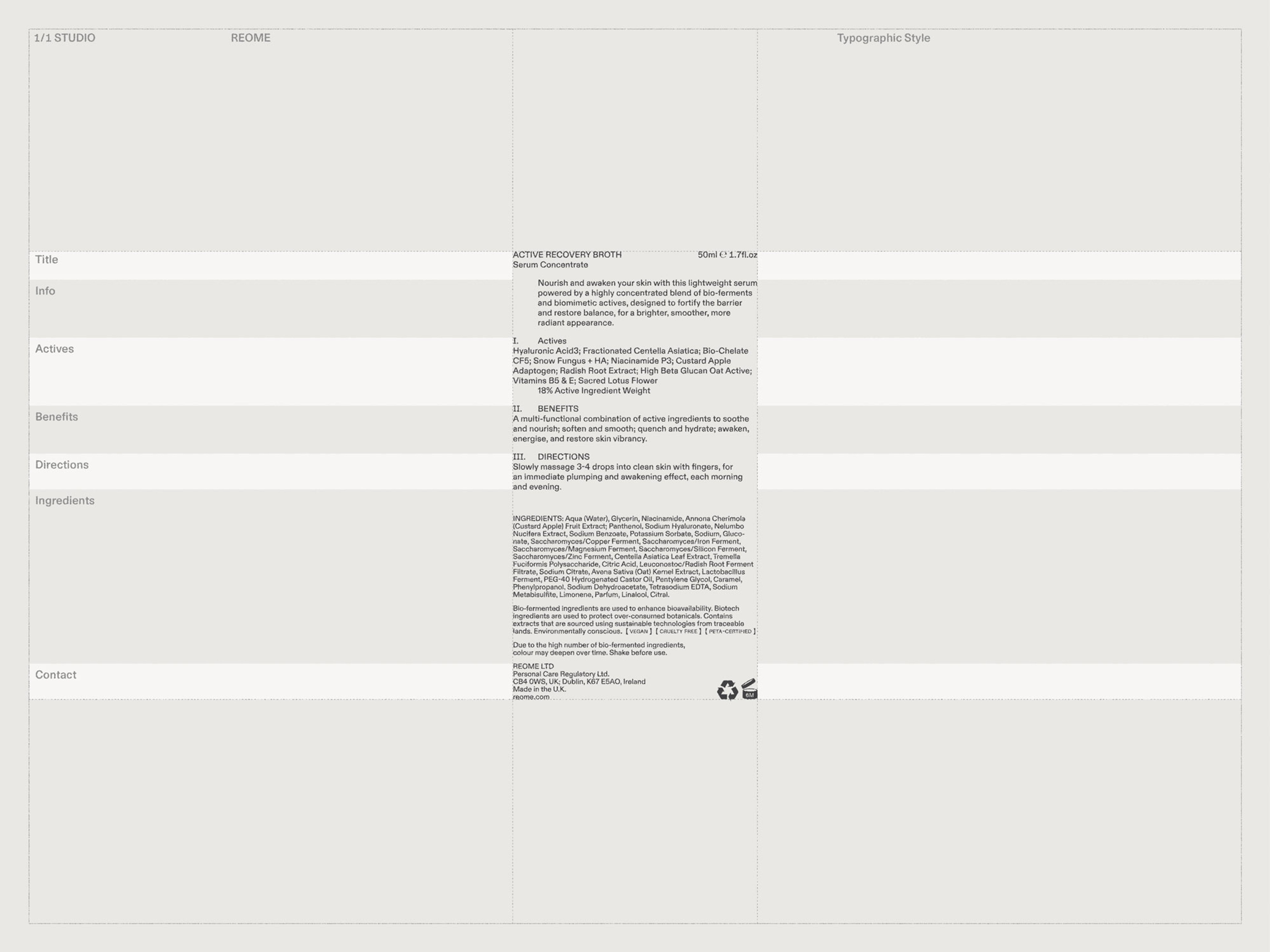
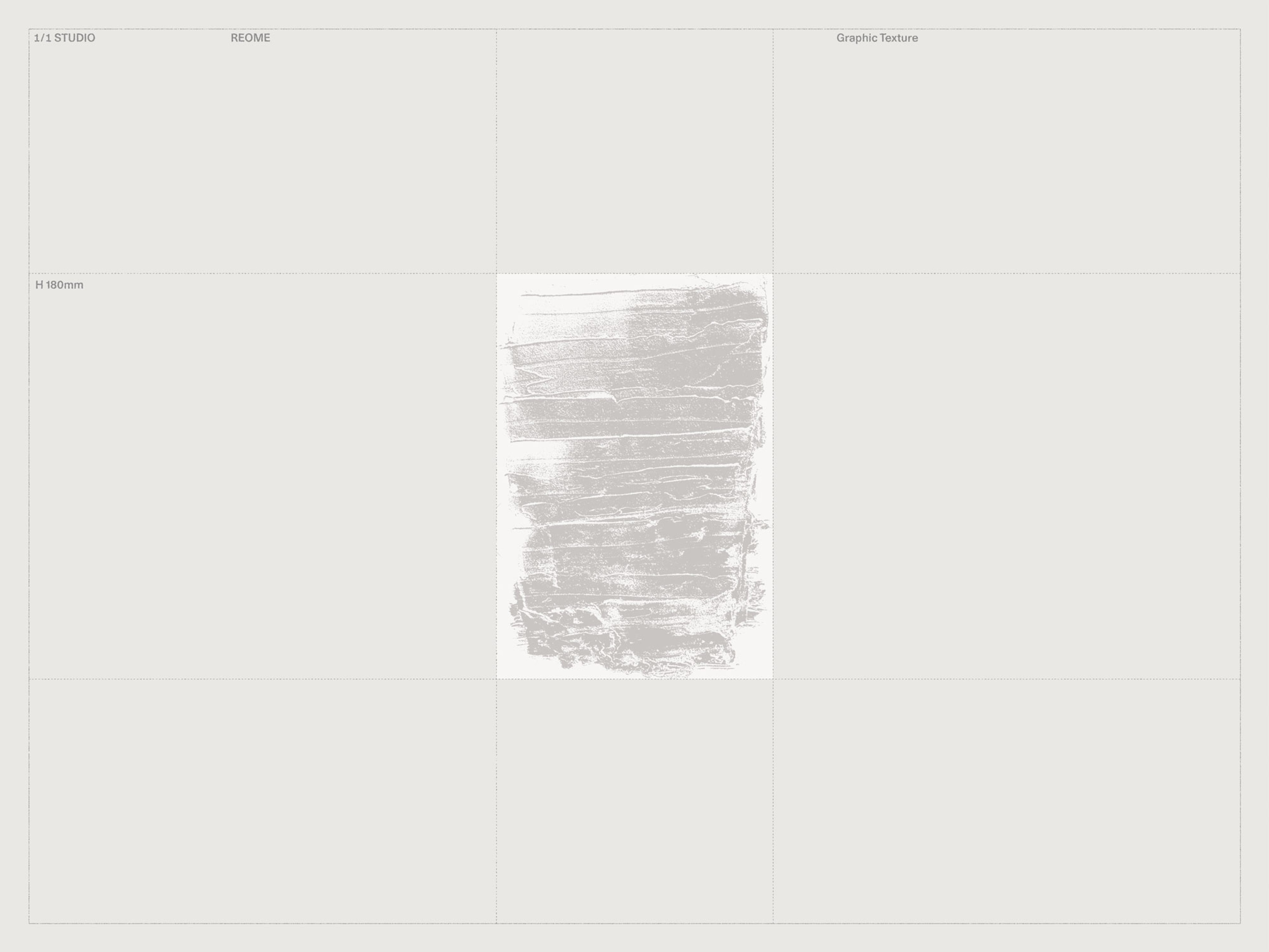
The concept we developed to reflect this purpose took inspiration beyond skincare from art and architecture’s treatment of materiality and tactility. A custom-drawn wordmark captures REOME’s boldness and balance, reflecting Joanna’s point of difference together with monochrome imagery of the natural world. Extending painterly references, we used a palette format to magnify the diverse textures of key ingredients. Across web and packaging, a structured type system incorporating Roman Numerals was designed to instil trust through transparency.
Context
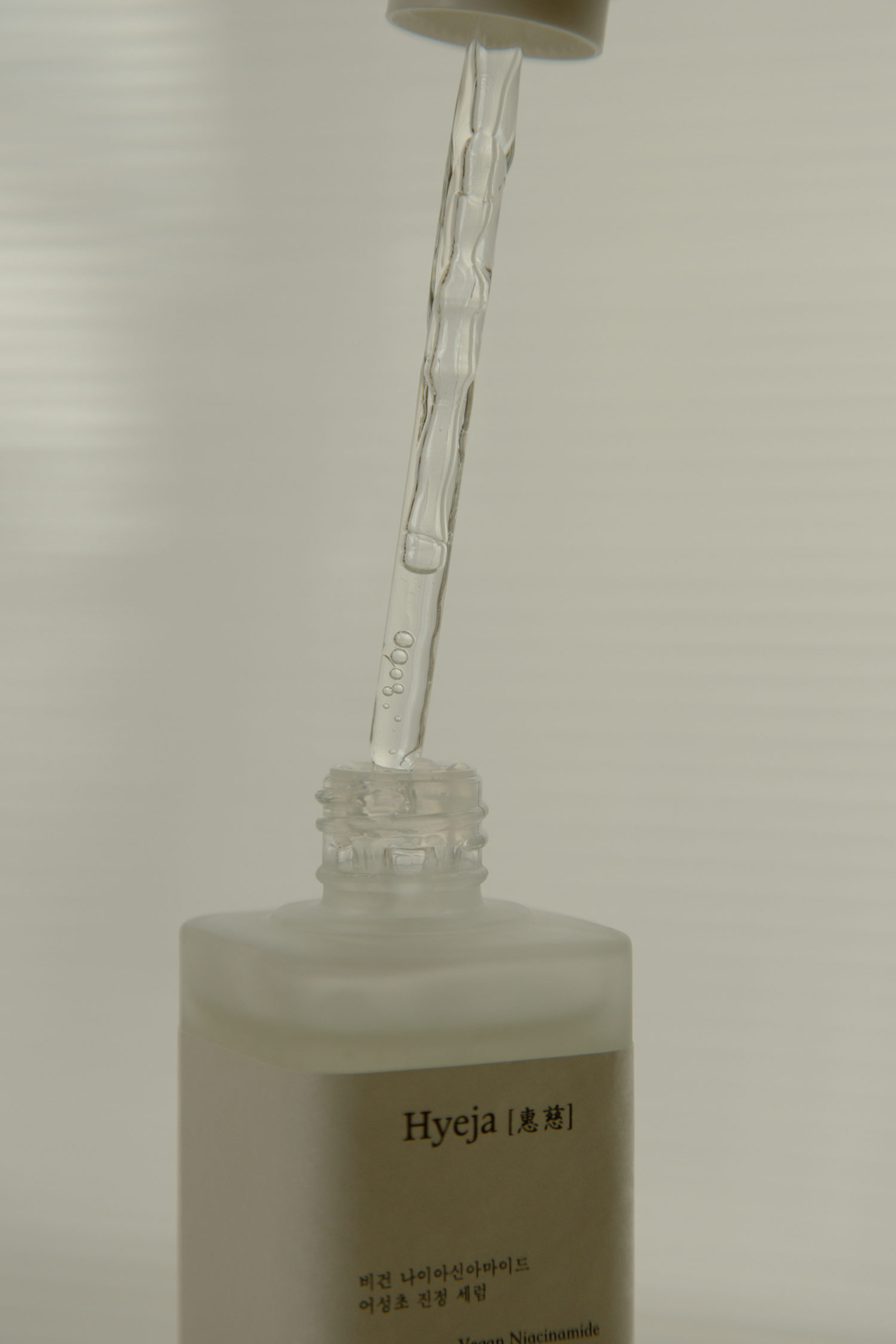
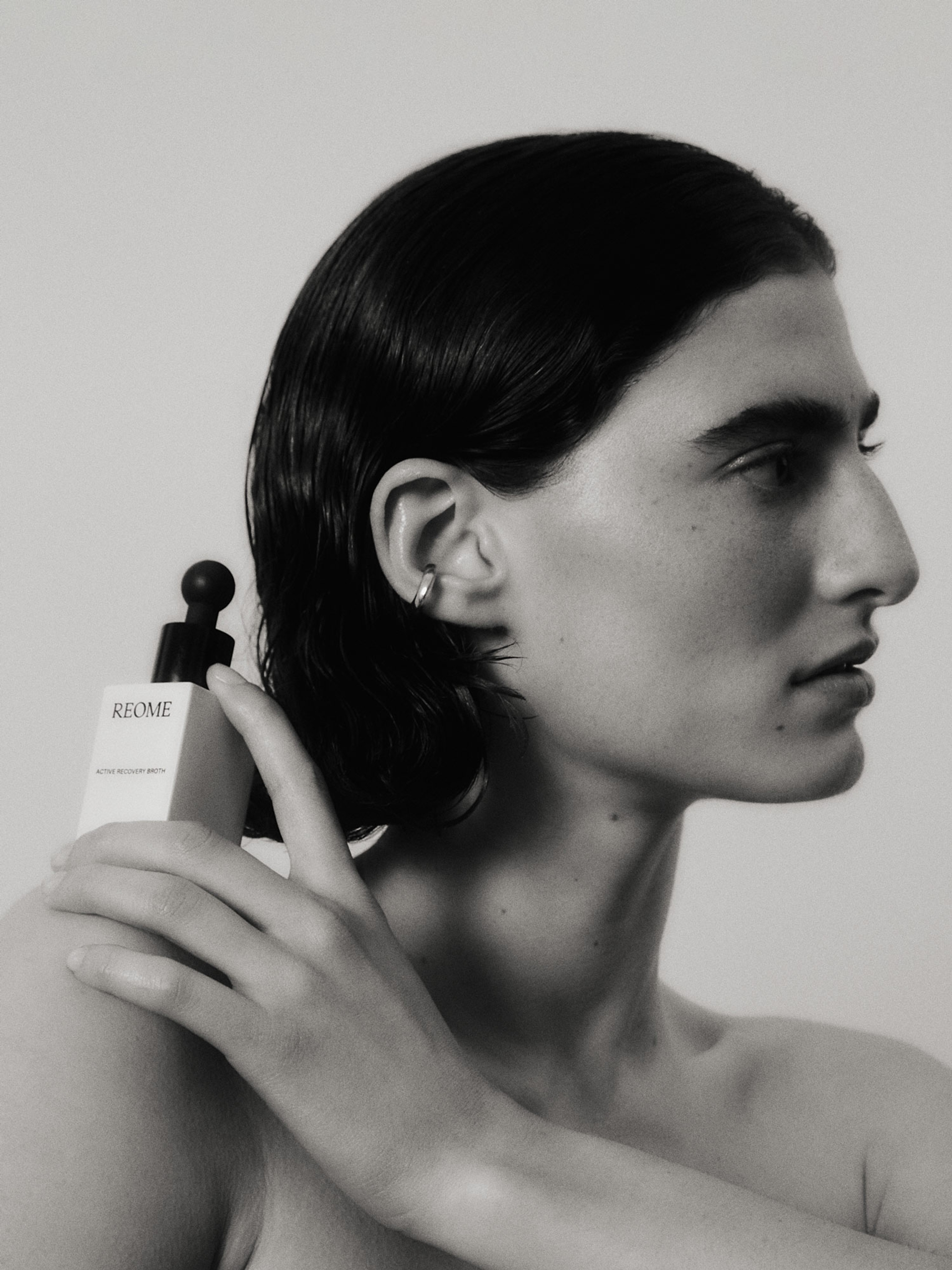
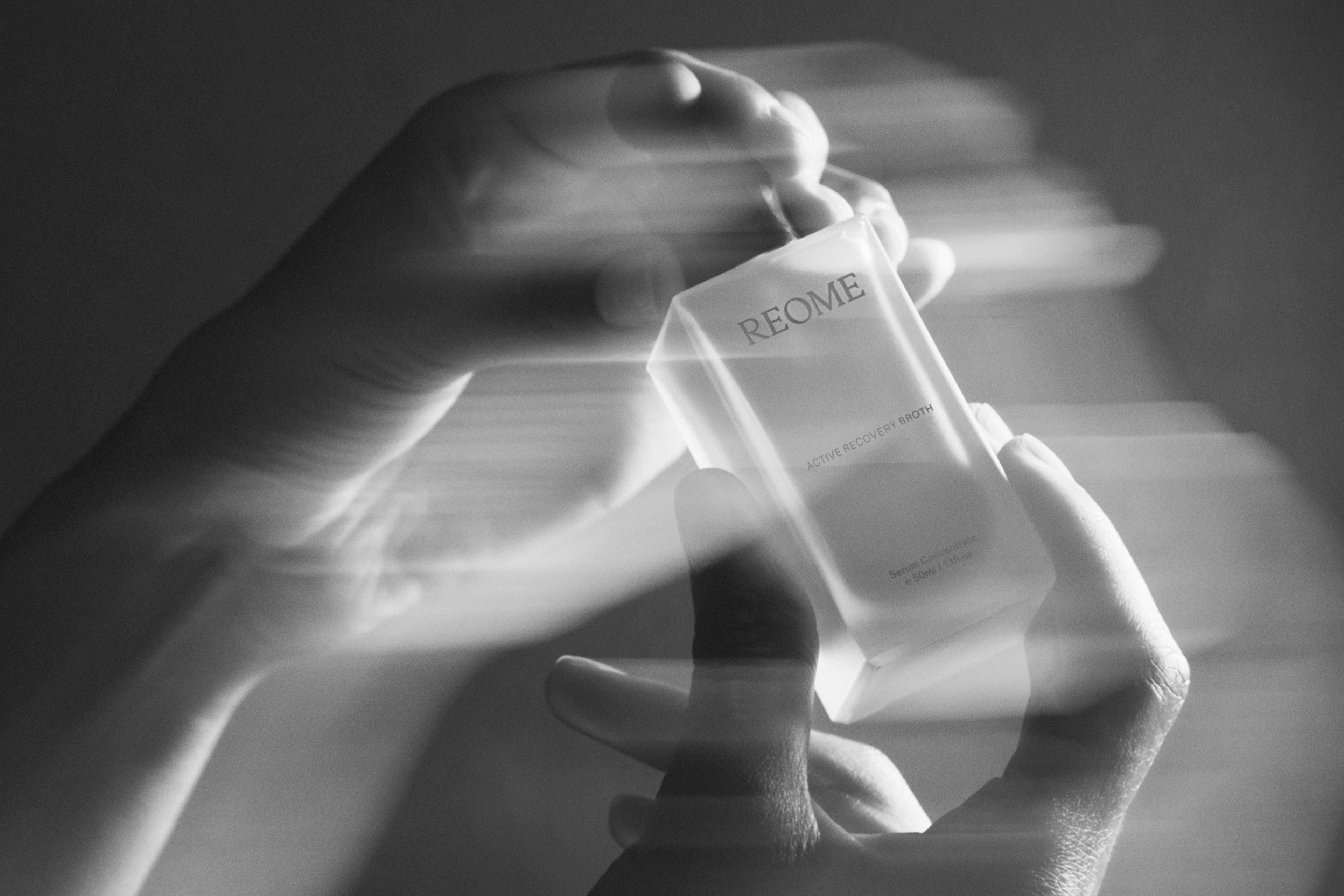
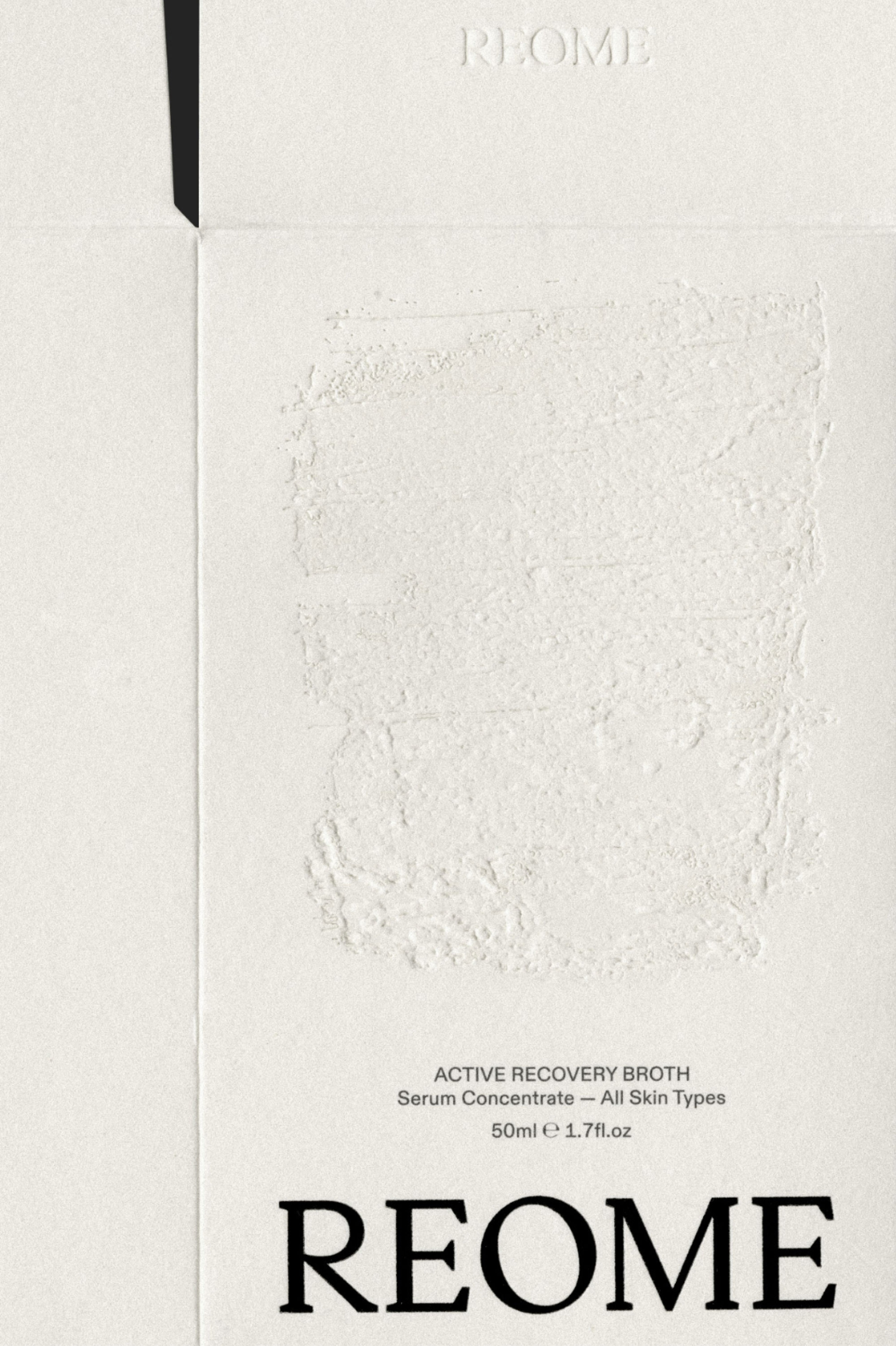
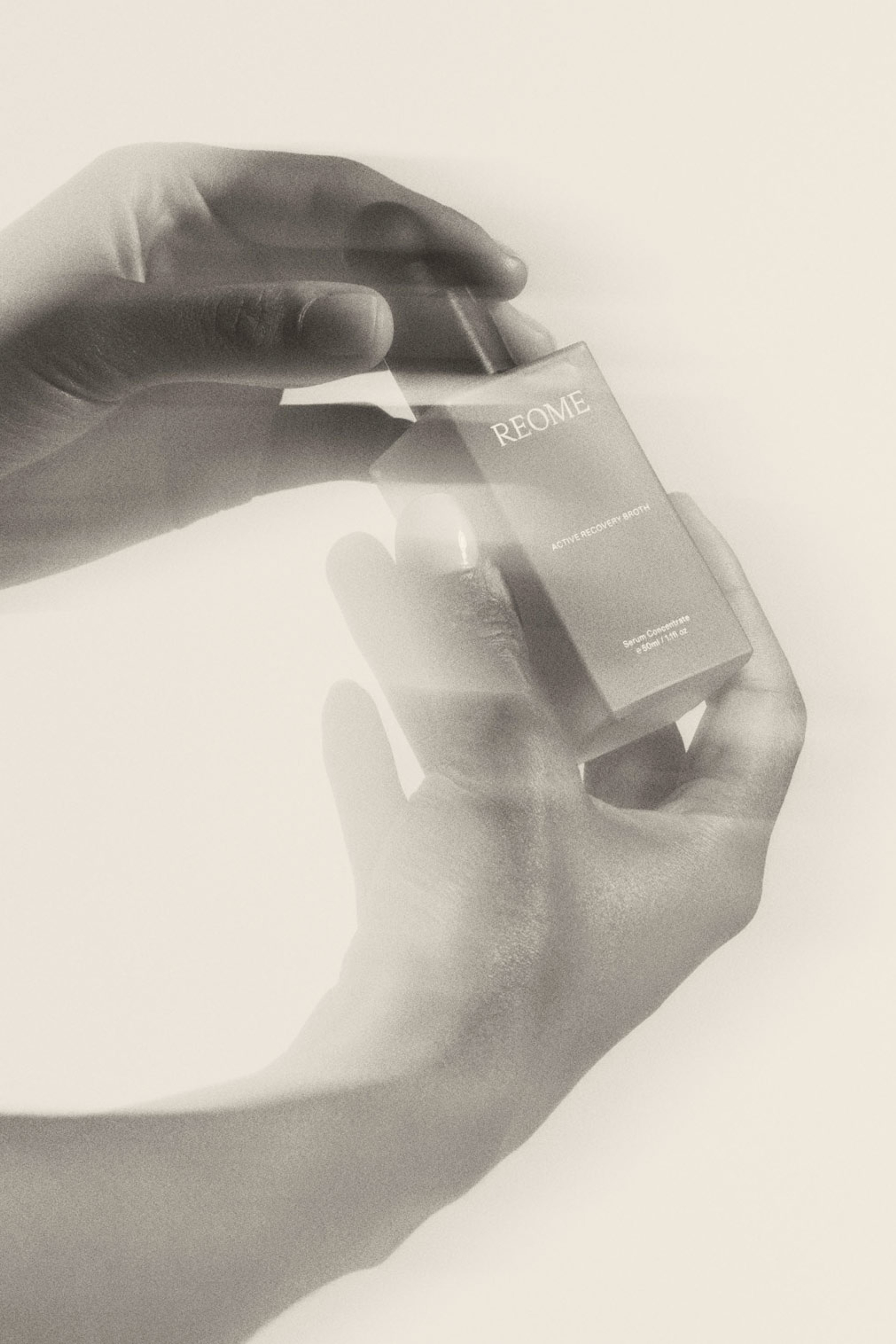
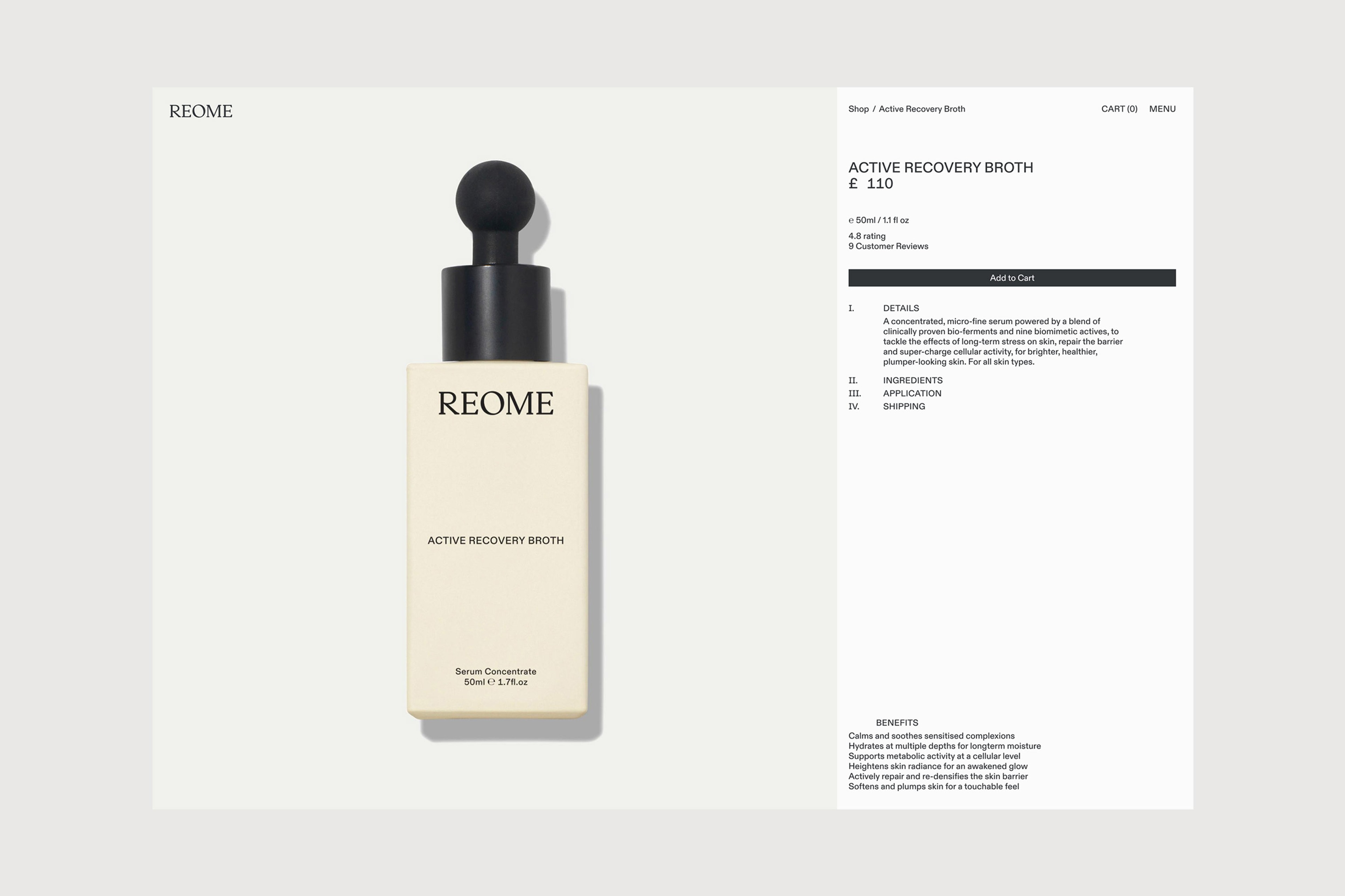
Applying REOME’s philosophy to sustainably-minded product packaging, a frosted-finish glass bottle with an exaggerated round dropper invites a heightened tactile experience, which is further reflected in the choice of blind-debossed box stock made of recycled coffee cups. Complementary social media assets including a launch campaign and templates for ongoing storytelling overlay type and imagery to highlight product benefits. The cumulative effect of these components enabled REOME to efficiently make an impactful debut into the skincare industry on the basis, including an exclusive stint at Space NK and a placement at Liberty London.
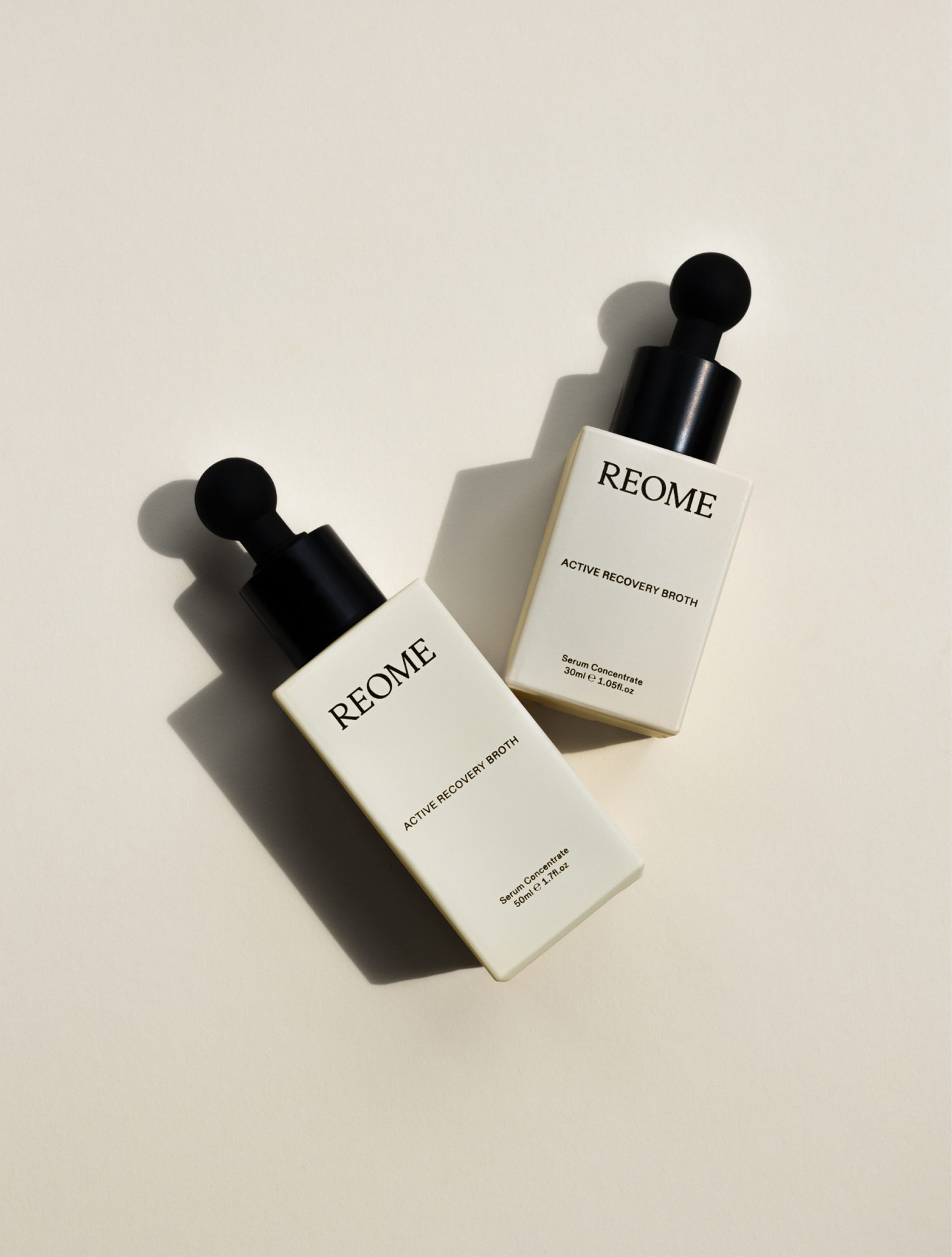
Active Recovery Broth, 50ml / 1.7fl.oz & 30ml / 1.05fl.oz
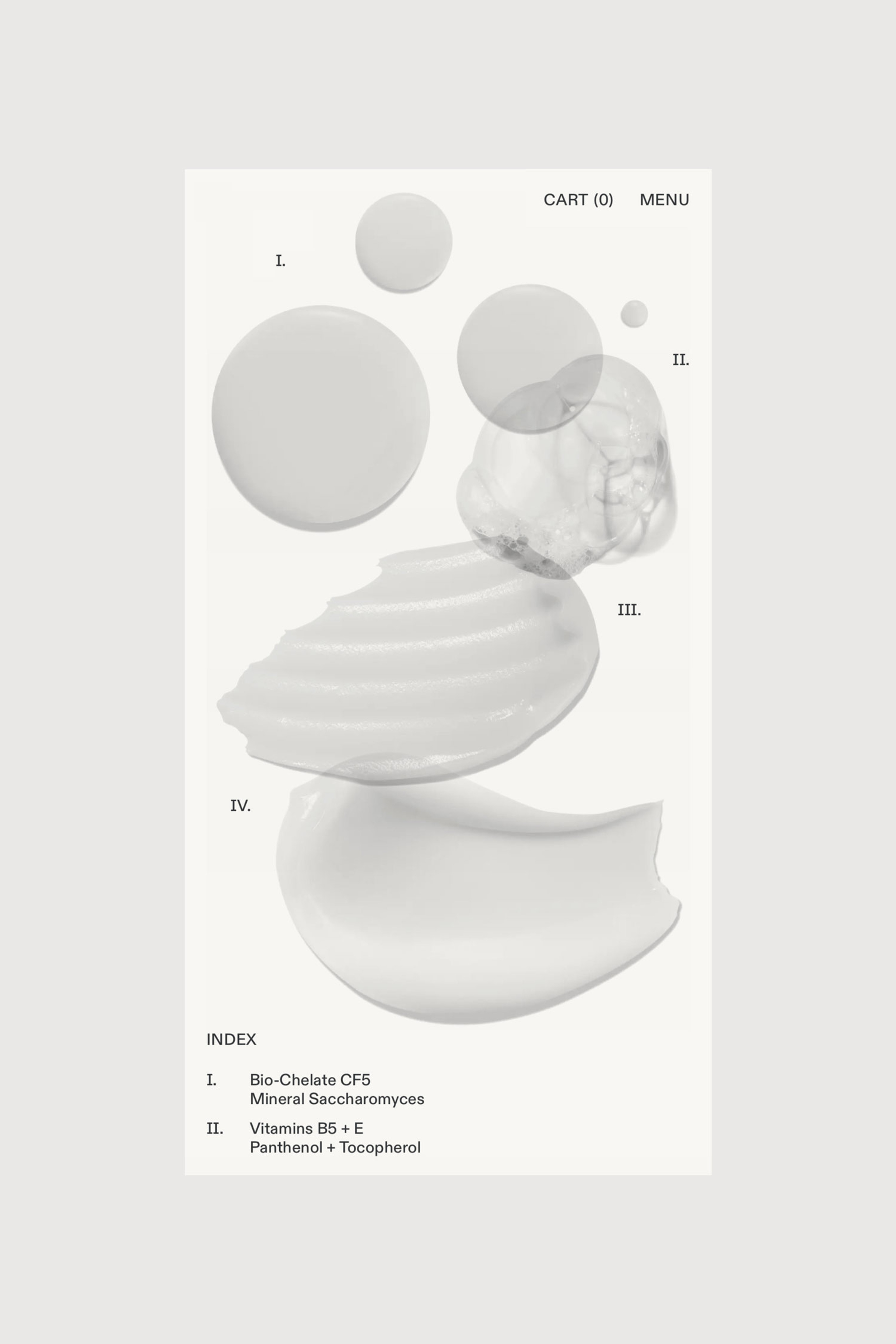
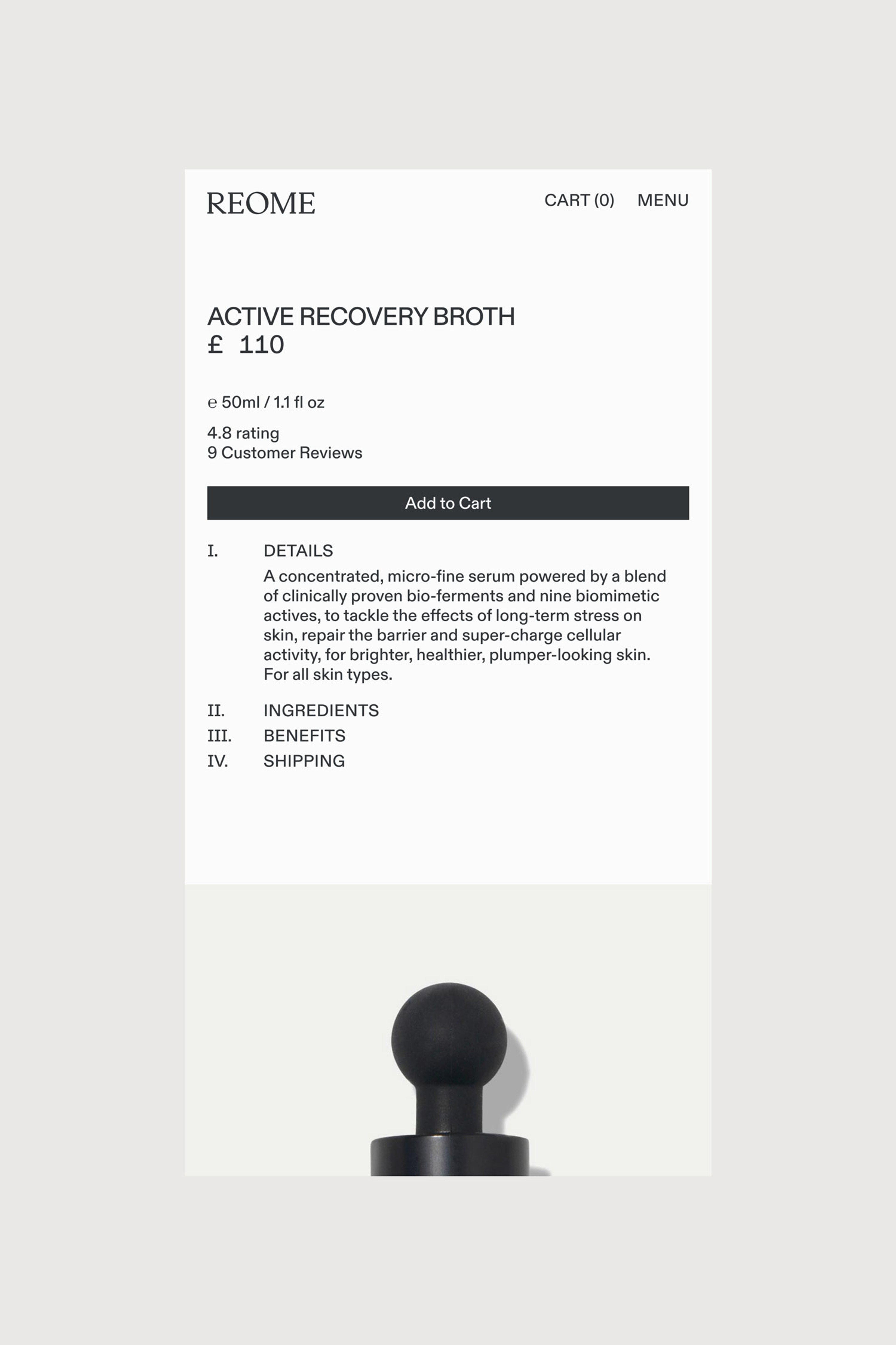
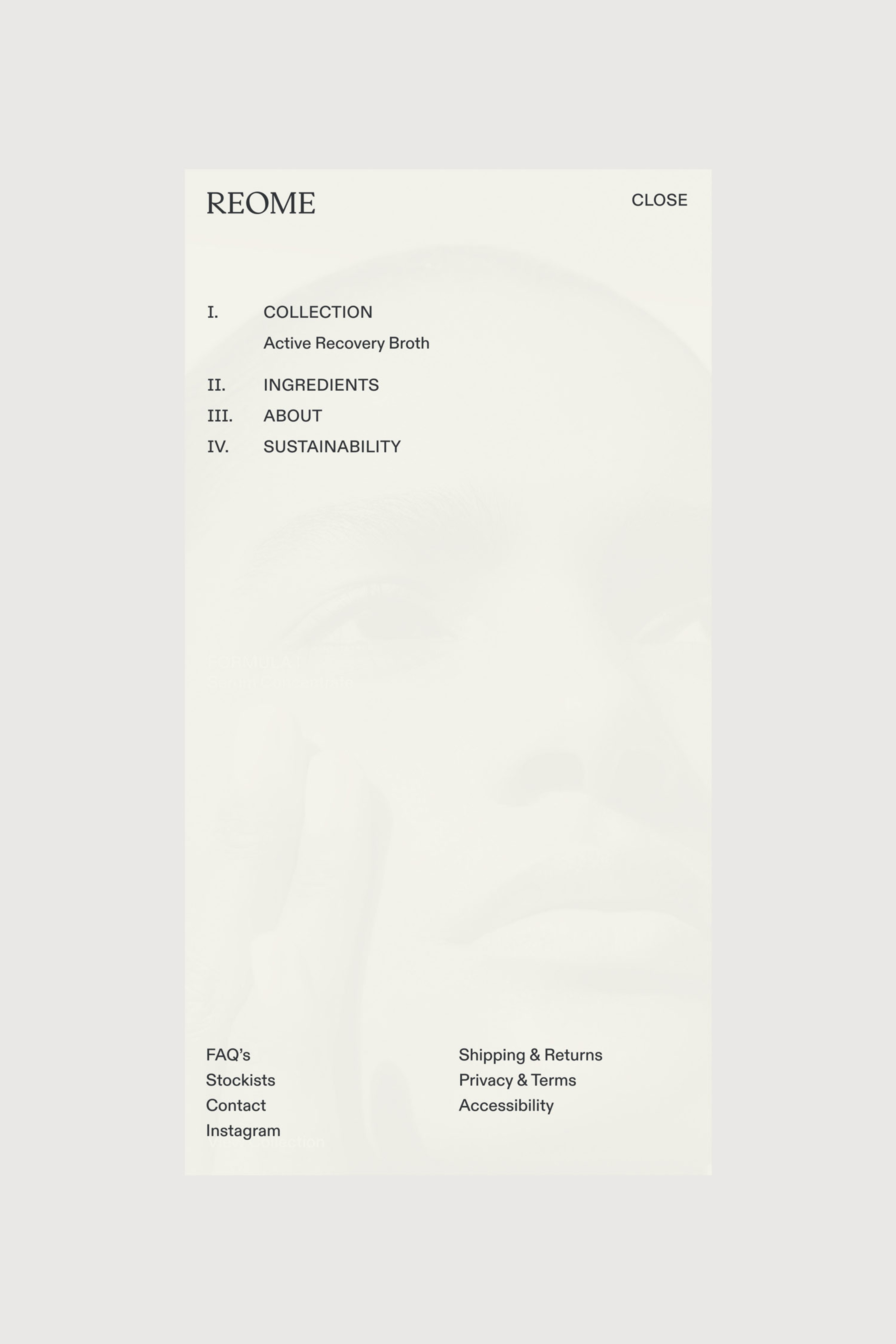
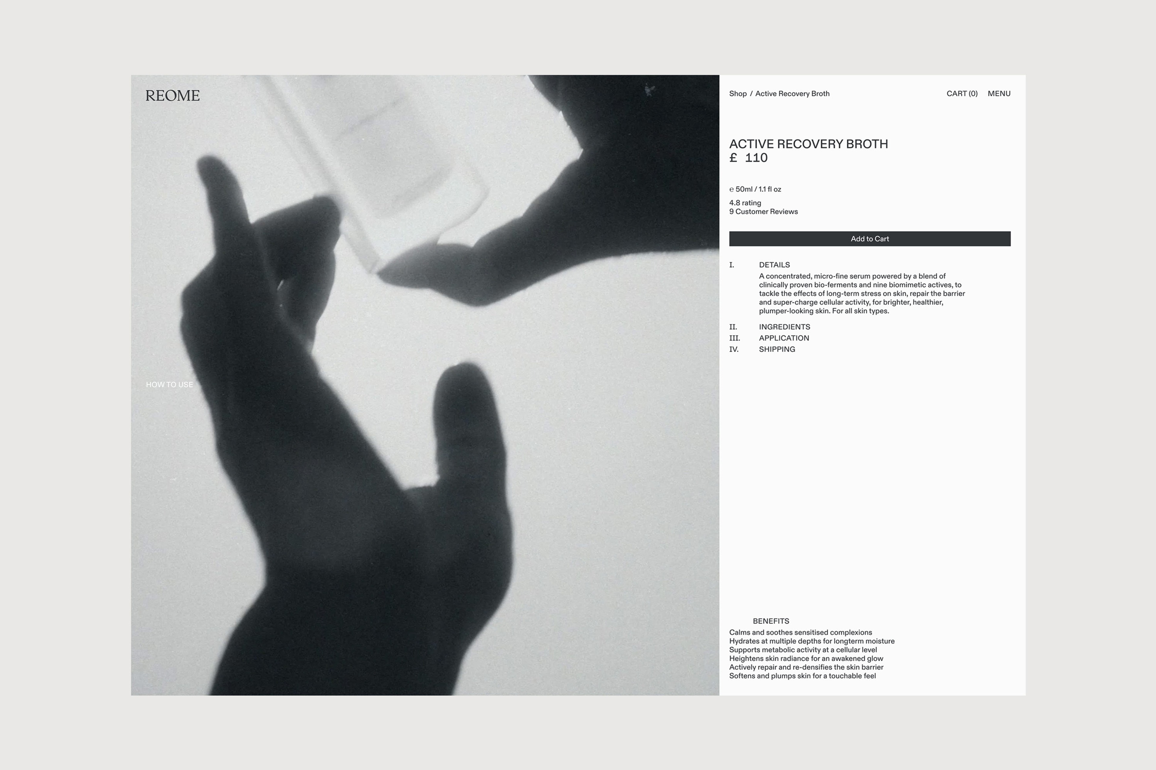
In REOME’s typographic system, form and content align to convey the advanced scientific research underpinning the brand, underscoring its philosophy, thorough development process and proven benefits of its flagship Active Recovery Broth.

Graphic Systems
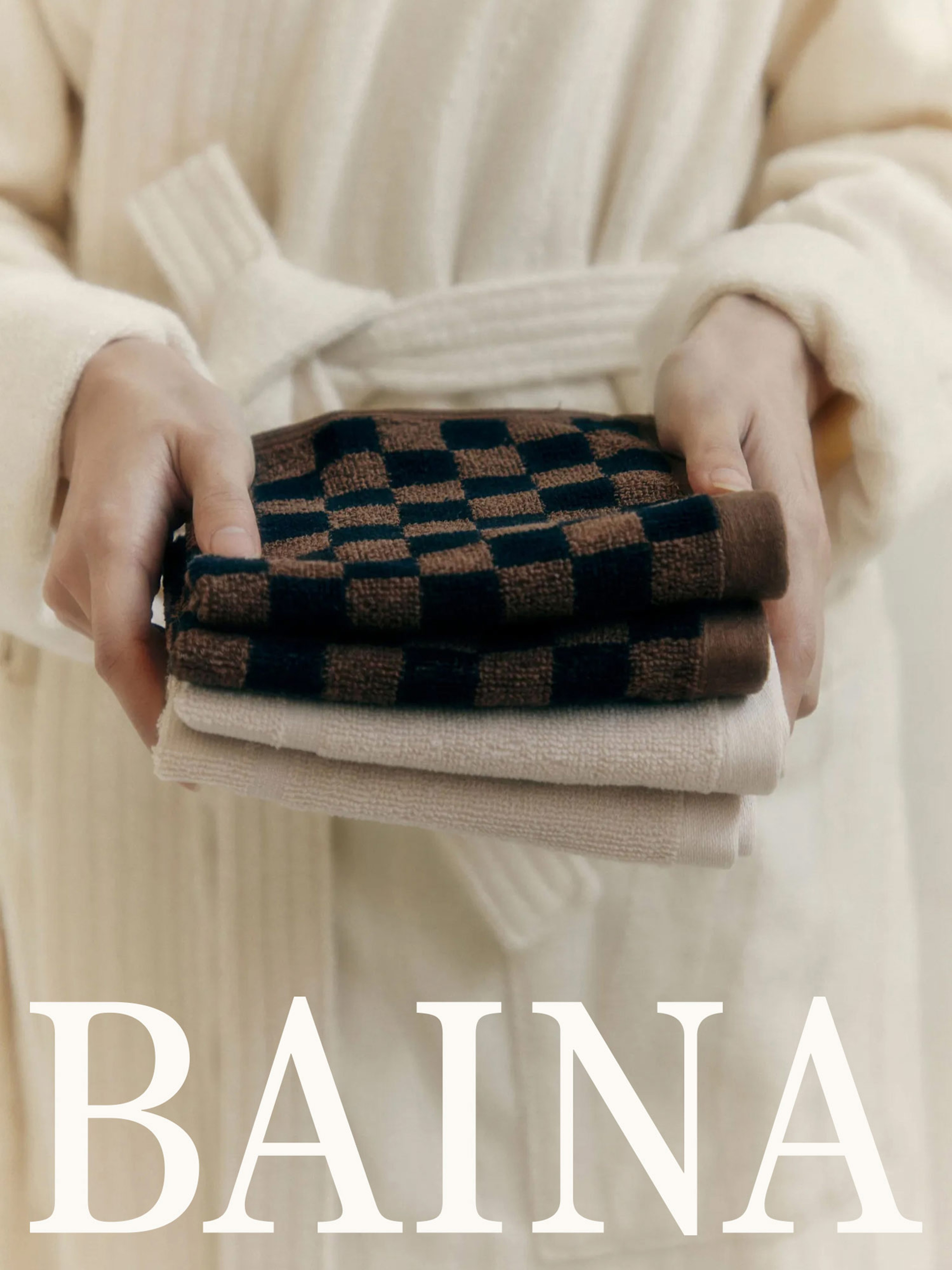
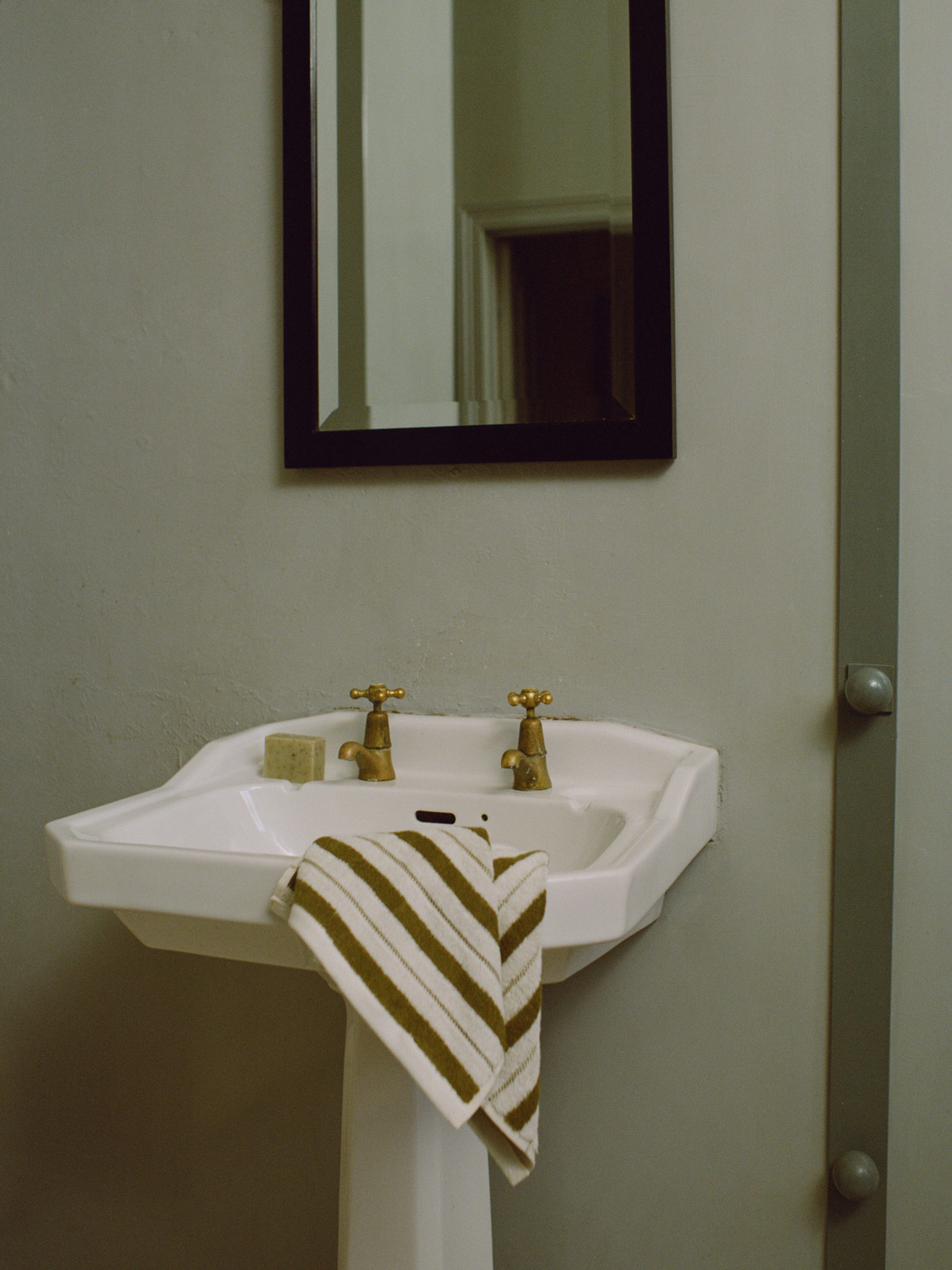
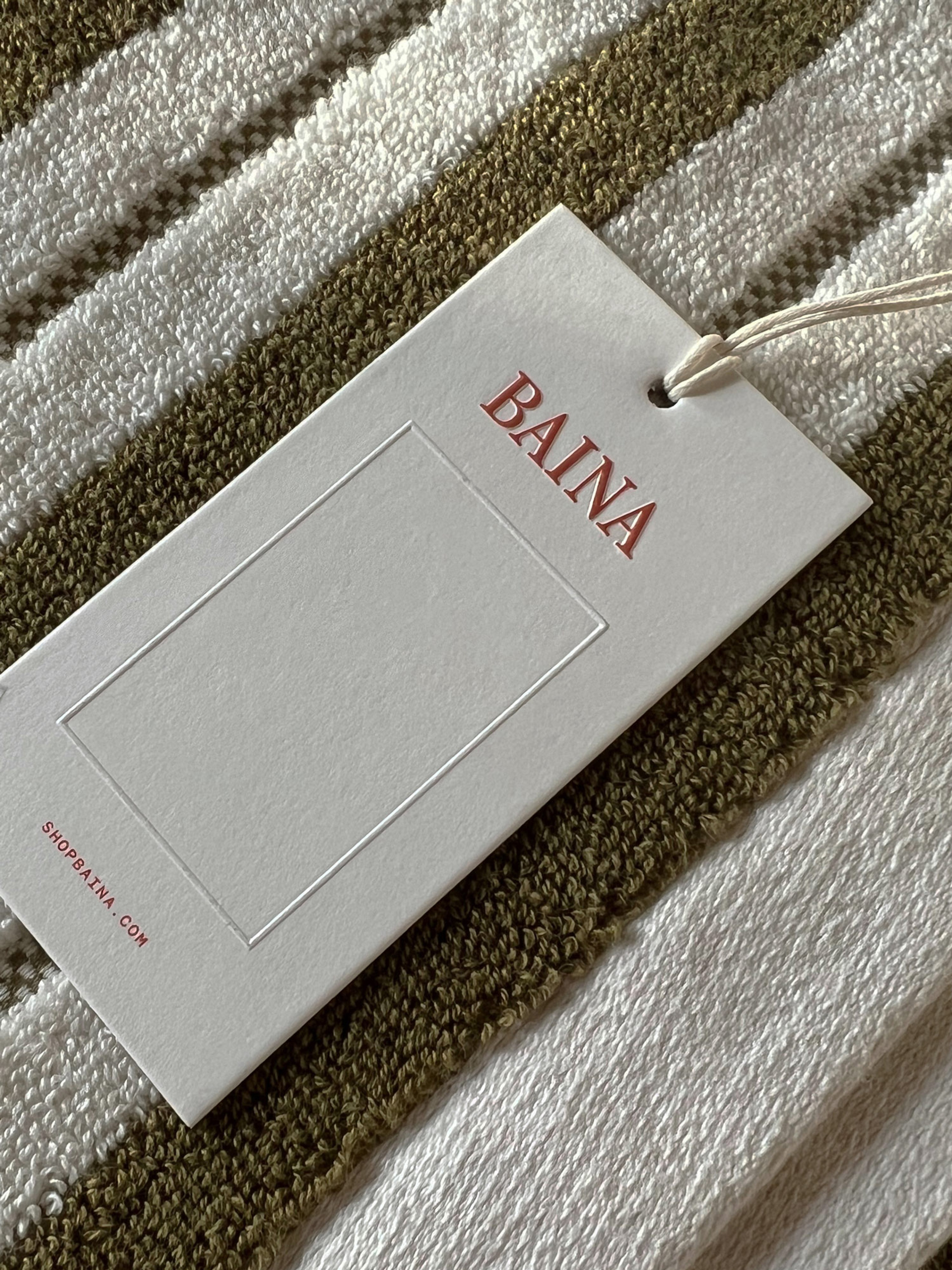
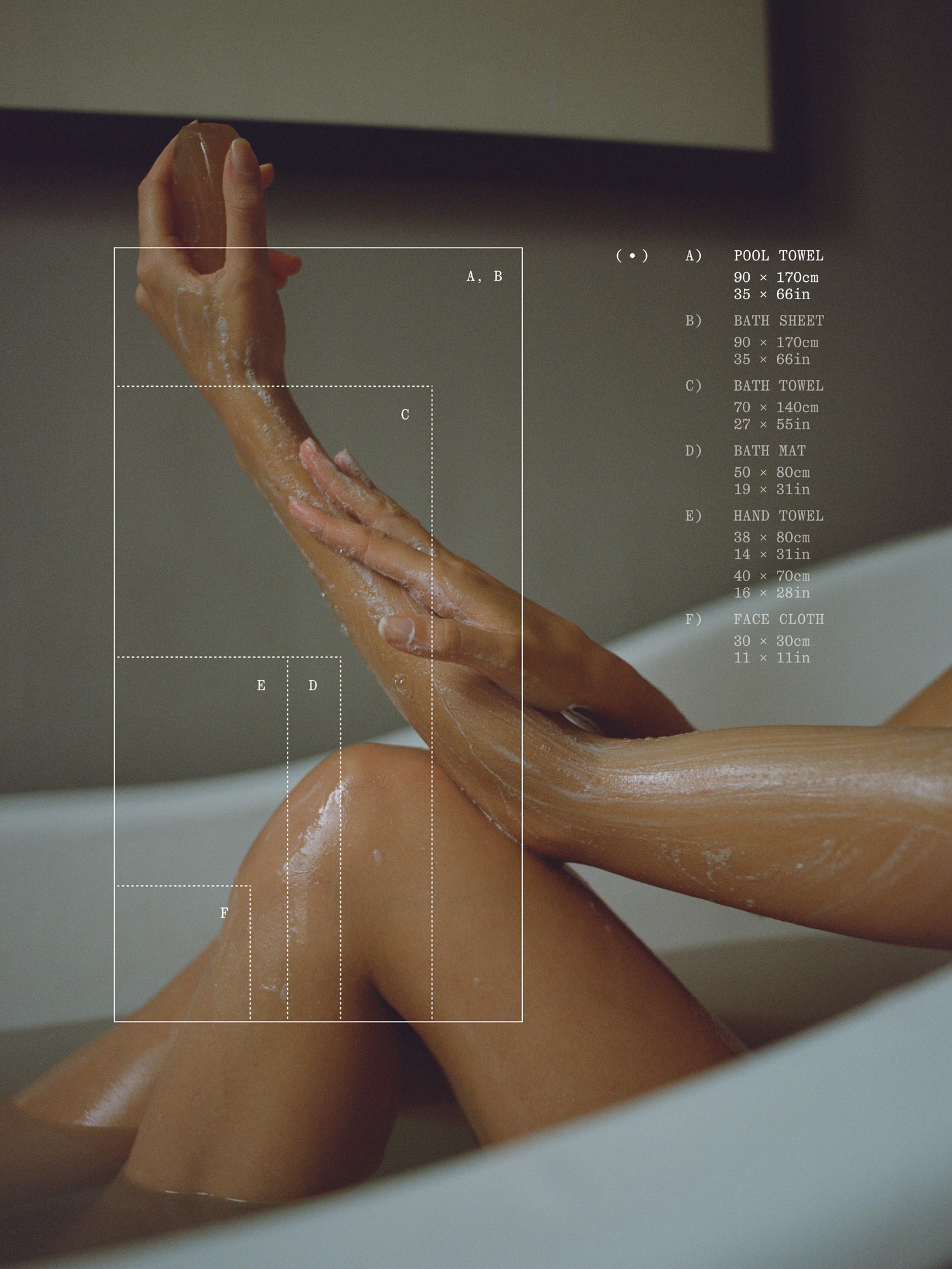
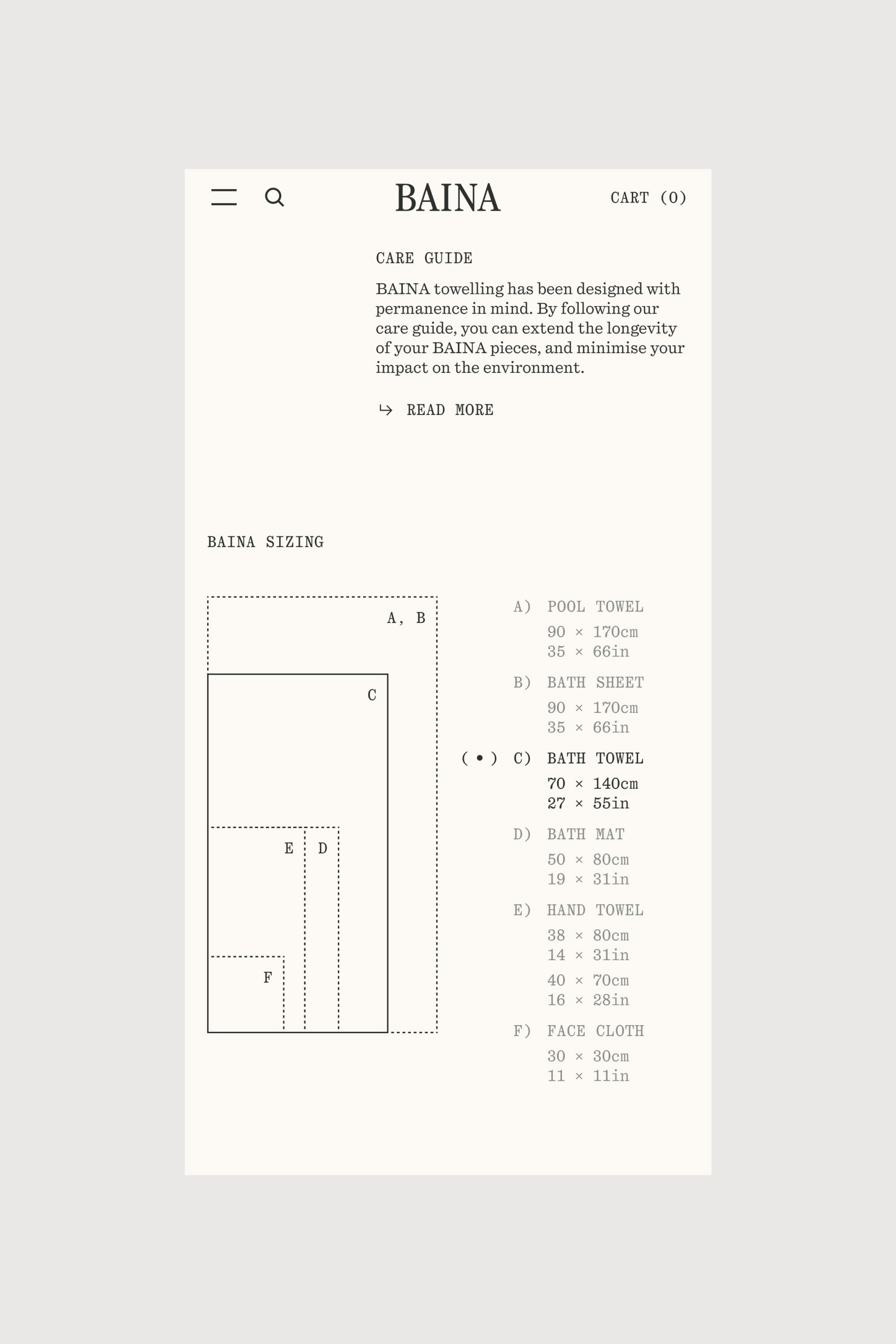
BAINA